Using Typekit web fonts on mobile
Ever since experimental support for Typekit web fonts came to the iPhone and iPad, developers have had another performance angle to consider. How does an array of custom fonts weigh against the potential load times your users will see? Jenn Lukas recently raised some interesting questions over at The Nerdary, and got us thinking about this again.
Unfortunately, there aren’t simple answers to these questions. In fact, talking about “mobile devices” is a bit confusing: what we are really trying to do is enable, delay, or disable resources based on the bandwidth of the network connection. There is no easy way for a website to query the available bandwidth of a visitor’s connection and intelligently decide which resources to load. (The Network Information API is meant to fill this gap, but is currently only implemented in Firefox.)
In the future, it might be possible to detect a device on a low-bandwidth connection and intelligently load fonts and other assets (or choose not to load some at all). For now, however, we can offer a few options for you to try.
Strategies for using Typekit on mobile devices
You have several options for working with fonts served to mobile devices. Which method you should choose depends on how people access your website or application. If you’re working within tight aesthetic guidelines and you know your audience mostly uses devices connected to WiFi or other fast networks, it’s probably best to use the same fonts for all display options. On the other hand, if it’s important that your website load as quickly as possible, and your users are primarily on mobile devices, it might be worth exploring options for either fully or partially disabling fonts for mobile devices.
(A note on testing these suggestions: record the network performance of your site before making any changes so that performance problems are quantifiable and not just perceived. Perform the same network recording before and after making any changes to see whether there are significant performance gains.)
You should first consider changing nothing at all. Fonts on Typekit are highly optimized for file size, and our Content Delivery Network (CDN) ensures fonts are delivered worldwide as quickly as possible. Many developers will find that this combination allows Typekit to perform respectably on your mobile site.
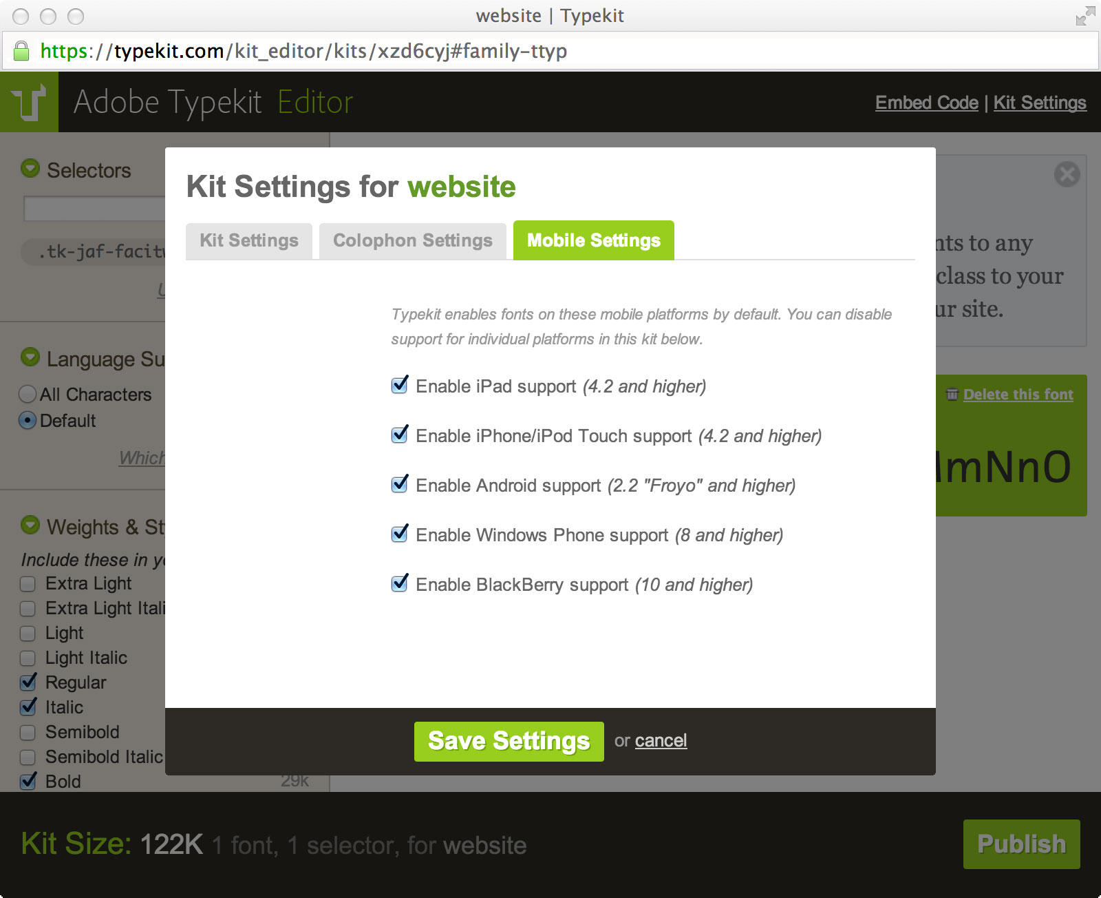
It may be worth disabling fonts for mobile devices if a large portion of your users are on slower mobile connections, however. In this case, the font specified in your CSS font fallback stack will be used (or the browser default, if no fallback is available). You can disable support for multiple mobile devices through the Mobile Settings tab in the Kit Settings option of the kit editor. Remember to republish your kit to have the changes take effect.
If your website only requires a small subset of your fonts, another approach is to only load the small subset first and then load additional fonts after the page has loaded. You can do this by splitting your kit into two: one small kit with only the essential fonts, and a larger kit with the non-essential fonts. Jordan Moore discusses this approach in detail in his post, “Fallback Fonts on Mobile Devices.”
A third option is to delay loading the fonts until all the other content of your website has loaded. You can do this by embedding the Typekit JavaScript, but not calling Typekit.load() until your page has loaded, for example when the browser calls onload.
This will force the browser to render your content using fallback fonts, and it will only load and show web fonts once all content has loaded.
Testing your CSS font fallback stack
Whichever of these strategies you use, an important thing to consider is choosing the right fallback fonts. You can test your font fallback stack by commenting out the Typekit embed code and refreshing your page. This will disable loading of the Typekit fonts and ensures the browser will use the fallback fonts in your font stack. Make sure your font stack contains the same generic font family as your Typekit font and has a similar x-height to prevent a jarring user experience of falling back to a completely different font.
As always, if you have any questions about mobile fonts or would like advice on implementing one of these strategies, please get in touch at support@typekit.com.
One Response
Comments are closed.
Thanks for this post! It’s rad that y’all confirmed answers to some of those questions I was wondering about. I think it’s really great that you folks have that mobile settings screen.
I think I learned about this through this blog, but just in case others didn’t see it, http://ffffallback.com/ is great for testing out the fallback stack as well in comparison to the preferred fonts.