Bickham Script: The Allure of the Vintage Form
George Bickham (1684–1758) published one of the best-known English writing manuals, The Universal Penman, in 1741. His aim was to ease the learning process of formal calligraphic writing with a pointed pen, used primarily for business correspondence. The letterforms were flowing and open and accentuated the thicks and thins, with emphasis on entry and exit strokes, particularly for the capital letters. The business writer and the casual correspondent soon adopted the style that is now known as English Roundhand.
For years both before and after George Bickham’s life, one’s handwriting symbolized intellect and stature in society. Both the rich and poor at the time aimed for appealing and elegant handwriting and, with the proliferation of handwriting manuals of which Bickham’s was one of the most popular, many were able to achieve it.
Considering that these letterforms are nearly 350 years old, it doesn’t mean that they are dusty and dated. Scripts still have purpose and are far from obsolete. In fact, they are enjoying a bit of a renaissance, perhaps as a reaction to the abundance of computer typeset forms. We’re in the middle of an Arts and Crafts revival, and applications of older typefaces and letterforms are now at the forefront.
However, after five centuries of encouraging writing publications such as George Bickham’s, it could all be coming to an end. Most people older than their twenties learned ‘cursive’ or ‘joined up’ writing in primary school, but the younger generations these days aren’t as fortunate. Cursive is being removed from curricula in the United States and Canada as the Common Core Standards shift towards more scientific goals. This is to be lamented, as the ability to read cursive and scripts will eventually become anachronistic—this loss will affect more than just those that are interested in typography.
The modern uses for Bickham Script are numerous, beyond the obvious wedding invitation. Just because a letterform is old, doesn’t mean that it needs to be applied in a manner fitting its original intention (which, in Bickham’s case, was business letters). Try an unexpected application, such as shadowed behind a more legible form. Or layer words and sentences in the background, creating an angled structured grid from which other lines of text could derive. Have a look at the glyph palette, and never hesitate to explore possibilities with the numerous alternate glyphs.
Bickham is most effective when used for display purposes and partners best with a robust form; therefore, avoid combinations with light or airy typefaces. In addition, don’t be timid with the point size. Bickham looks lovely when large, and, when bleeding off the edges, can create dynamic compositions from its own swirls and swooshes, without the need for additional graphic elements.
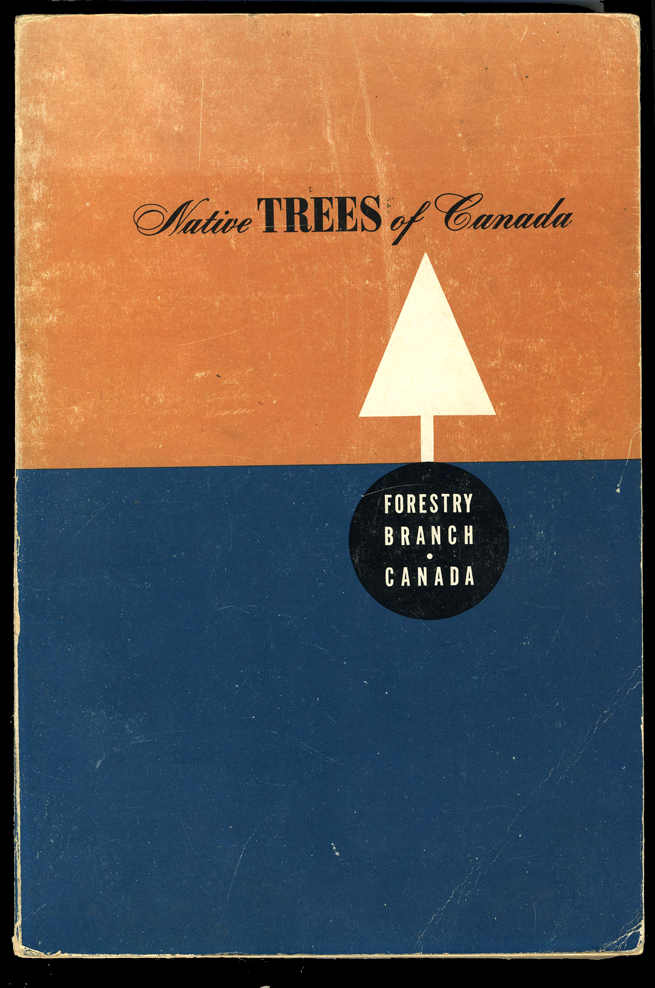
The images shown here are example of scripts on vintage book covers, circa 1950s–60s, from my personal collection. These are simple typographic covers from a past era, but the typographic treatments still demonstrate typographic approaches to be admired. Note how the narrow body of the scripts balance the chunkier Didone and slab serif capital letters. The scripts offer a horizontal or diagonal movement—as if the letters are leaning on their neighbors—that leads the eye to the right and therefore prevents the covers from appearing too blocky or static. The result is a balance of texture, direction, weight, and form, and the scripts are an integral part of this.
Bickham Script can give words a lively voice, with a bit of a flourish or lilt for added emphasis. Who says scripts have to be stodgy and staid? Bickham Script proves that there is still life left in these flowing and fluid forms.

From the collection of Dr. Shelley Gruendler.
From the collection of Dr. Shelley Gruendler.