Sites We Like: Typekit Edition
This week, we’re taking a break from our regular exploration of great uses of Typekit out on the web and turning our eyes closer to home. You may have missed it in last week’s excitement, but we’ve replaced the Typekit homepage with something completely new.
The original homepage first appeared way back when we made Typekit available to the public in November of 2009. Since then, web fonts have gone from fringe to mainstream, new trends and techniques in web design have surfaced, and now, with the launch of desktop font sync, Typekit is expanding from web fonts to fonts for all parts of the creative process. The old page had served us well, but the time had come to update the way that we introduce ourselves to the world.
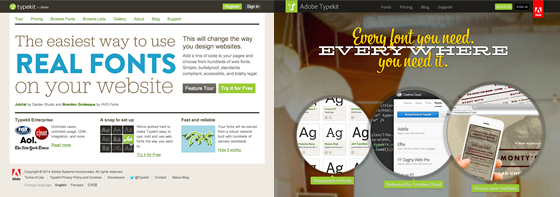
Original Typekit homepage on the left and our updated Typekit homepage on the right.
Working with the talented people at Weightshift, we designed and built a new homepage to better communicate Typekit’s expanding role. We also took the opportunity to incorporate best practices and new ideas in web design that have evolved since the original homepage was designed. Here are just a few of the things we like about our new homepage:
Bigger, tangible type
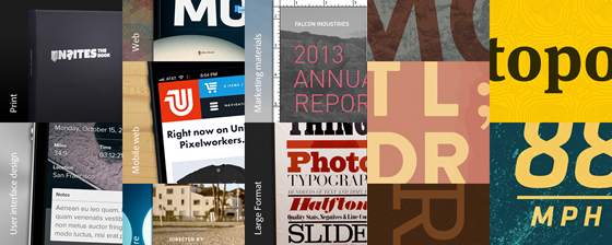
The original Typekit homepage featured a single example of web fonts on a white background. With the arrival of desktop fonts, we have an opportunity to present great type in use for all kinds of design, from the web to print to motion graphics and beyond.
To help communicate the ubiquity of type, we’ve incorporated a greater variety of examples from all sorts of mediums. We’ve also introduced more texture and depth to the page, which helps the digital type samples feel more tactile and touchable.
One page to rule them all
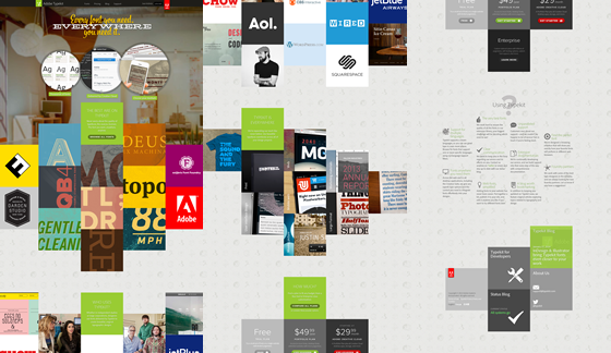
Our original product walkthrough spanned multiple pages, telling a story about the features and benefits of Typekit piece-by-piece. For the new homepage, we decided to take advantage of a long-scrolling product tour pattern to tell a more cohesive story about how Typekit is unifying the use of type across mediums and tools.
Responding to context
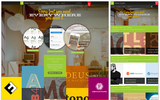
With the explosion of devices and screen-sizes that access the web, we can’t just assume that every visitor is sitting in front of a desktop computer. Responsive web design is a collection of techniques that have evolved to deal with that increasing variability, and the new Typekit homepage is our first attempt at incorporating some of those techniques to explain our product in a format more appropriate to the reader’s context.
Updating our brand
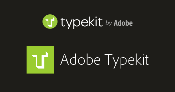
Since our acquisition by Adobe over two years ago, we’ve been finding ways to integrate Typekit with Adobe’s other products in ways that provide benefits to our existing users without too much disruption. It’s safe to say that we wouldn’t have been able to make desktop font syncing so seamless without Adobe’s Creative Cloud platform to build upon. With more new users coming to us via the Creative Cloud, it was time for us to look more like a consistent part of the suite.
To that end, we’ve updated our logo and wordmark to better match Adobe’s other products, and we’re transitioning from our trusty old friend Omnes to Adobe’s custom branding typeface, Adobe Clean. We think this update stays true to Typekit’s heritage while making us more recognizable as a part of the Adobe family of products and services.
With our new homepage, we’ve done our best to fuse the best of what’s new with the best of our history, sometimes quite literally: the repeated background pattern is created from original Typekit logo concept sketches from Jason Santa Maria’s notebook. We’re excited about our new homepage and the direction that it points for our future. We hope it’s a site you like as well.