An Unconventional Engineer: How fine art and computer smarts brought Ernie March to Adobe
Ernest March, affectionately known as Ernie to friends and colleagues alike, does Quality Engineering and so much more for the Adobe Type team. Since he embarked on his typographic career in the 1980s, this self-titled “accidental type guy” has seen major upheavals in our field (and lived to tell the tale). Writer and typographer Tamye Riggs recently had a deliciously geeky chat with Ernie, and we asked her to share some highlights from his colorful past and present.

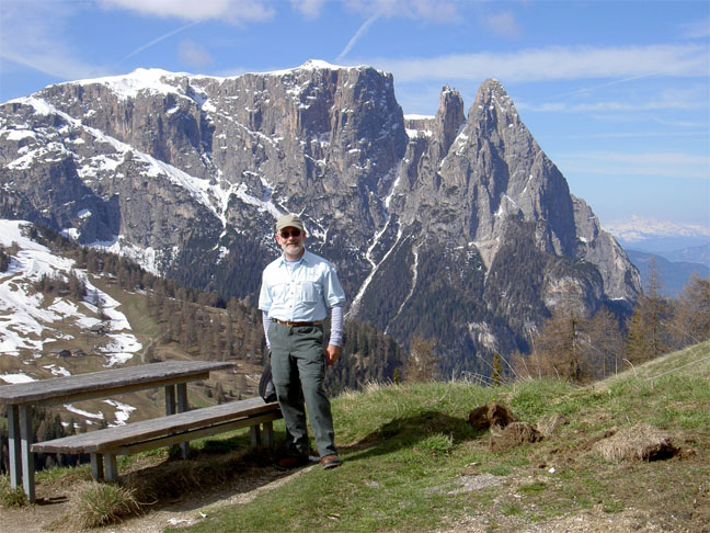
Life is all about making good choices. Ernie March ponders the vast selection of Dijon mustards on display at an open-air market in Beaune, France, capital of the Burgundy wine region. After thoughtful consideration, he chose four delectable varieties to bring home. Selecting the tastiest condiments is nothing compared to the critical decisions Ernie makes daily in his role at Adobe. Photo by Ed Koizumi.
Ernie, you seem to wear a few different hats at Adobe. What’s your official title?
Senior Quality Engineer. I say that with a snicker in my voice because my dad was a mechanical engineer, and when I was going to college, he said, “Don’t be an engineer. It sucks.” So I went off to art school instead—180 degrees in the other direction. But even though I went to art school studying design and illustration, my job title still has engineer in it. They have to pinhole you into something—we tend not to take it too seriously.
Where did you go to college, and what did you study?
I went to Santa Clara University for my history degree. I was taking art classes as electives. I was enjoying it, and, as I got closer to graduation, I thought, what can I do with a history degree? I didn’t see myself teaching, so I thought, I’ll keep going to school. The head of the art department helped with my portfolio and I submitted it to Art Center in Pasadena. My portfolio was pretty piss-poor, but they let me in the door. You can actually train someone to be a decent artist!
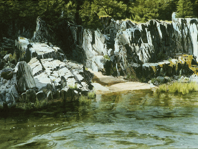
The whole premise of this was to learn how to draw and paint. My professors said to study illustration—you can make money doing illustration, so you can spend some time doing the painting you really want to do. As an illustrator, my weakness was people, which kind of limits things a bit. I was good with rocks and buildings and things. I got decent at it, but on a regular toss-it-off basis, there were guys way better than me at school. Then I discovered stuff with type and computers—I found something that was interesting, and thought, I can do this.
I have to admit when I went to art school, I thought, this will be fun. But I never worked so hard in my entire life! They basically weed out the weak ones in the first two semesters. When I got out of school, I thought, no more homework or weekend projects. This is cool!
How did you get involved in the type business?
At Art Center, I took one lettering class as an elective because I thought it might be interesting. Doyald Young’s class was full, so I took the class from his teacher, Mort Leach. Mort was in his eighties, hands shaking. But when he started lettering, his hands stopped shaking. He would letter a word from the middle out, both hands going in different directions. We were suitably impressed!
Even so, I didn’t think after class, this is so cool, I have to go into this full time. I just thought, if I have to letter something, I can. But my lettering samples were actually how I bagged my first job doing type with computers.
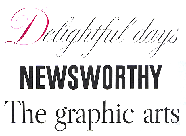
Examples of Ernie’s hand lettering from a class taught by the legendary Mort Leach at Art Center in Pasadena.
I went to work for Autologic [a former maker of proprietary typesetting systems]. They no longer exist, but they were in business for quite a while. They were founded by engineers who created this nifty piece of hardware, and they had to have font software to sell it. The art department got a lot of drawings from ITC that they would scan. Then we would edit and space them and generate accented glyphs depending on what customer wanted the font. We never did anything in a standard way; only on an as-needed basis when orders came in.
The monitor sitting in front of me was a text monitor with green letters on a black screen. I was working from a printed proof, typing up coded instructions. If I was lucky, I’d get results about a week later from the computer room. There was no GUI; there was no instant feedback.
I worked for Autologic twice—once for four years and once for two years. In between, I spent ten years at a small design shop in LA. Robert Slimbach also went through Autologic, as did Sumner Stone and Fred Brady. I was there first, then I left for the design shop. Those three went to Autologic, then they left and went to Adobe. I went back to Autologic for two years before they closed the department. I sent my resume up to Adobe and they said, “Come. You have skills we can use.”
So you were more of a fine art and design kind of guy. How exactly did you end up on the QE side of type?
My running joke is I fell into this job. Honestly, if I tried to interview for my job today, I wouldn’t get past the first phone screen. I got in at the start of things, coming in the back door.
I had learned type between working at Autologic and doing design stuff. When PCs were coming along, I couldn’t interest my old design shop owner in any of that, and Autologic gave up on converting fonts to Type 1. That’s when I sent my resume up here and came for an interview. At first, I contracted doing type production work, but my contract ran out. I kept banging on the door, and eventually a position opened for a release engineer. The last guy I interviewed with was a QE guy, and he said, “We need someone to do Windows type QE—please come and work here.” (Everyone else was a Mac junkie!)
My official twentieth anniversary with Adobe was last month (December 1, 2013). However, I did have a year and a half of contracting before starting on payroll, so this February I will have been at Adobe 22 years. I didn’t see that coming! When I started, the HR person asked what I saw myself doing in five years. At the time, I didn’t plan that far ahead, as I’d already been through two layoffs in a row and I said as much. We joke about it now. Even in our small group of nine people, the average tenure is something like 15 years. What we’re doing is a very niche thing—there are not a lot of people doing type, at least for a big company.
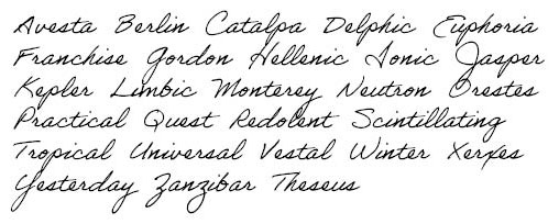
Ernie’s handwriting was chosen to be made into a font for use within Adobe applications. “I was enjoying the hell out of it,” he said, “because I hadn’t been able to do anything like that for awhile. It was a great change of pace from my point of view.”
How have things changed since you first began your life at Adobe?
A lot of the culture is kind of the same—the founders instilled that into a lot of people. The company tends not to hire a lot of jerks. There were 400-500 employees when I started. Now, it’s something over 10,000. But I still, in a lot of ways, feel like I work for a small company. I consider the nine of us [on the type team] a small company working inside another company, because these are the people I deal with on a regular basis.
And how has QE evolved over the past twenty-odd years?
My job isn’t just QE anymore. A lot of release engineering and other weird tasks end up on my desk. OpenType—there’s a whole range of stuff that needs to get tested that wasn’t on the plate before. It used to be: glyphs okay, stems okay, basic hinting, does it work in a few applications, etc. Now, I can spend quite a while just creating feature test documents. If I get something like Bickham or Caflisch Script with tons of contextual substitutions, testing can take longer. The average feature test doc for a Western font is three or four pages long. The one for Bickham Script is 48 pages!
Type in general has gotten orders of magnitude more complex than before. Back in the 1990s, you could design a font and manage the spacing and kerning and you were done. If we were doing 240 glyphs, we were lucky to have 100 kern pairs. Now, you have to have some programming skills to do a decent job with a font. Try doing OpenType for the first time with nothing to go by! Three weeks before InDesign 1 went out the door, I kept shaking my head, saying, “This is never going to work.” But it finally all fell together.
These days, we’ll turn out a Western font with 2-3,000 glyphs—every European language, Greek, Cyrillic, Vietnamese, etc. That’s one of our standard monster character sets. Small or large, it doesn’t really change the amount of work I have to do—I just have more glyphs to look at. It’s much more work on the designer, especially when you come up with something new. There’s a truckload of research you have to do first.
What is your favorite project you’ve worked on?
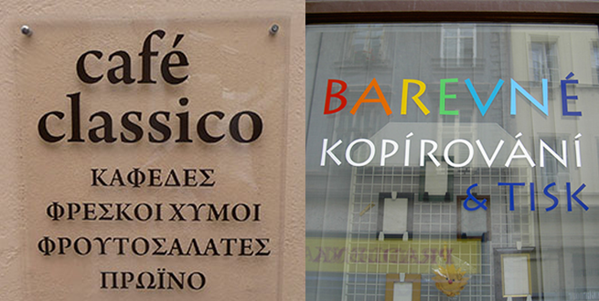
I did enjoy Bickham the first time we did it, just because it was so dazzling. I liked doing Kepler, too, simply because it was so enormous. It’s still the record holder for the hugest family we’ve ever concocted, and adding Greek and Cyrillic are on the wishlist. It’s my go-to face when I do stuff for myself. That and Arno—I like Arno. When I was on vacation in Greece, I was walking down the main street of Fira on Santorini. One of the restaurants had printed up their features really large, like three feet tall, on two panels on each side of the door. One side was in English, one side was in Greek. They used Arno. It’s really cool when I’m out traveling and see one of our fonts, especially when it’s something I wasn’t expecting, in some little out-of-the-way place.
Speaking of vacation… there’s a rumor going around that you’re quite the international jet setter. Any truth to that?
Up until some years after I started working here, I always used to get in the car and drive somewhere when I had time off. Flying someplace didn’t really register in my brain. When my second sabbatical came up, two co-workers were pestering me to go somewhere further than I could drive. They convinced me after six months to go to Italy. I came back really jazzed and I’ve been off to Europe every year since!
When people talk about Italy, they really think of northern Italy. I discovered southern Italy has a different personality. Big difference! Northern Italy is a bit more stylish and business-like. Southern Italy is a bit scruffier and laid back. One notable example is Naples, which is a complete madhouse. When our bus driver went to drop us off when we got there, he threw up his hands and triple-parked in the middle of a traffic circle. Nobody batted an eye—that was the part that was really interesting. Yeah, this is Naples, yeah, so whatever, okay, fine. They just figured out how to flow around him, he’ll move when he’s done in a few minutes, whatever. The ten-minute ride from the hotel to the train station when I left was white-knuckle scary.
Do you struggle with any language barriers on your journeys?
The method my high school French teacher used was that you walk in the door of the classroom, there was no more English, only French. It sticks better that way. I was flabbergasted how much of it stuck in the back of my brain. When I traveled to France, I could carry on simple conversations and get around. When I’m in Spain or Italy, I can function on a printed basis, even if I can’t have meaningful conversations. I was so proud of my first Italy trip—I ordered a whole dinner in Italian and actually got what I was expecting.
Just one more question. If you could look into a crystal ball, what do you think you might see?
People think fonts just come on computers, but there are hard-working people making them. They don’t appear out of thin air! As things get even more complex, I don’t doubt we’re headed to Star Trek: talk to the computer and make it happen.
And I still haven’t been to Sicily.
Take your own trip around the world with Ernie via his website. It’s full of eye-popping photography documenting his European travels, along with funny bits of commentary about people, places, food, fashion, and other lovely things he’s encountered along the way.
Tamye Riggs is a type-obsessed writer/editor and social media junkie who produces killer creative events on the side. Her irregularly scheduled broadcasts can be found at @tamye on Twitter, and are soon-to-be-regularly seen on www.typelife.com.

