A Typographical Curiosity: Frank Grießhammer joins the circus with the release of HWT Tuscan Extended
As part of Adobe’s ongoing mission to help support the Hamilton Wood Type and Printing Museum, several members of our team have been digitizing antique typefaces for the Hamilton Wood Type Foundry (a partnership between the Hamilton and P22 type foundry).
My co-worker Frank Grießhammer threw his hat into the ring, so to speak, unleashing one of those strangely wonderful “circus types” onto the world. In celebration of its release today, I’m happy to share with you a little insight into the making of HWT Tuscan Extended. Although Frank has not yet been able to visit the Hamilton—a “wood type wonderland,” as he imagines it—he feels strongly about the importance of the museum, and its mission to preserve and promote such a rich part of typographic culture.
“Wood type is this genre of type that very much has its own rules, and I think that is great,” Frank said. “I imagine it like this big guy, just doing his own thing, not caring about what anybody else will say (please understand that this is supposed to be a compliment!).”
“Leafing through Rob Roy Kelly’s American Wood Type, I have yet to find one page which is not awesome,” Frank continued. “Often, I will laugh when seeing the specimen of a wood type alphabet—something that does not happen very often with digital fonts.”
In choosing which type to digitize for HWT, Frank decided to work on a less-than-typical design, focusing on the fun and challenging aspects of reviving a little-known antique face. “I wanted to digitize the craziest typeface Rich [Kegler of P22/HWT] had to offer; first, because I wanted to have a bit of fun while working, and also for the sake of drawing something I had not drawn before.”
A wild hybrid fluctuating between a Gothic Tuscan and an Antique Tuscan, HWT Tuscan Extended is an extremely wide face, abundantly decorated with spikes and crossbars. Although this Tuscan is not overly ornate, each letterform is a study in complexity—unique combinations of spikes and bars dress each character’s outrageous curves with cheeky exuberance.
“Creative freedom is much more of a possibility in wood type; I can imagine it is quite a different way of working with large-scale patterns than it is with the file and a metal punch,” Frank said. “The sheer size of wood type letters allows for decorations and solutions impossible in metal type.”
HWT Tuscan Extended is closely based on the 1872 William Page & Co. cut, but also resembles versions from Morgans & Wilcox, Tubbs Manufacturing Co., and Heber Wells. (All four of these competitors were eventually acquired by Hamilton Manufacturing as it became the dominant producer of wood types in the United States.)
Frank worked primarily from photos of specimen books and of the actual wood sorts taken by Rich Kegler and Adobe type team member Miguel Sousa. Luckily, Frank also found some photos on Flickr. “This was a great resource just for checking how some characters actually looked like in print, outside of the specimen books which do not always include the whole alphabet,” he said.
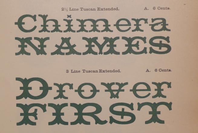
Page from the 1872 type specimen of Wm. H. Page & Co. at the Newberry Library.
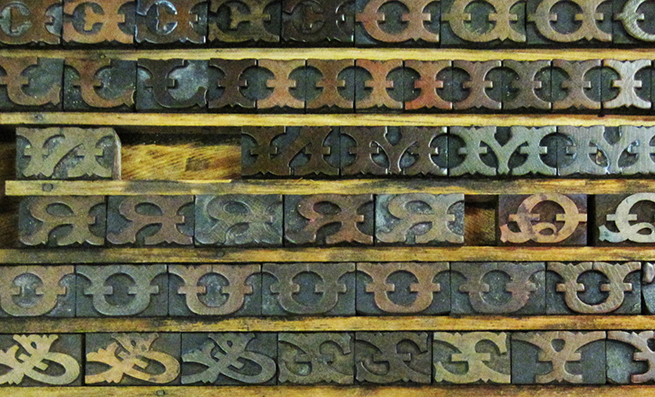
A drawer of Tuscan Extended, photographed by Richard Kegler
Frank’s digitization of Tuscan Extended was a fairly straightforward revival, although he did encounter some minor difficulties along the way: “In some of the photos (especially of the wood sorts), it sometimes was really difficult to see where the actual border of the letter would be. I sometimes just drew a very rough digital outline and then refined it based on information from other glyphs.”
Frank’s first iteration over the alphabet was quite literal. He then refined the outlines and matched the proportions of the letters to better work with one another. “It is still a pretty crazy typeface,” Frank said, “but since I had prints of various very different point sizes as samples, it was necessary to unify the shapes somewhat.”
A technical point of pride for Frank is that HWT Tuscan Extended is his “first 100% UFO-project.” (UFO stands for Unified Font Object—a cross-platform/cross-application format for storing font source data.) “I worked in [Frederik Berlaen’s] Robofont from start to finish. A very pleasant experience.”
Weighing in at just over 300 glyphs, HWT Tuscan Extended contains “enough characters for your next circus poster, and then some,” Frank said. As with most antique types, a number of essential glyphs were naturally absent from the original design. Frank drew several new forms in order to make the font usable, including the “German Sharp s” (ß); the Icelandic Thorn and eth glyphs (Þ,ð), and the Pound Sterling symbol (£). With this slightly fleshed-out character set, the font now supports a large subset of Western languages.
“You just have to arrange travel plans for your circus in a way that it does not stop in countries where the language uses unsupported glyphs,” Frank recommended.

All 316 glyphs in HWT Tuscan Extended
When asked how this wacky Tuscan might be used, Frank suggested, “Everywhere from encyclopedias to phonebooks; on labels for nutritional information; and, of course, also engraved on coins and jewelry. And on stamps.” But, seriously!? “This is a pretty unusable design, but I am confident it will find a place somewhere,” Frank said. “You can see some of the Adobe Wood Type designs in the craziest applications. Maybe in 25 years, that will also happen to Tuscan Extended! It would be funny to see it cut in wood.”
View the PDF specimen.
Frank Grießhammer works in Type Design and Font Production at Adobe. In between drawing type, programming, and admiring photos of glamorous lettering, he’s pondering the possibilities of metal type—he’s heard it’s the “next big thing.”
Additional information
HWT Tuscan Extended at the Hamilton Wood Type Foundry
More of the story behind HWT Tuscan Extended
More info on the Gothic Tuscans and Antique Tuscans from the Rob Roy Kelly American Wood Type Collection
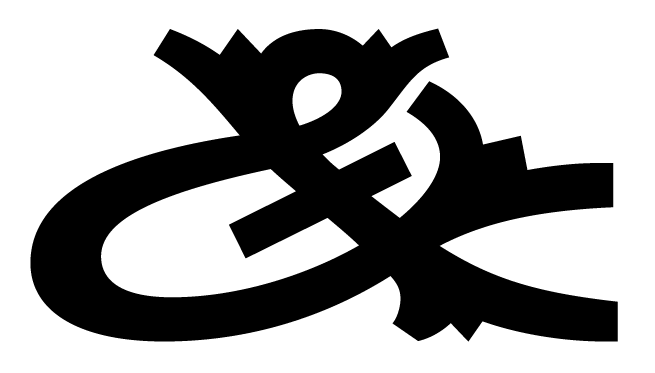
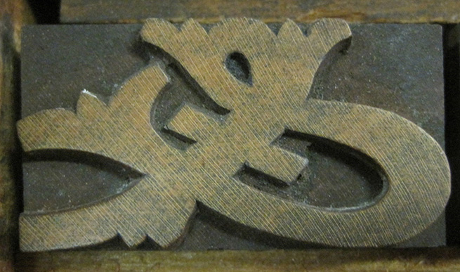
The ampersand from above, digitized.