Typekit’s first CSS Zen Garden theme: Screen Filler
Following our sponsorship of CSS Zen Garden, we’ve commissioned three CSS Zen Garden themes from different designers using fonts from Typekit. The first theme comes from our own creative director, Elliot Jay Stocks.
I’ve named this first theme Screen Filler, and in direct contrast to previous Zen Garden themes and a lot of my own previous work, it’s intentionally devoid of any imagery. Instead, I’ve focused on simple, bold blocks of color, using semi-transparency to reveal some of the underlying proportions of the grid.
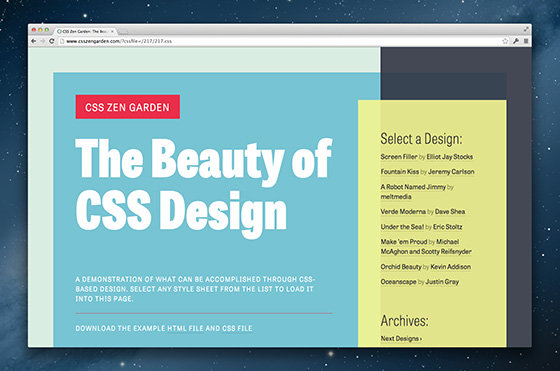
Perhaps most importantly, I’ve tried to design something that keeps the type (a few choice weights and widths of TypeTogether’s wonderful Tablet Gothic) pleasantly readable at any size with a technique I’ve used on a number of recent projects: increasing the size of the type with the width of the browser. This might sound too painfully obvious to state, but I’m surprised by how few responsive sites use this technique. It’s a nice way of avoiding max-width declarations—which, in my opinion, can often stand in the way of future-proofing our sites—and it feels like a more all-encompassing adoption of what responsive web design can offer.
I’m obsessed with achieving optimal measure (line length), and it’s possible with just a few simple media queries. Here’s an example of what you can find in the CSS file:
/* 700 and up */
@media screen and (min-width:700px) {
    body { font-size:90%; }
}

/* 800 and up */
@media screen and (min-width:800px) {
    body { font-size:100%; }
}

/* 900 and up */
@media screen and (min-width:900px) {
    body { font-size:110%; }
}
And so on and so forth. The important thing here is that the break points and size changes are not based on anything mathematical—just when it feels right.
Here are three different widths, captured on a 27″ monitor:
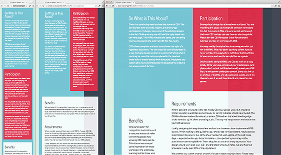
Of course, there are some arguments against this technique: perhaps you don’t want to have massive type when you expand your browser to its maximum width on your 27″ iMac. And that’s okay! The CSS Zen Garden is about showing what’s possible—what we can do with web design; not necessarily what we always must do.
I love that the Garden is a playground. It was hugely influential on me back in 2003 when I started getting into web standards, spending hours of my time pouring over the designs on the site and all of those that were lovingly immortalized in Dave’s book. It’s been a great honor to provide a theme myself, and I can’t wait for you to see the incredible themes our next two designers have been working on!
One Response
Comments are closed.
CSS Zen Garden is such a brilliant name.
I’ll definitely use this scaling idea with the fonts, makes complete sense, in fact I’m about to check my own site now!