On Weights & Styles
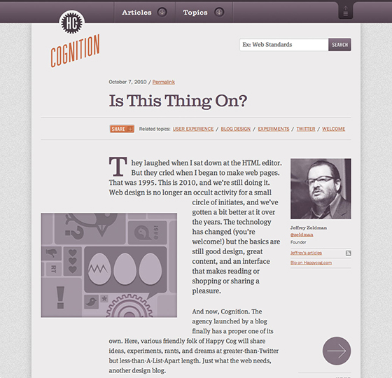
While I was at Happy Cog, we designed and built our own blog called Cognition. It was one of our first projects using web fonts. We knew from the get-go that we were going to use web fonts, and settled on Clarendon for headlines and Franklin Gothic for a sans-serif that we used for navigation, captions, and various ephemera throughout the site.
I had a lot of fun as I started coding the site with type in mind. I’m sure you can relate to the feeling we got the first time we saw all of these beautiful typefaces in the web browser. However, we realized we had made a bit of an oversight.
In our excitement in getting to use web fonts, we had used far too many weights of Franklin Gothic, which was now bogging down the page weight. So I sat down with Chris Cashdollar, the designer for this project, and we made some tough decisions to pare the choices down to a few solid weights.
In retrospect, the final result was even better. The consistency offered by using fewer weights of the typeface, though somewhat forced upon us at the time, made for a more stable, effective design.
Respecting your constraints
What we learned is that it’s easy, way too easy, to get carried away with web fonts. I don’t know about you, but when I come across a really well-made typeface that has loads of weights and styles, all beautifully hinted and looking stellar across all the sizes you need, I can’t help but want to use them all.
But just because you can doesn’t mean you should. This is an important design lesson that applies far beyond typographic choices, but for the purposes of selecting type for a design, Robert Bringhurst summed it up succinctly in The Elements of Typographic Style: “Don’t use a font you don’t need.”
He goes on to say: “The marriage of type and text requires courtesy to the in-laws, but it does not mean that all of them ought to move in, nor that all must come to visit.”
Bringhurst is suggesting a simple, very deliberate approach to choosing typefaces for a design. Let’s work through an example.
Here is a sample of text set in Chaparral. It’s a simple paragraph with a headline. When choosing how to style the headline, my gut reaction is to make it bold and big. Again, Bringhurst suggests exercising a bit of restraint: “Change one parameter at a time.”
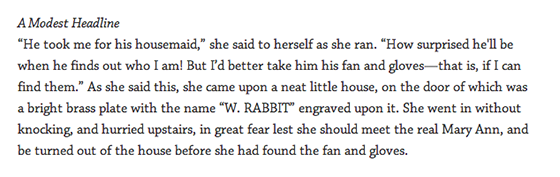
So, perhaps choosing to set it in italic, at text size, is a solid move that allows some flexibility as we move up through the hierarchy. As we start to style the more important headlines (in web design parlance, moving from h6, h5, and so on up to h1), we can proceed to make small adjustments. Let’s keep going:
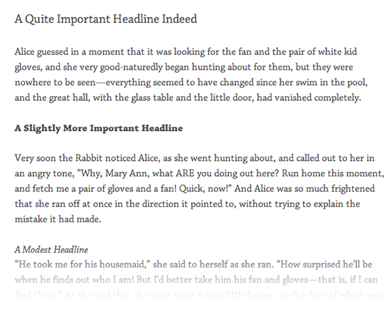
For the “slightly more important” headline, I removed the italic and chose the bold weight. The size is still the original text size.
For the “quite important” headline, I went back to regular text weight, and used a larger type size. In the end I have three rather useful and diverse headlines that were built from regular, italic, and bold text. I intentionally stuck with those three, because since we’re working with our main text typeface, bold and italic are already going be in my webfont kit. Of course you can pack whatever you want in your kit to start, but in my case, the body text has the regular weight, the bold, and the italic.
Mocking up the rest of the set is a simple matter of making more small parameter changes while staying true to the typeface.
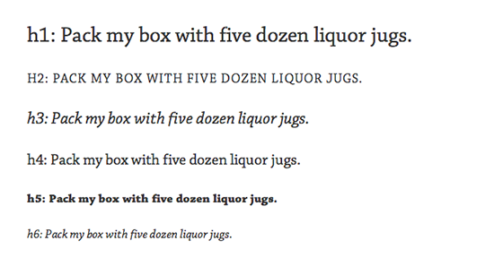
We’ve made it from h6 to h1 making only modest adjustments to the type, all the while sticking with either the regular, italic, or bold versions of Chaparral. I feel like we’ve only barely scratched the surface of what’s possible here. Other modest ways to differentiate might be to use color, or you could even (gasp) employ a line.
Does this mean you avoid using anything other than the main text typeface in your headlines at all cost? Of course not. Maybe a semibold ends up being the best choice for some of the headlines, or, jeepers, why not a sans serif? However, this exercise is enormously helpful in forcing us to carefully consider which typefaces make it into our project and which ones have to wait until next time. Giving extra weight (pun!) to these decisions is important from the perspective of both design and site performance.
When designing a full set of headlines like this, it’s a great idea to start with the smallest headline and work your way up like we did today. While you’re at it, make sure you design how bolds and italics look in a paragraph, as well as lists, blockquotes, and all the common styles that will show up in a page. We call this a “General Styles” page. You can include tables, images, captions, and even form elements. Planning ahead for the styles you might need in the future helps you build a more complete typographic system and avoid any surprises.
Be Good Not Bad
When I was redesigning my own site, Be Good Not Bad, I decided to put this idea of working within constraints to the test. From the headlines down to the body copy, and everywhere in between, I used a single typeface.
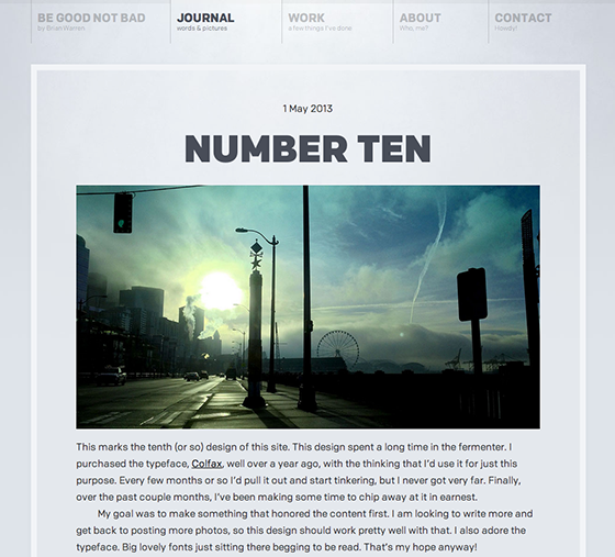
The typeface I picked was Eric Olson’s Colfax a semi-oval sans serif with tons of spunk. The lowercase “a” immediately drew me in and didn’t let go. I knew when I saw it I could use it exclusively for my site.
I used three weights: Regular, Bold, and Black. It worked great for this design, kept my web font load nice and small, and was a fun exercise in restraint.
In the end, I don’t mean to rail too hard against web fonts or even using a few different weights and styles. I absolutely love that web fonts like Franklin ship with a bevy of different options. It’s beautiful, and there’s certainly a time and place for every single one of them.
The route I took with my blog is definitely not a prescription for designing every site. I love to mix it up, and you should too. What I do recommend, however, is to start small and keep it lean from the get-go. That will open up your options for when you flesh out the rest of your design.
5 Responses
Comments are closed.
Great article! Thanks!
Interesting that you are styling from H6 on up. Hadn’t tried that before.
Lovely article. “Keep it lean!”
I have searched for three days for guidance on styling headlines on the web and this article is pay dirt.
Wow, thanks Robert! That comment made my day.
I find getting the font that “feels right” one of the most difficult designing aspects!
I have to say that Colfax font is really nice and versatile.