Aligning Type to a Brand
Maybe you’ve been there before: You open a zip file of logos, flip through samples from a recent ad campaign, or someone hands you a binder of brand guidelines. You gulp, and prepare to design a website whose aesthetic will hold together these disparate pieces.
An industry-leading newspaper can lose credibility if its website is significantly harder to read than its paper copy. A gourmet private chef can have a tough time reaching the right audience or justifying his prices if his site doesn’t feel as “high-end” as his plated dishes. If you can make a brand appear consistent across touchpoints, you’ll boost its reputation on the web and provide a positive opportunity to connect with users. But without a solid foundation, your website and brand can deteriorate as soon as the site launches.
Your goal is to craft a beautiful website that effortlessly extends a brand’s visual vocabulary and serves as a flexible entity over time on the web. To establish this brand recognition and start the visual inquiry for your design, one reliable approach is to choose a typographic palette that supports (and even amplifies) that brand’s personality.
Designing a visual system from scratch
It’s likely you’ll encounter a situation where your client (or your own company) has no design guidelines to share with you. You’ll be building the system upon which future designs will rely. So, where should you start?
Think of type as your building blocks. Type dictates several other key decisions in your design, such as your column widths and layout, and by association your grid composition, media-query breakpoints, and the hierarchy of your messaging. Your type palette is your users’ entry point to your content. It’s the first point of interaction with your brand. Ask yourself candidly: if your website were to address your visitors out loud, what would its voice sound like?
If that voice is chirpy and candid, the voice of your type should be, too. You could explore typefaces like Rooney Sans Web and Soleil, whose upright posture, rounded forms, and open counters will convey your brand’s bounciness.
If that voice is husky and intellectual, look at durable faces like Acuta and JAF Lapture, whose defined edges and texture give the sense that they have a few stories under their belt.
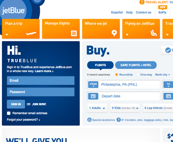
JetBlue applies FF Din on its site’s most important labels, flight information, and pricing to create visual consistency with the brand’s logotype. They save page weight by relying on Arial for microcopy, paragraph text, and form styles.
You may find that using a single (super)family’s weights, widths, and styles—along with introducing color and scale to further hierarchize your content—can be enough to convey your brand’s voice. Working within a restricted palette automatically introduces brand consistency, making every piece of content feel like it’s coming from the same mouthpiece. JetBlue built its recent redesign around FF DIN (served via Typekit), which lends itself to friendly, clear labels that emphasize UI. Meanwhile, McSweeney’s uses Adobe Garamond to evoke the site’s publishing roots while nodding to the innate humor of using a traditional print face with such emphasis on the web.
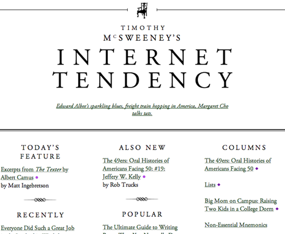
McSweeney’s fills its hierarchical needs with Adobe Garamond Pro‘s regular and italic, letter-spaced uppercase, and a restrained link style. Ornamental dividers section the content and emphasize the site’s bookish feel.
Some typefaces may not have enough flexibility to handle all of your content, or your brand may have multiple voices, each warranting its own treatment—and that’s totally fine, too. In its most simple manifestation, you could find one typeface to serve for your headlines and another for your body copy. But it’s important to exercise restraint. Beware of creating overly complex systems, whose patterns can be difficult for users to decipher and may add unnecessary page weight to your site.
There’s no better way to test your options than with content. Not some lorem ipsum—I mean the actual written words that will find a home on the site. Does your chosen typeface match the attitude of the material?
One way to evaluate this is to hierarchically map out all of your content needs, from h1 down to captions, and assign typographic styles to each. Then, ask yourself: independent of layout, does the rhythm of the palette feel right for the brand? When you’re building your type system, consistency in the tone of your voice across the palette will set a stable ground for your content.
Sealing the cracks: Working with existing guidelines
If you are given any guidelines to shepherd your exploration, it’s imperative to recognize that while brands live across medium, the same guidelines simply cannot—particularly if they were originally intended for print. You’ll have a benchmark for comparison (and therefore a leg up on starting from scratch), but there’s no magical mouse maneuver to translate print-oriented guidelines to the screen.
You might realize that you’ll need to tweak the dictated color palette for better contrast and onscreen accessibility, or that brand graphics should be simplified for smaller file size. You may decide that assets like gradients are better built directly in code to serve as a progressive enhancement. It may seem like you’re making cracks in the already-set foundation, but you’ll at least know which cracks need to be filled in order to produce a sturdier end product.
Finding a typeface that evokes the sentiment of your brand and meets your site’s design and technical needs will seal these cracks in your client’s visual guidelines. Whether your brand-dictated typeface has a web font available or a comparable replacement, ask yourself a few questions to help evaluate whether your choice is suitable for the brand on the web.
Does the web version offer the weights and styles you’ll need in order to add hierarchy to your text?
Knowing you have enough variety to play with will keep you from developing a system that feels monotonous, and help you avoid sticky design situations—like realizing the italic isn’t a true italic halfway through your page designs.
Is the web version adequately hinted for use at a range of sizes?
The fine details and delicate curves of your print-dictated typeface may be difficult to replicate in pixels, leaving the reader with an uncomfortable onscreen reading experience. If there’s too much contrast between thick and thin strokes, your typeface may deteriorate at smaller settings—restricting its use to headlines. The opposite can also be true; your typeface may read effortlessly at 16px but appear crude and cumbersome at 42px.
Finding a web family that distinguishes display from text and/or caption (like Typekit’s Chaparral Pro, Freight, and PT Sans) can help ensure you have access to the right font for your scale. But, finding families with higher x-heights and more open letterforms will make letters more identifiable at all sizes, save page weight, and also make fine-tuning styling across your scale easier.
Does the typeface render well and similarly across browsers and devices?
Since your type will be the vehicle for constructing a consistent brand, you’ll want to make sure that the typefaces are themselves consistent across viewing environments. Cross-browser testing tools and Typekit’s browser samples will give you a realistic picture of how the type renders—a competitive advantage against working solely in Photoshop. Also, setting fallback fonts that align with your choices can reinforce your brand’s voice as you account for older browsers, or aim to deliver thinner pages at certain screen sizes.
At the root of it
Just as you conduct research at the beginning of each web project, visual design merits a thorough examination of your site’s brand. Guidelines merely serve as a place to start. You’ll explore a world of aesthetics and interactions for your users that goes far beyond deciding between a bifold and trifold brochure. Your exploration boils down to creating a typographic palette that successfully evokes your brand’s personality and simultaneously serves the needs of your content.
When you develop a new visual system—one specifically for the web—that is as well-considered as every other aspect of the brand’s existence, it will stand the test of time. You’ll be giving your clients the freedom to continually evolve their content while still appearing like themselves. Your system will work no matter the browser, the device, or the screen size. As everything else evolves, as new devices come to market and as clients change marketing messages, your design decisions are what will hold the brand together.
2 Responses
Comments are closed.
Really great article.
I find it difficult sometimes, to create impressive infographics while still keeping to the brands voice/typeface style, and end up using more images than text in some cases!
アイホーンカバー