Sites we like: Harper’s Magazine and Food Studio
Good reads and good food in this week’s sites we like.

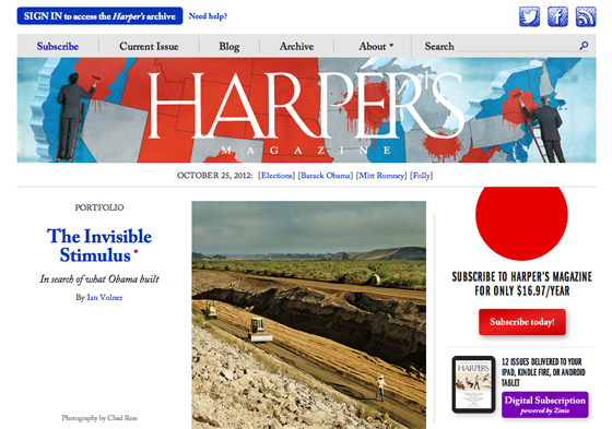
Harper’s Magazine, the oldest general interest monthly in America, relaunches with a classic combination of Franklin Gothic URW and Adobe Caslon; the latter can feel a bit anachronistic on screen, but here manages to convey Harper’s history without resorting to nostalgia.

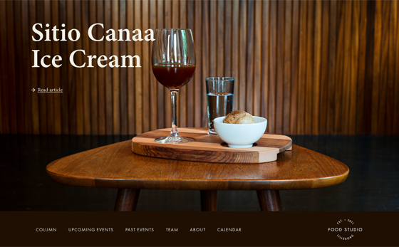
Food Studio pairs the prim and proper Minion with the hip Futura PT, for a look that’s elegant but casual. Minion’s sturdy and reliable at text sizes, but relaxes a bit when used in headlines.
That’s all for this week! Share sites that you like in the comments!
2 Responses
Comments are closed.
I just redid my portfolio site at http://adam.gillitt.com using Jubilat and Nimbus Sans Condensed, from the TypeKit library.
I responsively re-built http://skinnyties.com which uses FF Enzo from TypeKit throughout. Lots of type-level tweaks for readability optimization across devices if you like to explore those sort of details.