JAF Bernini Sans from Just Another Foundry

From Just Another Foundry comes JAF Bernini Sans, a brand new type family that has already garnered rave reviews. We’re pleased to announce that all fifty styles are now available in the Typekit library: five weights ranging from Light to Extra Bold; four widths including Narrow, Condensed, and Compressed; plus two versions of every variation (hard-lined Bernino and the softer Bernina).


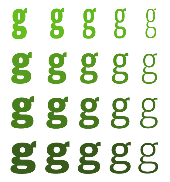
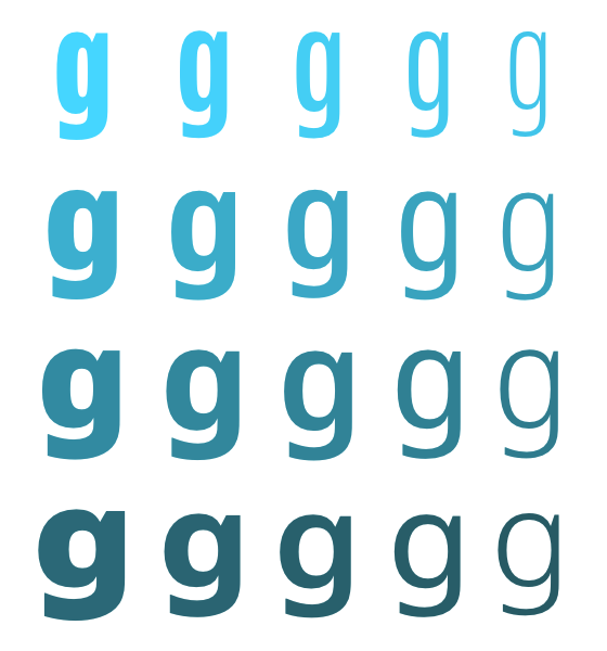
Top to bottom: Bernina Compressed, Condensed, Narrow, Normal; left to right: Light, Regular, Semibold, Bold Extra Bold. Hover for Bernino.
Bernini Sans’ versatility stems from its many weights, widths, and alternate characters, as well as its unpretentious and straightforward design. Most of the shapes and spaces in these fonts do their jobs quietly and efficiently; and in cases where a different style of character is called for, a little hop from Bernino to Bernina (or vice versa) makes a big difference.

Left to right: Bernino Sans Condensed with Bernino, Bernina Sans Compressed with Adelle, and JAF Peacock with Bernina. See the full examples on our demo page.
Used for both text and headings, Bernini Sans feels efficient and precise, but also comfortable; paired with Adelle, it produces a squared, rhythmic energy. And, it can give a more expressive titling face like JAF Peacock a sturdy foundation. Bernini Sans makes pairing typefaces easy.

Left to right: 12, 11, and 10 pixel Bernino Regular on Windows (GDI/ClearType)
The normal width styles of Bernino and Bernina render exceptionally well across browsers and operating systems, thanks to extensive manual TrueType hinting by designer Tim Ahrens. In his words:
One nice thing about Bernini is that you can use it for body text but also for headlines. It is definitely a font you have to work with — and one you can work with — as opposed to “dipping” your website in it. A bit in the vein of what Jason [Santa Maria] says: “Don’t use readymades.”
Upgrade to a Personal plan or higher to use JAF Bernini Sans. If you’re already a paying Typekit customer, enjoy the new fonts! If you’ve never given Typekit a try, sign up (it’s free!) and upgrade to a paid plan whenever you’re ready.