TYPO San Francisco
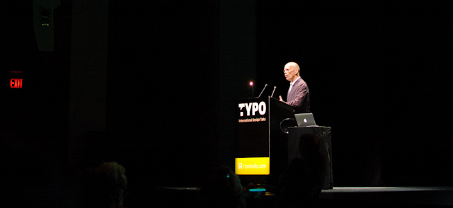
Last week, the Yerba Buena Center of the Arts was the venue for TYPO San Francisco. TYPO is a series of conferences organized by FontShop, and is well known for its annual installment in Berlin, where designers from all over the world have the chance to talk to a large, interested audience. This concept has recently been exported to London; San Francisco was the first TYPO to be held outside Europe. Obviously, this venture was a success, as initial attendance expectations were exceeded – the event attracted designers from all over the country.
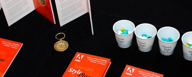
As TYPO SF was a local event for us, most of the Adobe Type Team were able to attend. Being a co-sponsor of the conference, we were representing our work at a shared Typekit/Adobe Type stand, where attendees could fill their conference bags with some rare collectibles like hard-to-find, vintage type specimen booklets, or a valuable Adobe Originals key chain. Apart from that, we were happy to get into conversations with many customers, students and educators.
Despite its name, the TYPO conference is not only about type, but touches many subjects revolving around the world of type and design. It was possible to hear presentations about graphic design, interface architecture or about art projects. The mix of speakers was impressive, all of the talks were inspiring and informative – most of them also entertaining. Some of the more type-centric take-aways were: large webfont projects are important, and not always easy (Kutlu Çanlıoğlu); current webfonts often appear too ‘thin’ (Oliver Reichenstein); and FUSE fonts are ready for a comeback (Neville Brody). Another talk about webfonts was presented by Typekit’s Sean McBride, which I unfortunately could not attend because of limited seating capacity.
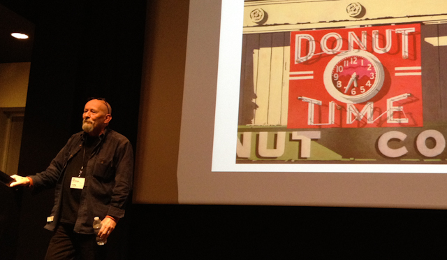
A particularly enjoyable talk was given by Oakland native Jim Parkinson, who was presenting a delightful showcase of his personal type and lettering career, finishing up with an insight into his artistic work; he creates oil paintings, which in return heavily incorporate lettering.
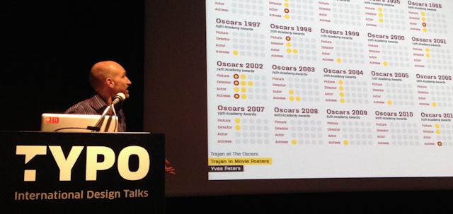
Another interesting presentation by Yves Peters was entitled “Trajan in Movie Posters”: Exploring why Trajan is the de-facto cinema poster typeface, Yves made a scientific analysis of when and where Trajan is used on movie posters, and which genre that particular movie belongs to. He also found that a direct connection between the use of Trajan and winning an Academy Award does not exist. Yves noted that any new addition to the typeface had increased the use of Trajan significantly. We will see how the new releases of Trajan Pro 3 and Trajan Sans will influence the Hollywood poster designer community.
Of course, the whole conference could not have happened without the organizational experience and talent of the FontShop crowd – for being a premiere, TYPO SF was absolutely flawless. A great help certainly were the facilitators, for instance Erik Spiekermann, who charmingly introduced many of the speakers. For myself, it was nice seeing a some well-known faces from Germany, and to have a chat with a lot of people I had not seen in a while.
The after-party at Public Works was also sponsored by Adobe, and received very positive remarks. Apart from the free drinks (Myriad/Utopia/Brioso; with Brioso being strongest), a taco truck in front of the venue was highly appreciated. We are hoping for a comeback of TYPO SF in 2013!
One Response
Comments are closed.
Big props to Adobe for hosting such a great party – esp. the taco truck. Already craving more… And of course it was a pleasure to catch up with everyone. See you at Typecon this summer.