India type tour 2012

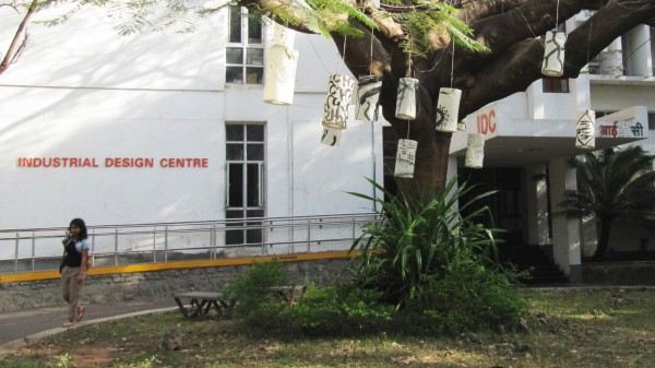
Industrial Design Centre at the Indian Institute of Technology Bombay
Hot on the heels of Todd Macfie’s report on Type Camp India, which I was privileged to attend in December 2009, I decided to publish my experiences from my most recent trip to India. It has been just over two years since I traveled to Chennai for my first visit to India. As part of the Type Camp group, I was there very much in the capacity of learner to study the Tamil script and to document its forms with my own amateur photography.
However, my return trip was to focus on imparting some of the knowledge that I have attained in the intervening years since my initial visit. In particular, I was honored to be able to present at Typography Day 2012. It was an inspiring event to see the state of the art in India in terms of typography, publication design and typeface design. I was somewhat surprised at how much type design was showcased at this conference, which I fully expected to be more focused specifically on typography. It was encouraging to me to see many students active in learning the essentials of type design.

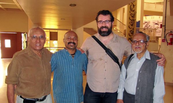
At the Symbiosis Institute of Design in Pune (pictured: Mahendra Patel, Manoj G, Paul D. Hunt, and Mukund Gokhale)
In fact, the main purpose of my visit was to present a series of workshops on typeface development to support those who were interested in adding to their knowledge in this field. In many cases I was joined by participants with a wide range of experience, from students in visual communications and creative professionals to local luminaries of typeface design. My time at each location was very brief – just one day for instruction at each location. As such, I’m afraid that I tried to present too much information: from the basics of the difference between typeface and font, character and glyph to the compiling of a small font project using the Adobe Font Development Kit for OpenType. However, I was impressed by the savvy of the workshop participants who were generally capable of keeping up with the quick pace at which I covered the information.

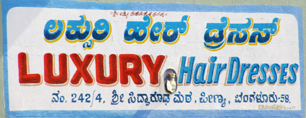
Signage in Latin and Kannada script
I kept a very tight schedule while in India, visiting five different cities and presenting six workshops in just over two weeks. Whenever I had a chance, I tried to get out and experience one of the aspects of India that fascinates me most: its plurality of writing systems combined with a rich culture of making things by hand. Beautiful lettering exists everywhere in India, from painted shop fronts to lavishly decorated vehicles. There is so much of it, in fact, that it drove me a little crazy to see so much beautiful work as I whizzed by it without opportunity to stop and capture it. The letter treatments in these cases and are always innovative and intriguing. Because much of this will no doubt be replaced by signage created with fonts over the next few decades, I have created a group on flickr to try to collect as much of this as possible for reference. I hope some of you can appreciate this artform as I do. If you happen to use this photo service and have images that fit in this category, I invite you to submit them to the group.
I am deeply grateful for the hosting institutions that provided space for us to hold this workshop series, refreshments for the attendees, and hospitality for my personal welfare. These include the Industrial Design Centre at the Indian Institute of Technology Bombay, the Symbiosis Institute of Design in Pune, and National Institute of Design at both their Bengaluru and Ahmedabad campuses. I would like to publicly thank them for their warm generosity and for a delightful experience for all involved.
One Response
Comments are closed.
Hi Paul,
Thanx for the brief report of a Typoday 2012, couldn’t attend this one and i was really curious about your workshop, i hope my friends & teachers has got lot info about Adobe FDK from this workshop.