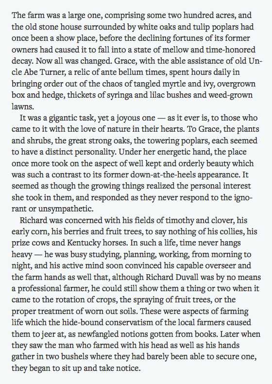
Freight Text from Phil’s Fonts

We’re thrilled to welcome another of Joshua Darden’s typefaces to Typekit: Freight Text Pro. Although it was designed for printed text, its calligraphic forms and tailored outlines translate beautifully to the web. It’s a smart, efficient serif for both short- and long-form reading.

Freight Text Book (source text)
Freight Text is available in six weights, each with a matching italic. Its four basic styles have been manually TrueType hinted to render well at text sizes, and the remaining eight styles are served with PostScript-based outlines for smooth rendering at larger sizes.

Freight Text Semibold Italic and Light
Upgrade to a Portfolio plan or higher for access to Freight Text Pro. If you’re already a Portfolio plan customer, enjoy the new fonts! If you’ve never given Typekit a try, sign up — it’s free! Upgrading is easy, whenever you’re ready.
2 Responses
Comments are closed.
I am a big fan and user of Freight and it’s great to see it hit the web, but I’m disappointed that Freight Text’s extra tight spacing wasn’t adjusted for the screen. This one drawback of an otherwise great text face is easily remedied in the desktop version with a bit of tracking, but that’s not practical on the web.
Anyway, beautiful font.