Sites we like: Michael James Milton, York Associates, DePauw University
Some lesser seen fonts and a classic pairing in this week’s sites we like.

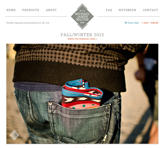
Michael James Milton produces pocket squares handcrafted in San Francisco. The humanist sans serif, Open Sans, makes for warm body text, while the slab serif, Kulturista, provides a muscular counterpoint. (Oh, and the pocket squares are lovely, too.)

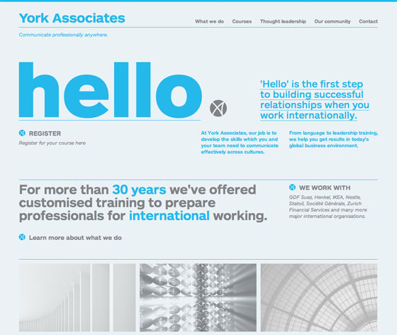
York Associates help their customers communicate professionally anywhere on the globe. ARS Maquette (available from ARS Type and transferrable to your Typekit account) is equally successful as very large headline text and small print. Paired with a monochromatic color palette, the effect is confident and impartial.

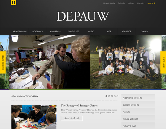
DePauw University opts for a classy look, with Adobe Caslon and Futura PT. Carol Twombly’s Caslon revival is traditional but not stuffy; in its company, the light weight of Futura PT is both elegant and academic.
That’s all for this week; we’ll be back with more sites we like next week.
3 Responses
Comments are closed.
DEPAU W
Wow, I love the York Associates site. It’s not often that a site really jumps out at me like that but it completely captivated me right from seeing the thumbnail image. I guess it just goes to show that good typography and text can be just as powerful as imagery.
Thanks for featuring the DePauw site. We were excited they chose to go with such a modern and classy design – setting a bold presence for the school. They were a great client and we are happy the work we did for them is getting recognized in the design community!