More fonts from Adobe Type

Today we’re happy to welcome four new Adobe web fonts to the Typekit library: Madrone, Stencil, Letter Gothic, and Kepler Caption. Plus, we’ve added more styles of Minion Caption (Medium, Medium Italic, Bold, and Bold Italic) and Kepler (Light Italic, Medium Italic, Semibold Italic, and Black Italic). Above, Kepler Std Light Italic.
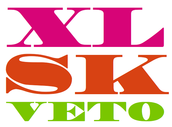
Madrone’s bulky letterforms make for meaty, boisterous headlines. It’s a great candidate for playing with CSS mask-image. And while it only comes in one style, what a style it is! As you’d expect, we serve this display font with PostScript-based outlines for smooth rendering on Windows.
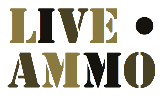
Another single-style display font served with outlines appropriate for big sizes, Stencil needs little explanation. This classic style evokes thoughts of cargo, military surplus, and caution tape.

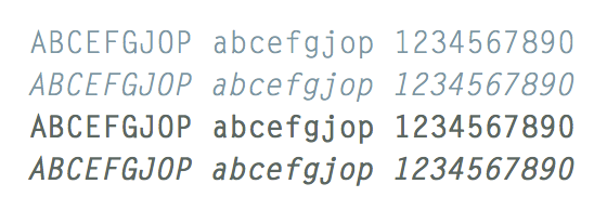
Letter Gothic Std Regular, Italic, Bold, and Bold Italic
Letter Gothic is a monospaced sans-serif typeface designed for typewriter use. Great for tabular information, and manually TrueType hinted by the Adobe Type team for excellent rendering at small sizes across browsers and operating systems.

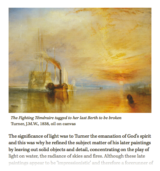
Kepler Std Caption Regular, with Kepler Std Regular
Caption versions of Kepler and Minion are stockier versions of the standard faces, built for optical balance at a specific size range (small text), including having been manually TrueType hinted. Above, 14px Kepler Caption Regular gives the image caption text a purposeful air, rather than simply looking like a scaled-down instance of normal Kepler.
Upgrade to a Personal plan or higher for access to Madrone, Stencil, and Letter Gothic. Upgrade to a Portfolio plan for Kepler Caption and the new styles of Kepler and Minion Caption. Or, if you’re already a Portfolio plan customer, enjoy all the new fonts!
If you’ve never given Typekit a try, sign up — it’s free, and upgrading is a snap.
2 Responses
Comments are closed.


Why not use typekit instead of displaying images? I know browsers render differently, but it would be a nice way to demo the functionality.
Since our blog has many posts like these, and all of our recent blog posts load on the main page, we’d need to load dozens (if not more) different fonts to display font samples that way. That’s too many fonts to realistically render on a page without causing performance issues. We may in the future move to a design that lets each post live on its own page, in which case, demoing the fonts would work. As of now, images make the most sense.