Abril from TypeTogether

Usable didone web fonts are hard to find. Their high contrast means that the thin parts of letters often degrade or disappear entirely. But TypeTogether’s Abril is different. Available in three styles — Display, Fatface, and Text — its rugged shapes stand up to the screen, and its rendering has been strategically reinforced with both manual TrueType hinting and PostScript-based outlines.

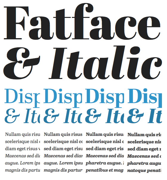
Top to bottom: Abril Fatface & Italic, Abril Display (8 styles) in blue, Abril Text (8 styles).
All eight styles of Abril Display, as well as the formidable Abril Fatface — styles of type meant for use at large sizes — are served optimized for such use, with PostScript-based outlines for smooth rendering even on Windows. On top of that, TypeTogether has TrueType hinted Abril Text’s basic four text styles (Regular, Italic, Bold, and Bold Italic) for crisp rendering at small sizes. Please give them a shout to let them know it’s appreciated.

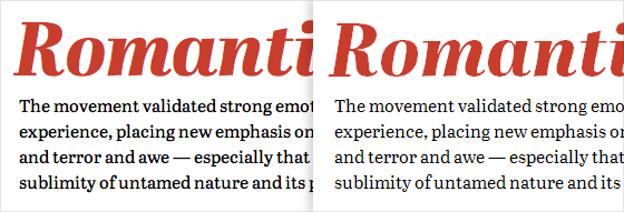
Abril Display Extra Bold Italic with Abril Text. Left, on Mac OS X. Right, on Win 7 (GDI ClearType).
Abril Fatface is available on our Free plan. Upgrade to a Personal Plan or higher to use Abril Text and Abril Display. If you’re already a paying Typekit customer, enjoy the new fonts! If you’ve never given Typekit a try, sign up (it’s free) and upgrade to a paid plan whenever you’re ready.
One Response
Comments are closed.
I’m loving the work that Type Together are producing at the moment. It’ll be great to have a didone that’s actually usable! Cheers Typekit.