New fonts, more styles from Adobe

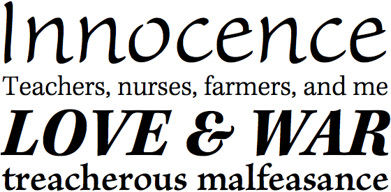
Top to bottom: Sanvito Pro Light, Kepler Std Light and Bold Italic, and Brioso Pro Semibold
Happy Monday! Three more Adobe typefaces have been added to Typekit’s library: Kepler Std, Brioso Pro, and Sanvito Pro, each designed by Robert Slimbach and manually TrueType hinted to look great on screen by the fine folks on Adobe’s type team. Let’s give them a hand for this excellent work.

Kepler Regular at 18px and 16px. Left, on Mac OS X. Right, on Windows 7 (GDI ClearType).
Kepler, in particular, excels where few web fonts yet have. It’s a high-contrast serif, hearkening back to the days of John Baskerville, but with a touch of humanist influence. Kepler is a wonderful face for body text; its tone is similar to Georgia, but with a warmer, rolling rhythm, and its spacing not quite as loose. Plus, the weights and styles of Kepler available on Typekit are part of a fuller family of condensed, extended, and optically-sized variations that Adobe could someday make available for web use.
Finally, three more styles (Light Italic, Bold Italic, and Black Italic) have been added to Myriad Pro Semi Condensed. Browse all of Adobe’s typefaces on Typekit by visiting their foundry page.
4 Responses
Comments are closed.
Kepler is a great font family, but I look forward to seeing the Slimbach family.
Kepler does look like a great choice for a body text. It looks formal enough yet it still carries a significant amount of style.
Any chance the Caecilia family might someday make its way into the TypeKit library?
Bob, PMN Caecilia is available for web use at Fonts.com. We’d like to offer this and other Monotype/Linotype faces via Typekit in the future, but I can’t say when that might happen.