Sites we like: Voltage
The Voltage runway rock show combines Twin Cities fashion designers’ spring collections with a lineup of local bands. The design conveys the event with a series of delightful band posters that show just how far along we’ve come since the dawn of web fonts. Even just a few years ago, layouts like this were impossible with just text and stylesheets; now, with Typekit, and the advent of new properties in CSS3, semantic markup can be transformed into sublime layouts such as this one.
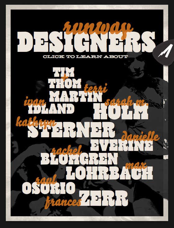
Above, a list of the designers participating in Voltage pairs Bello’s playful curves with Cowboyslang’s retro kitsch. A wee bit of transparency applied to Bello makes for a beautiful overlapping style.
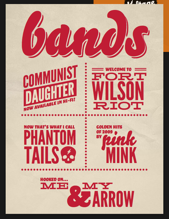
The next poster uses a single color, but an array of typefaces, to distinguish each of the bands. Hellenic Wide and League Gothic make a fabulous couple for Fort Wilson Riot; Bello Caps sidles up with some cheeky commentary.
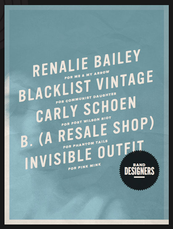
The band designers are displayed in Vinyl, using a CSS transform to set the text on an angle. Vinyl’s soft edges are quite fetching when paired with the lightly textured background.
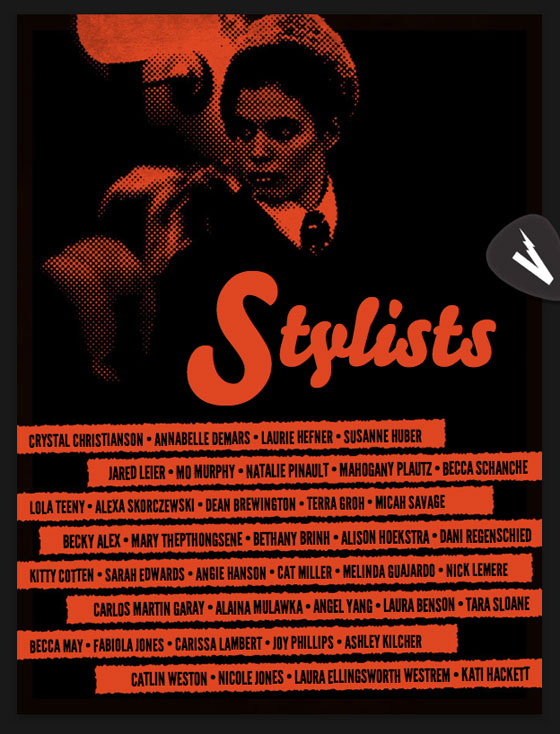
Bello returns large for the list of stylists, while League Gothic goes all caps and small. A tiny (0.8 degrees) rotate transform adds a subtle shift to League Gothic, with an unexpected bonus: the transform results in an uneven baseline, lending a handmade flair to accompany the torn-paper edges.
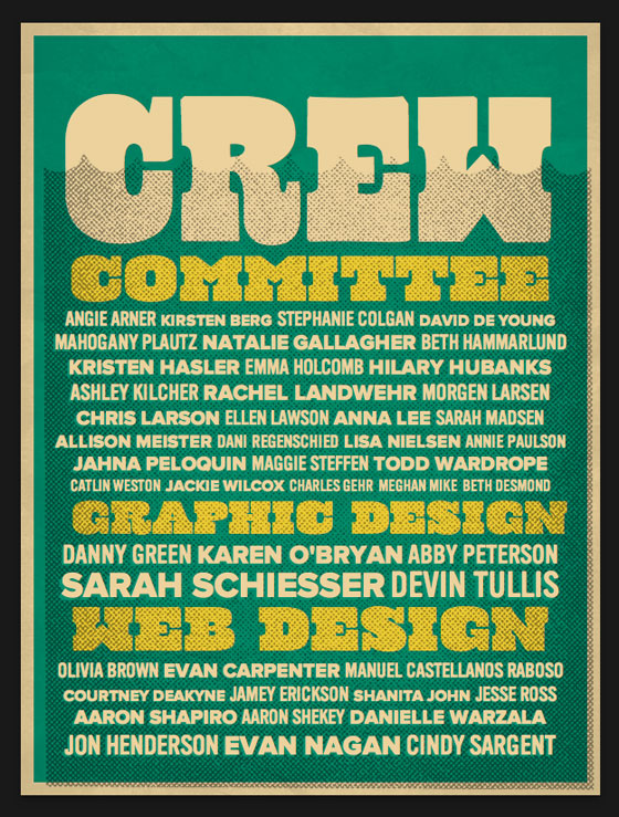
The crew gets a send up with a mix of Cowboyslang, Proxima Nova, and Vinyl. Small text shadows allow the fonts to stand out against the grainy background.
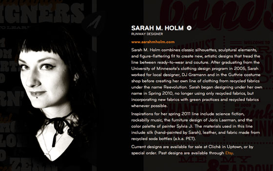
And lest you think this is all fun and games, minimal overlays provide more information about each of the contributors. Bryant (available from Process Type Foundry) makes for warm, readable text, while the barely-there transparency allows just a hint of the posters to shine through.
All in all, a fantastic experiment with type on the web. Please join us in a round of applause for the designers at Sevnthsin for the hefty dose of inspiration.
2 Responses
Comments are closed.
Lovely!
This really demonstrates what’s possible with a comprehensive and tastefully orchestrated palette of web native typefaces. Truly, a typographic tour de force.