Sites we like: Fish Slaps a Baby
Fish Slaps a Baby is a blog written by the students of 826NYC — a nonprofit dedicated to supporting young students with their writing. Designers enrolled in SVA’s MFA in Interaction Design program worked closely with the 826NYC students (all of whom are between the ages of 5 and 12) to craft a site that would suit their needs for expression. The result is a suite of themes which can be used on each blog post, accompanied by a delightful logo system.

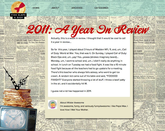
The Pancake TV theme uses Corner Store for headings and Proxima Nova for text. Plus, a stack of pancakes on a TV, of course.

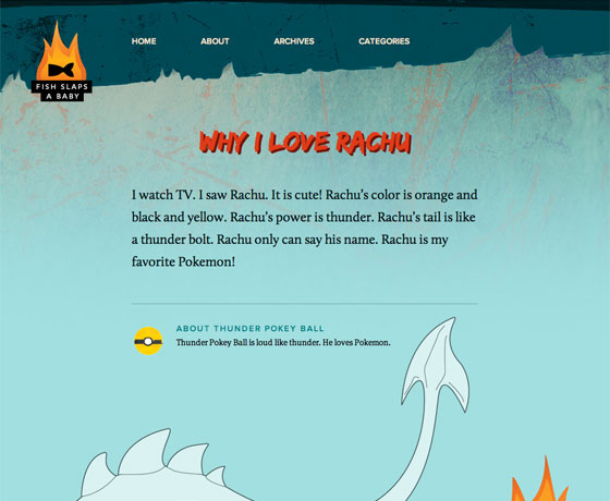
The Fire Dragon theme pairs a subtly textured background with Edo’s brush strokes. Calluna serves well as body text.

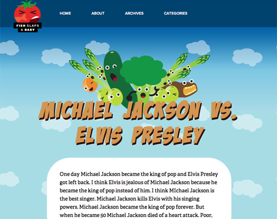
The Green Team theme marshals its vegetables with Badaboom and Adelle. A text shadow helps lift the headline off the background.
In addition, Frank Chimero‘s lyrical logo system adapts to each theme in playful, lovely ways.

All of which work together to make a wonderful home for the students’ writing, creating variety within a cohesive visual system. We’re glad to see the authors approve.
4 Responses
Comments are closed.
We’ve been using Typekit heavily on some of our new special event pages and its been working out great.
An “Art and Design of TRON: Legacy” event with a bunch of concept artists from the film:
http://www.gnomonschool.com/events/2011/tron/
And a visual effects online training event:
http://www.gnomonschool.com/master/2011/
Both pages have benefited a lot from the Typekit integration, largely just saving us a ton of work and letting us focus on other aspects. Super useful for a small team with limited resources.
Nicely done!
Whoa, those are created and designed by tweens/teens?! I should be used to it now, but I’m always continually amazed by how talented the younger folks are in the realm of multimedia and technology.
It was designed by graduate students, with young children (ages 5-12) as the “clients.”