Featured site: The new Readability
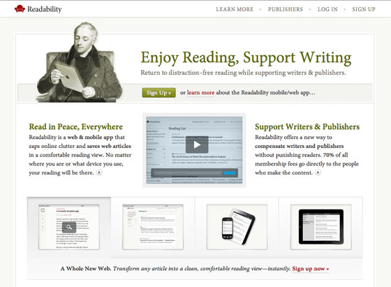
The new Readability has launched, and brings with it a slew of fabulous new features. We’ve written about Readability before, and we’re very happy to see the new version released. Now, in addition to creating a calm, decluttered space for reading, Readability offers tools for saving and sharing your reading list. Plus, a mobile-optimized site makes your content available on the go, as will a forthcoming iPhone app.

The new Readability.com, using Minion via Typekit.
The new website sports Adobe Minion for a classy look. Subtle shifts in color, placement, and type size create a clear hierarchy, while the subdued color palette suggests a calm, quiet reading room.

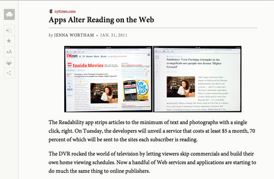
The newspaper theme, one of two themes using Typekit fonts.
Minion appears again in the aptly titled “newspaper” reading theme; another reading theme features Athelas by TypeTogether. All of the themes offer tools to customize the font size and line length to your liking.
Perhaps most exciting is Readability’s new subscription model: users pay $5 a month (or more if they like), and 70% of that revenue is shared with the publishers of the content they read. That makes Readability not only a tool for a better reading experience, but also an exciting new way to support writers. Try it now!