Microsoft DirectWrite is Coming
You may remember my earlier blog post in which I stated that turning on ClearType makes the fonts look better on Windows, and that is generally true if the text is set at a small size (i.e. 9–16 px). But at the same time, text set at a large size displays jagged edges, whereas it doesn’t if the font smoothing option is set to anti-aliasing (aka grayscale).

Headlines from Typekit's homepage rendered by Google Chrome 7.x on Windows 7 with ClearType turned on. Notice the jagged edges on the curved top and bottom parts of the letters.
So, turning on ClearType gives us the much needed legibility for reading text paragraphs, but will make the large titles look a bit rough around the edges. On the other hand, with ClearType turned off we get nice and smooth headlines, but the copy text suffers. Then, how do we get the best of both worlds? The answer is DirectWrite! (Or Direct2D to be more precise. Direct2D is one of the rendering APIs that can be used with DirectWrite, the others being GDI, GDI+, and Direct3D. Although the rendering improvements are specifically coming from Direct2D, DirectWrite is usually the name that gets referenced because it is the hub that provides access to the libraries that handle various aspects of the text, such as OpenType, extended language support and font rendering.)

The same text as above but this time rendered by Firefox 4 Beta with DirectWrite turned on. Notice that the jagged edges are now smooth.
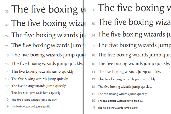
Among other things, DirectWrite enables high quality typography by leveraging OpenType and Unicode, and improves ClearType text rendering by providing y-direction anti-aliasing (which is what smooths out the jagged edges mentioned above). The improvements on large size text are quite noticeable, but the good news doesn’t stop there: some fonts used at small sizes may also render a lot better, even when compared with GDI’s ClearType.

The same font rendered with GDI's ClearType (left) and DirectWrite's symmetric ClearType (right). Compare the sizes 10, 12 and 13 where the improvements are quite significant.
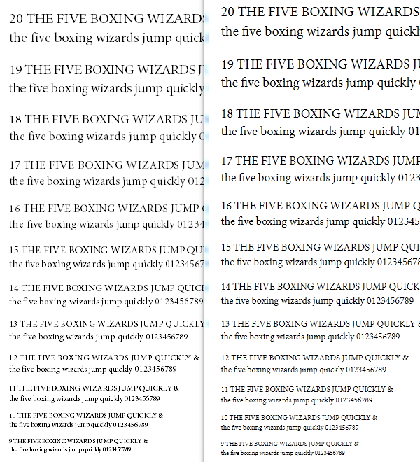
In addition, OpenType/CFF fonts will render remarkably better with DirectWrite than they did with GDI’s ClearType. A side effect of this is that web font services won’t be limited to TrueType fonts, and there are some advantages to that.

OpenType/CFF font rendered with GDI's antialiased grayscale (left) --GDI's ClearType can't render OT/CFF outlines-- and DirectWrite's ClearType (right).
DirectWrite is available on Windows 7 and Windows Vista SP2. Mozilla has been adding DirectWrite support to Firefox (check out Bas Schouten’s post on it) and they’ve just showcased the OpenType support in the upcoming Firefox 4. Likewise, the Internet Explorer team has announced that IE9 will use Direct2D and DirectWrite. I’d say it’s fairly safe to expect that the remaining browser makers will take the same route. Yay for web typography!
Update 25.Jan.2011: Clarified the references to ClearType.
6 Responses
Comments are closed.
What do you think about the future of TT hinting instructions? Will they still be necessary for font rendering on screen at small sizes? Or maybe they will be replaced by T1 hints?
I think that there will still be environments where hinting matters, but with pixel density of screens on the rise, hinting in general is becoming less and less crucial. And the ongoing improvements to the rasterizers helps as well.
For me, TrueType hinting is a double-edged sword: on the one hand you have full control of the pixels, but on the other hand it’s a big burden to the font’s production. I believe that Type 1 hinting has proven to be an approach that produces good results while requiring a lot less work from the font developer.
Thanks for your reply, looking forward to your next post!
Good news. I hope now it will be much easier to produce good-looking font without complex true-type hinting work.
It seems there will be 3 different .bmp (.png?) rendered for each letter in order to get “subpixel placement”.
A side effect of this is that web font services won’t be limited to TrueType fonts, and there are some advantages to that.
Could you be more specific about what those advantages are?
I’m going talk about them in an upcoming post. Stay tuned.