Sites we like: Smithsonian Channel, Glass House Conversations, and The Office of Frank Chimero
Simplicity and contrast mark the sites we like this week.

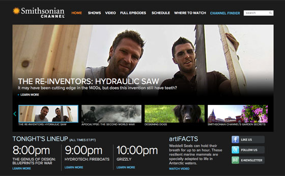
The Smithsonian Channel uses Proxima Nova and a black background for a slick, cinematic look. Proxima Nova works equally well in the tiny navigation links as well as in large, numbered time slots. A good reminder that typographic contrast can come as efficiently from different sizes and color as it can from disparate fonts.

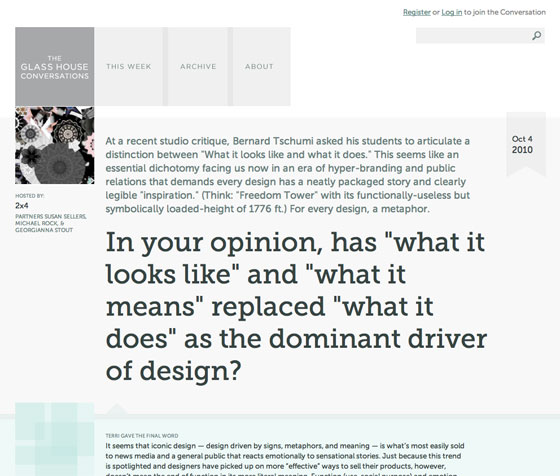
The Glass House promotes conversation with a perfect pairing of Museo Slab and Museo Sans. Overlapping transparent boxes make for a wonderful window-like feel, while the combination of the two Museo faces brings a unity and integrity to the design overall.

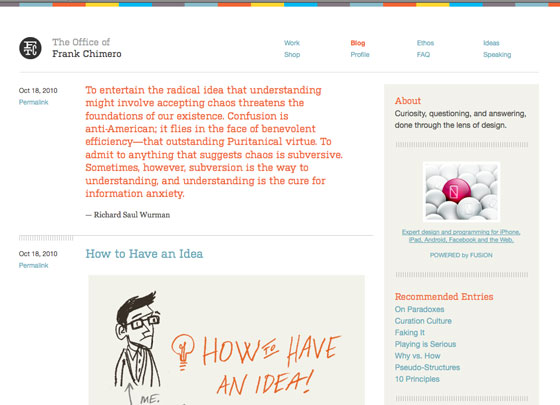
The Office of Frank Chimero uses Kulturista to great effect. Kulturista’s square shape and large, slab serifs stand up to the bright color palette, and pair beautifully with the small text (in Helvetica) used for metadata and sidebar navigation. In a previous version, Frank used FF Tisa for headings. Typekit’s easy set up means you can try on new fonts at a whim. What font should Frank use next?
2 Responses
Comments are closed.
I’m getting a redirect loop on the Smithsonian site, bad link maybe?
Hello, Typekit. I’m the frontend Web dude who developed the Smithsonian Channel site. Thanks for the shout out.
Typekit really helped a lot for this project. When you have a dark background with light text like we do, it creates an optical illusion of the letters being thicker. The usual suspects — Arial and Helvetica — were bulky and fatiguing to read. Being able to use Proxima Nova, which is nice and thin, solved all our typographic problems in one fell swoop. Typekit is amazing. I am using it on all my projects going forward.