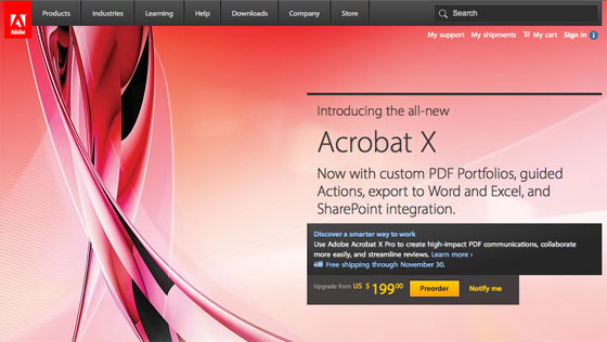
Featured Site: Adobe
Adobe’s products and fonts are an integral part of nearly every designer’s day, but you’ve never before seen their classic fonts in use on their very own website. Until this week, that is. Welcome to the new Adobe.com, featuring Myriad Pro:

Myriad’s humanistic curves and open shapes lend a warm, inviting air; more importantly, with Typekit, Adobe is finally able to use their own fonts on the web, showcasing their commitment to excellent typography and unifying their on- and offline presence.
We’re continuing to work closely with Adobe to bring more of their outstanding fonts to the web, so stay tuned!
8 Responses
Comments are closed.
More great news on the web typography front – long may it continue. Let’s hope for an equally rapid advancement in internet browser platform and software update awareness (particularly in office/network systems) so that at last beautiful typography can be available to everyone!
C’mon the Typekit!
Excellent. It’s such a testament to Typekit’s success to have Adobe featuring your technology. Outstanding work, guys.
Ahhh, why do Adobe always insist on left aligning their website!
it’s not any more! hip hip hooray
The link at the top takes you to adobe.com yeah? Still left aligned to me. Cleared my cache etc, still left aligned. Strange.
I just checked – Internet Explorer still aligns the site left – Chrome, Firefox, Safari all make in centrally aligned for some strange reason… Must be having the usual dreaded layout problems with IE styling.
Weird, it’s centre aligned on Firefox/Opera/Safari/IE9 but left aligned on Chrome/IE7/IE8.
Haha, this is ridiculous – it’s centre aligned in Chrome and all others except IE for me!