Default Font Smoothing On Windows
A couple weeks ago I mentioned the three rasterization methods available on Windows XP, and explained how to enable ClearType. This time I’m going to talk about the browsers’ default font smoothing method on the various versions of Windows, and how that may affect the rendering of text.
| Windows XP |
Windows Vista and 7 |
|
|---|---|---|
| Firefox 3.x Google Chrome 6.x Internet Explorer 6.x Opera 10.x Safari 5.x |
Anti-aliasing (browser uses the system’s default setting) |
ClearType (browser uses the system’s default setting) |
| Internet Explorer 7.x Internet Explorer 8.x |
ClearType (browser has a setting independent of the system setting) |
|
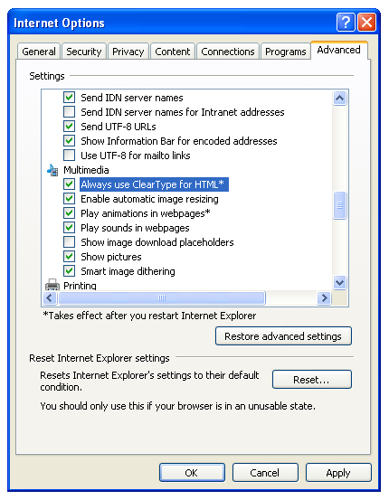
The table above summarizes the situation. As you can see, most browsers rely on the operating system’s rasterization setting, with the exception of Internet Explorer versions 7 and 8. These two have their own setting — it’s named “Always use ClearType for HTML” and can be found in the Internet Options window, inside the Advanced tab, under the Multimedia section (image below) — which allows them to switch the font rasterization method independently of the operating system.
But this also means that, in the case where Windows browsers and OSes are using their default settings, the text on a web page will not display the same way across all the browsers, particularly on Windows XP (where the default font smoothing method is anti-aliasing). I have the impression that this is an inconsistency that many web designers are interested to know about.

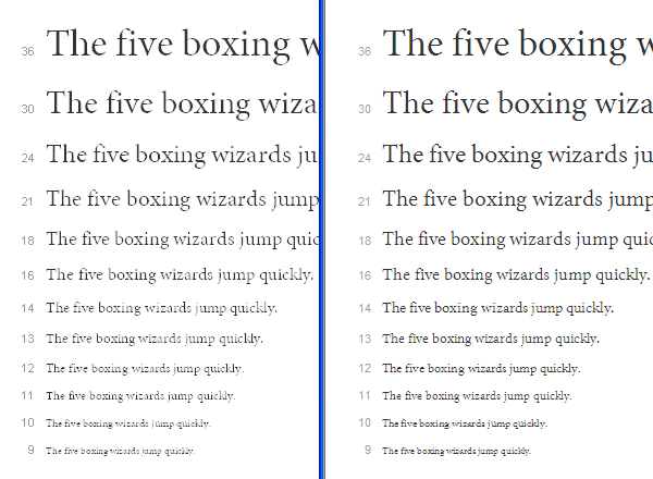
Minion Pro Regular specimen page rendered on two Windows XP browsers. Left side is Google Chrome 6 (anti-aliasing), and right side is Internet Explorer 8 (ClearType).
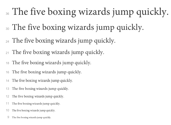
The image above shows Typekit’s specimen page of Minion Pro Regular when viewed in Windows XP. On the left is the page rendered by Google Chrome 6, and on the right is Internet Explorer 8. It’s easy to see the differences, right? If you’re a web designer, you should definitely keep this in mind, especially if you happen to be doing the design work on a Mac, otherwise you could be creating a challenging reading experience without even knowing it. Below is the same page rendered by Google Chrome 6 on Mac OS X.
14 Responses
Comments are closed.


The thing that strikes me is HOW much better the text looks at all sizes on OS X. Maybe I’m biased because I’ve been using Macs for so long, but dang yo.
I agree with you to some extent, maybe because I’m a Mac user as well. But I still recall the shock I had when I made the switch from Windows; all the text looked fuzzy. Now the shock happens when I have to go in the other direction.
The Mac might have the upper hand now, but DirectWrite (which FireFox 4 and IE 9 are planning to leverage) may swing things in Windows’ favor.
The funny part is how many Windows users complain that Mac font presentation is blurry.
And there’s some truth to that. The Mac ignores the hints that the fonts generally have and, although that might be beneficial in many cases, that treatment has some downsides. One of them being the fact that the tops of the letters do not snap to a pixel edge and thus “render fuzzy”.
Thanks, Miguel. This demonstrates the font buyer’s need for test previews that show how fonts perform not only on different browsers and platforms, but rasterization settings as well. Maybe you can nudge your colleagues over in the BrowserLab department?
They have been nudged already actually. Thanks for the tip nonetheless.
Miguel:
I do a website (www.mscnc.us) for a dog club. Being a font afficianado, I decided to try Typekit and to use Adobe Garamond–one of my favorite fonts–for the body text. The text renders beautifully on my monitor at home (Windows 7 and a Dell IPS-screen monitor) but looks terrible on a friend’s computer (Windows 7 with a low end Dell monitor), even though core fonts like Arial and Verdana look pretty similar on both computers.
Do you have any idea why Adobe Garamond might be rendering so differently on the two machines? (I’m going to have to check the pages on as many computers as I can to see if it renders badly on many of them, or if my friend’s machine is an anomaly.)
Thanks.
John Hoffman
It’s hard to know for sure what the problem may be without looking at your friend’s computer. But I think that the low-end screen might not be the main culprit. Could you check to see if your friend’s computer (and browser, in case he’s using IE7 or IE8) has ClearType turned on? The instructions for Windows 7 can be found at http://windows.microsoft.com/en-US/windows7/Make-text-easier-to-read-using-ClearType
In an effort to improve performance and more web standards compliance the IE team has been working hard to make considerable improvements to the IE browser. One of the advancements has been in the way the Internet Explorer 9 Beta has been improved to maximize web font choice. Some of the improvements include:
1.Ensured backward compatibility with continued support for Embedded OpenType (EOT)
2. Added support for the Web Open Font Format (WOFF), which repackages sfnt-based font files (TrueType, OpenType, and Open Font Format fonts) by compressing each table individually using a ZIP compression format
3.Added support for installable (no embedding permission bits set) raw TrueType fonts
You can read more about the new font standards at http://www.BeautyofTheWeb.com
Cheers,
Rick
IE Outreach Team
Thanks Rick. I’m sure looking forward to the improvements made possible by DirectWrite.
This is a nice quick summary. However, I think it may have left out an important detail regarding Internet Explorer 7.
My understanding is that IE7 works a bit differently than IE8, in that it actually turns ClearType on at the OS level, for all apps. So my understanding is that any XP computer that has ever had IE7 installed will by default have ClearType on, for all apps. (IE8 does it as a preference and it only affects IE.)
It is of course possible that I’ve got something wrong here, but I did get this from our mutual friends at Microsoft.
See also my own related blog post here: http://blog.extensis.com/web-fonts/font-rendering-in-browsers.php
Cheers,
T
Hi Thomas. Are you saying that installing IE7 over IE6 on XP switches the system’s font smoothing setting to ClearType, from anti-aliasing? I must say that I did that on a virtual machine I have and the system setting didn’t change. And the result was the same when I installed IE8 over IE6.
Since you reference your blog post I’ll take the opportunity to mention Typekit’s post entitled Type rendering: operating systems at http://blog.typekit.com/2010/10/15/type-rendering-operating-systems/
That’s what I heard from MS, yes. Though if you’ve tested it and found otherwise, that casts serious doubt on it. I’ll have to check up on it myself.
Maybe it only happens if the font smoothing setting has never been changed, i.e. once it has been changed it won’t be overridden.