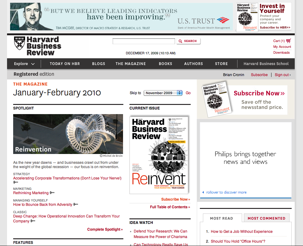
Featured site: Harvard Business Review

Yesterday, the Harvard Business Review launched a redesign of both their magazine and web site. Using the elegant sans serif National from Village type co-op, the venerable publication is not only updating its look, but its approach to content as well. Gone is the list of articles on the magazine’s front cover, replaced with more contemporary photography and design. A faster editorial cycle, with more connections into the website’s blogs and community, aims at keeping the print version up to date.
But here’s what we’re really excited about — when the project started, one if the key goals was to connect the magazine and website visually. They found a look that suited their brand, then found a way to make that work on the web. Furniture giant Ikea tried (some would say unsuccessfully) to unify their their brand by bringing the web’s Verdana to their printed catalogs. Thanks to advances in browser support of @font-face, HBR didn’t need to compromise.
You can read more about the redesign efforts on the HBR blog, and at Adaptive Path’s web site, the agency behind the website changes.
Have you redesigned using Typekit? Let us know!
6 Responses
Comments are closed.
I can’t seem to find National in the Typekit library. Ever since it was used in Eye 71, I’ve been dying to use it. Am I missing something?
HBR licensed National directly with Village, then asked us to provide the conversion and backend services. We’re doing lots of different types of licensing these days, some of which we’ll be rolling out more widely. No announcements yet, but soon.
Any chance of your making a full disclosure that Typekit’s founding partners used to work at Adaptive Path?
…or explaining why the site is still using Helvetica for everything except the headlines?
Although it is great that the site is using Typekit, overall the design is pretty dull. There is no color except for the red links and the banner ad. I don’t think red is a great color for ALL of the links since red is used conventionally to get attention. My eye wanders on this page, so I am not at all sure what the designer wants me to pay attention to. Business doesn’t have to be boring, unfortunately this site is “forgettable.”
Thanks Jeffrey, that makes more sense. You guys might want to consider a post or something to that effect clarifying this. I totally understand this and what you guys are doing, but I imagine it could lead to irritation and frustration down the road if it’s not clarified.