Building contextual behavior: “An essential part of the design process”
Developing the contextual behavior for Bickham Script was a central challenge to creating a script typeface with the fluid character that, in traditional hand penmanship, was a result of natural (though not necessarily unconscious) letter variations. “The goal is not to see the digital influence,” says Adobe type designer Frank Grießhammer, “but it’s very involved digitally to reach that goal.”
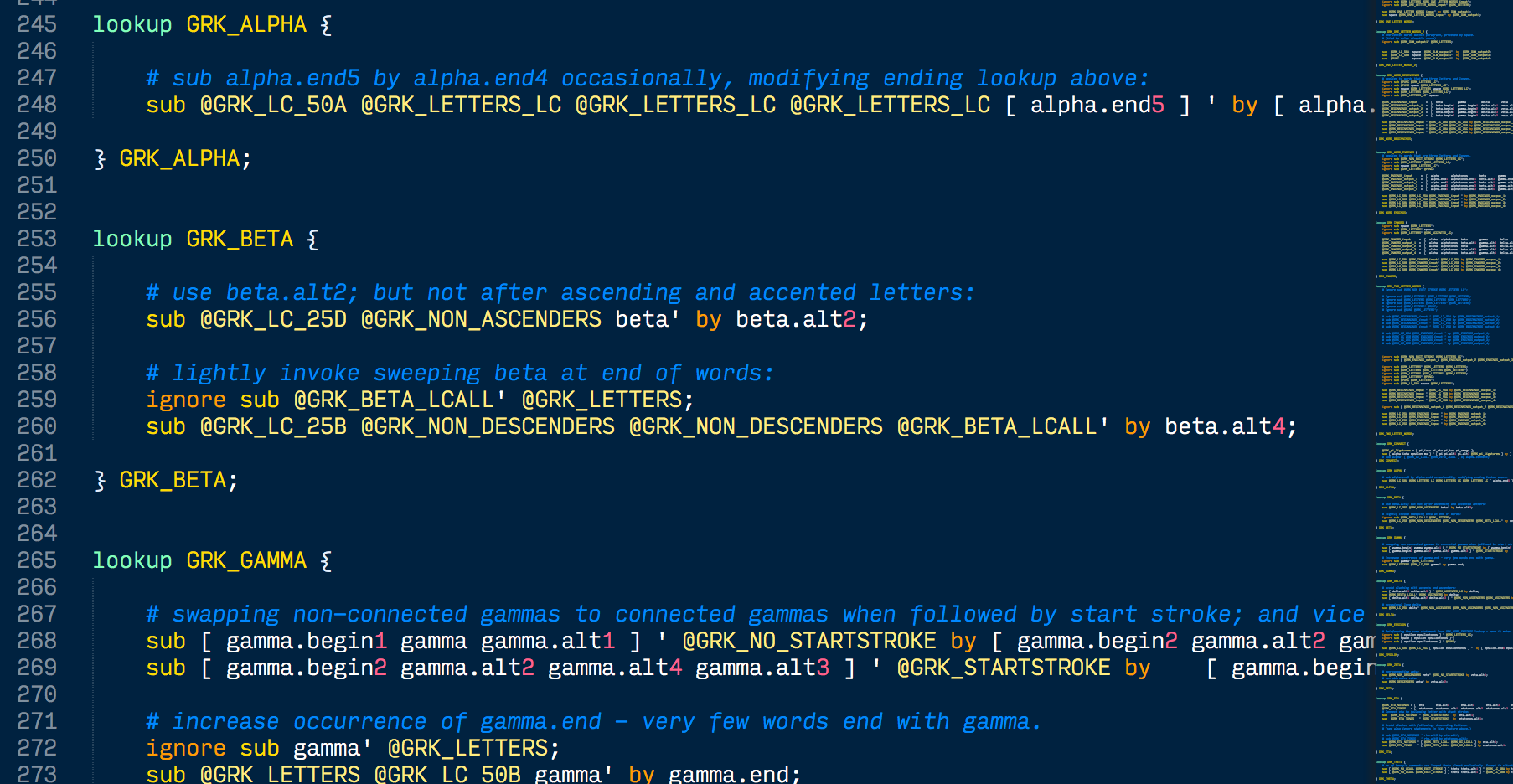
The underlying code supporting contextual alternates is built into the font files.
OpenType technology made that technological nuance possible for the design and performance of Bickham — and in the early 1990s the Adobe Type team had thrown its weight behind OpenType’s success, so was equipped to spend the time necessary on the daunting project. David Parsons did the trailblazing work of planning for OpenType features in Bickham and plugging them directly into the font files, working closely with both Richard Lipton and Robert Slimbach.
David Parsons’ work on the original OpenType features for Bickham Script included programming extensive alternate glyphs.
For the updated and expanded Bickham Script Pro 3, Grießhammer was tasked with implementing and testing the contextual behavior for the Greek and Cyrillic extensions. This was one of the first projects he was assigned when he started at Adobe in 2010, and as he got deeper into the technical nuances of OpenType feature programming it became a true learning process.
“Working on the contextual feature code for Bickham Script Pro 3 seemed like a fairly simple task,” Grießhammer says, “but it turned out that this was a clear underestimation by everybody involved, especially me.”
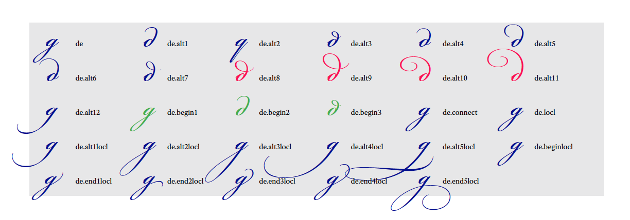
Cyrillic alternates sometimes needed multiple forms of the same letter, to reflect the script’s varying use across different languages. Here Grießhammer outlines the different alternates for the letter de.
Being so unusually intricate, Bickham pushed the regular software tools used to design fonts past their limits. The unprecedented number of specially-designed glyph pairs and alternates (each with their own kerning values) overwhelmed the ADFKO (Adobe Font Development Kit for OpenType). “Rebuilding this ‘scaffolding’ was a significant factor in the time this project required,” Grießhammer says, explaining how he had to reconfigure the ADFKO to accommodate Bickham’s detailed feature programming.
Another issue with Bickham’s intricacy was the high risk of interpolation errors. Typically, font developers use a 1000-em square grid for digital glyph manipulation, with various points on that grid indicating where the curves of the glyph should run or change direction. Many of the delicately-drawn curves in Bickham didn’t precisely fit within these standard gridlines, resulting in visible kinks in the curves where the software attempted to mathematically compensate. Grießhammer worked with engineer Read Roberts on this problem, and they ended up making more changes to the ADFKO to accommodate decimal coordinate values on that grid — giving the intricate curves more room to breathe and perform optimally.
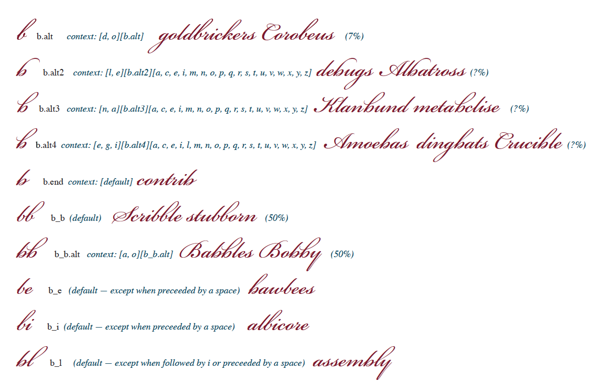
Software optimizations aside, the work involved for the new substitution rules necessarily drew heavily on Grießhammer’s training as a font designer, since it was important to achieve a level of variation in the text that appeared completely natural. He studied word frequency in Greek and the languages using Cyrillic, focusing in particular on shorter words to determine the optimum patterns for substitution — since these would be the most noticeable if the same glyph were to repeat too frequently.
“Working on the substitution rules themselves,” he explains, “I set up general replacements based on letter frequency. Then I would look at each letter and its occurrence in the role of beginning, ending, and in-word alternates,” making more decisions about how the substitution rules should play out in different circumstances.
Building on top of the complexity of Lipton’s work was no small task. “I was impressed by how well-drawn Bickham Script is,” Grießhammer says. “The curves really perfectly capture the balance and transition between thin hairlines and swelling strokes.” For the most part, Grießhammer’s changes were only additive, occasionally adding new alternate glyphs to build on an instroke or outstroke but otherwise staying close to Lipton’s drawings.
Grießhammer notes that it’s rare for a script typeface to get as complex as Bickham Script — or to take so long to develop. “We’re eager to create technically outstanding typefaces at Adobe Type,” he explains, going on to describe contextual alternates as “an essential part of the design process.”
“The outlines are beautiful,” he says, “but it is the alternate features that help bring their beauty to light.”
With contributions from John Berry.