Smoother curves with decimal coordinate values
When designing PostScript fonts, one long-standing challenge has been mastering the precision of placing points when drawing lines and curves. Here at Adobe Type, when this problem threatened to thwart the development of a typeface, we ended up adapting our font development software to allow for even more precise point placement.
Most glyphs are drawn within an area (called the the ‘em-box’) that is 1000 by 1000 units, and all points must be placed at integer positions within this area. Historically, this has been only a minor issue for Western font developers: although font developers occasionally complain, it is a rarely a problem, and the few cases where it would be nice to have higher resolution can be worked around by adjusting the position of the on-curve points.
After more than 30 years of font development using tools with these particular constraints, we finally ran into a real-world case that presented a problem: a complex Adobe script font with many off-curve control points that are close to the on-curve points, only a few design units away. The problem with this is that possible positions for an off-curve point which is close to an on-curve point are very limited. In Figure 1, the rightmost curve shows the desired point placement, and the left two curves show what is possible with integer coordinates.
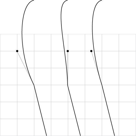
Figure 1: Ideal and possible placements for an off-curve point two units away from an on-curve point.
A developer can work around this in the master designs by choosing the position of the on-curve point so that the possible positions of the off-curve point work for the design. However, the Adobe Type team prefers to develop fonts by first building only a few master designs by hand, then generating most of the instances by interpolating between the master designs. In these instances, the point positions are not manually placed, and for this particular font, they really need to retain their decimal values in order to work as intended. This shows up in one of the faces where the rounding of the on-curve and off-curve point positions leads to visible kinks. Frank Grießhammer was tasked to work on this font, and Frank — being who he is — didn’t accept that the technology limited us.
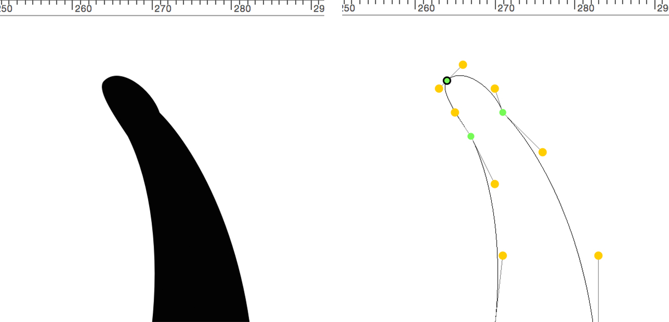
Figure 2: Example from script font of kink in curve due to interpolation of off-curve point.
How were we going to design this typeface successfully, then, if we couldn’t get the resolution we needed for fine-tuning? We ended up working through a couple approaches to this before landing on the solution.
Solution 1
Frank first explored using a larger em-box, but found that this font needed a 3000 em-box to reach the necessary resolution. Em-box sizes of other than 1000 are allowed, according to the font format specification, but it turned out that there are too many environments in which this causes problems. We expected some surprises with line spacing and selection field/insertion point height (which is why we didn’t do this years ago), but we also saw failure of some of the larger glyphs to rasterize under the Adobe, Windows, and OS X rasterizers. This font has some really exuberant swashes that extend above and below the em-box by factors of three and more.
The Adobe Type 1 Font Format (aka “Black Book”) states that “coordinate values … must be between −2000 and +2000.” Most modern rasterizers are more forgiving than that (the current Adobe rasterizers have a limit of ±10K) but this font exceeds this limit for a number of glyphs at an em-box of 3000.
Solution 2
Frank then asked if we could try using fractional point coordinates. This is also allowed by the PostScript Type 1 and CFF font specifications. However, he needed me to update the AFDKO tools to support fractional values in order to try this approach.
I was extremely skeptical. Since the dawn of Type 1 fonts, very few font development tools have allowed building PostScript fonts with other than integer coordinate values, and there have been no shipping fonts that we knew of. An old software maxim is that if no one has ever used a feature, it doesn’t work.
However, Frank was persistent. There is the fact that fractional values have always been used in hint values, so the rasterizers had to be able to handle fractional values. Frank was also able to cite Rainer Erich Scheichelbauer’s 2013 ATypI presentation, showing that a real font in the wild was working even though it had fractional coordinates. Of course, showing correctly in InDesign is a long way from functioning in the many possible workflows.
I first reviewed the ancient history on this subject, followed by some software archeology to determine whether there were any blocking issues. Our team’s rationale for not using fractional coordinates was originally (many years ago!) simply processing time: floating-point operations are far more expensive than integer operations. When PostScript fonts were first developed, rasterization time was a very real issue, and heavy use of decimal coordinates would noticeably slow down text layout on screen or when printing. Download time to printers was also a big operational problem, and decimal values are many times the size of an integer value in terms of memory and file storage.
However, I suspect that the main reason that decimal values have not been used in recent years is simply the high risk of trying to ship a product with a feature that no one has tried to use. Using fractional values certainly still increases rasterization time by large integer factors, but as long as it is still fast enough, this is not a practical problem.
It works!
With this encouraging information, we ended up enhancing our font development tools to support fractional coordinates. To my astonishment, this has worked everywhere we have tested it. We now have enough confidence that this is a robust approach that we are planning to release the family with fractional coordinates in at least one of the faces.
Some cautions
Decimal coordinate values should not be used for all fonts; for almost all Western fonts, there is no need to incur the additional complexity. However, it is very helpful when working with faces with lots of small features, especially when they are interpolated from master designs. Also, our Japanese font developers report that the increased precision will be very useful for ideographic fonts.
Most font development tools do allow you to edit fonts with decimal values, but there are some caveats. The AFDKO tools will support decimal values only when you are working with the UFO format; you must use checkOutlinesUFO rather than checkOutlines, and makeInstancesUFO rather than makeInstances. Finally, there are some issues with precision, but these issues can be avoided entirely if you limit your fractional resolution to increments of 0.5 or 0.25.
I posted a more detailed discussion of the technical issues on September 3, 2015, on the Google group mailing list UAFDKOML, with the title “Technical issues in using decimal coordinates in PostScript fonts.” If you have any feedback on this post, I’d be glad to read it.
The latest version of the AFDKO, our font development toolkit, now supports fractional coordinate values, and can be used by anyone. Please let us know what you think in the comments.
6 Responses
Comments are closed.
It is misleading to talk about “decimal coordinates” when you mean floating point or fractional coordinates. In computer processors and memory numbers, whether integer or floating point, are represented in binary ones and zeros. (Some ancient computers did compute in something called binary-coded-decimal (BCD) but that is not germane to this discussion.) It does make sense to talk of decimal when representing a number in source code (eg, a PostScript language program) or read by humans on screen or print but that’s not really what you are talking about here.
I quite agree with you about the correct terminology. However, most of the people reading this blog are neither software engineers nor necessarily very math-oriented. I took an informal poll of what term would be associated by most people with the idea of floating point values, and ‘decimal’ won.
Did you find the files getting bigger?
Yes, Without subroutinization, the script font we are working on gets about 2.3 times larger when decimal values are used. With subroutinization, it is about 0.6 times larger. The before and after sizes for our script font with subroutinization are 0.94 Mbytes vs 1.45 Mbytes.
Read – you mentioned file size increasing using decimal values, but out of curiosity, do you have any idea if it takes more processor cycles if there are decimal values? or is one indicative of the other? the initial search that brought me here was to find out if it was less processor intensive to have more points and not use bezier handles, so if you have any answer to that, too, please explain. and no, I’m not on an impossibly old computer, I’m using custom glyphs as 3D object forms and trying to minimize rendering anywhere I can. any help is greatly appreciated.
Hi Ryan;
Nowadays, it is no longer always true that floating point operations take more cycles than integer. There is no one answer to your question – it depends on whether the processor has a floating point processor, and if the compiler takes advantage of this. Googling on this, it looks like there is no penalty for most desktop machines for using floating point operations, but there is on some mobile devices. However, it sounds as if your real question is whether is better to describe a curve as a bezier function, or flatten it to series of short straight lines specified by lots of points along the original curve. The answer again depends on the kind of operation – you will be worse off with a flattened curve for rotation, better off for rendering. My past experience is that you will be better off not worrying about this level of optimization, and using the most convenient and accurate object representation, which in this case is bezier curves.