A fresh collaboration for better type UI
Choosing a typeface is really just the first of many design decisions you can make when setting type. Ever since 1996, when Adobe began developing the first OpenType fonts in collaboration with Microsoft, type developers have added features like stylistic alternates, old style numerals, and discretionary ligatures to the font files. Informed use of these features can truly bring out the personality of a typeface… so long as the software you use makes those features easy to view and enable.
We’ve heard loud and clear that many people feel Adobe hasn’t done enough to make robust typographic controls accessible in app UIs, or to educate people about the typographic power that OpenType features can enable. We got called out for this at ATypI in September, and rightfully so: it’s past time to begin doing this in a meaningful way. Yves Peters summarized the issue eloquently on ILoveTypography.com, and the #AdobeTypeUI initiative and petition was born out of this conversation. We’ve been listening to this discussion ever since this started, are taking suggestions like Kris Sowersby’s seriously, and we’re committed to improving the situation.
Introducing the Adobe Typography Customer Advisory Board
Earlier this year, we reached out to a group of typographers, designers, foundry representatives, and others from the type community. We invited them to join us for a day-long meeting in Adobe’s New York City offices. That meeting took place on November 17, and we’re very grateful to each of the participants for the time and attention they invested in that collaboration.
We found this so insightful that we’re planning a second meeting in 2015 with an expanded roster, and we’ve given the group a name: the Adobe Typography Customer Advisory Board.
Advisory Board members:
Nadine Chahine
Yves Peters
Nick Sherman
Tobias Frere-Jones
Kris Sowersby
John Hudson
Adobe liaisons to the board:
Matthew Rechs, Director, GM for Adobe Type & Typekit
Miguel Sousa, Manager for Western Type Development at Adobe Type
Michael Ninness, Senior Director for Design Product Management at Adobe
Tim Riot, Senior Lead Product Designer for Photoshop
Stephen Nielson, Senior Product Manager for Photoshop
We’re committing to regular, ongoing communication with this group, and its members will remain active between those working sessions with issue advocacy and discussion in the type industry. We want this to be a space where customers can hold us accountable as we work on improving our products to better accommodate typographic technology and generally advance the state of the art.
With the creation of this group, we’re reviving a tradition of type advocacy that the Adobe Type Advisory Board established over 20 years ago under then-Director of Typography Sumner Stone. Gathered together to critique the work coming out of Adobe, the insights of the original Type Advisory Board helped refine the scope of Adobe’s typography program and guide its commercial success. We hope to accomplish something similar this time around, so that our customers can truly get the most out of type with Adobe’s products.
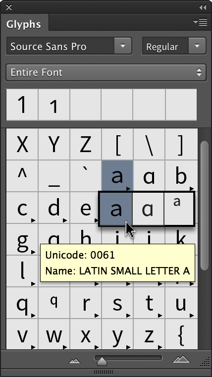
A glyph panel in Photoshop is in progress.
We’re already working on some long-requested changes to the Photoshop UI, and plan to introduce a glyph panel in the near future. We’re also beginning to tackle the problem of simulated type variations, so you can enable stylistic variants like Small Caps with confidence that you’re seeing what the type designer intended. And on the Typekit side, we’re experimenting with some custom subsetting controls within the Typekit UI to make these features easier to employ on the web.
We’ve got a lot of work ahead to finally tackle these issues head-on. We and the members of this board will keep you up to date with our progress. Contact us anytime to share your thoughts and questions: comment below, send an email, or find us on Twitter.
15 Responses
Comments are closed.
Well done Typekit and Adobe Type, this is great news. Please don’t let this become too focussed on Photoshop. Whilst Illustrator and InDesign may already have Glyph panels, all three could certainly benefit from a standard OpenType panel, at the very least. Indeed, InDesign is perhaps the most important of all in this regard, its primary purpose being the arrangement of type on a page.
Great to see some very well respected names on the board. Keep up the good work!
Thanks Dave, we really appreciate that.
Looking over the post, I can see how it might seem that the emphasis is on Photoshop, but I think that the group as a whole is 100% on the same page with you.
Now get rid of the subscription plan and I’ll buy your products again.
A much needed step in the right direction! What I’d really love to see is some more UI unformity across apps—particularly with the type panels—and this might be a good time to do it.
Yes, pleeeease! Make those three great Apps work as if they would come from the same company. I know this might not be easy. But the differences in the UI and especially concerning type treatment are really upsetting me every time i stumble upon them. Which in fact might be 8–10 times a day. This is a real productivity killer! And while you are there, please do not forget AfterEffects which is very type-related for many designers as well.
Agreed, some consistency between the apps would be amazing.
And please don’t forget about After Effects guys, the typography features in AE annoy me every day.
Great news. Really amazing to know Adobe is hearing.
One suggestion. Add a feature that, for a given font, would open a new window displaying a full sample of how it looks, including many of these stylistic alternatives. That’d let us know our options. Lacking that, we have to create a text and try them one by one. That’s very time consuming.
Another suggestion. Come up with various measures for fonts, including how dark they are on a page and how compactly they fit on a line. The measures don’t need to have any literal meaning. They’ll work fine if they simply allow us to make relative comparisons between fonts, again without a lot of bothersome experimentation.
For instance, sometimes I need to shorten a book by a few pages. It’d be great to know that font X is about 5% more compact that font Y.
Please, make it easier to use stylistic sets! Some time ago I’ve made a rough mockup how should it look and work https://dribbble.com/shots/1555731-A-rough-sketch-of-desired-OpenType-UI?list=users&offset=6
That’s great to hear. Now if Microsoft could do the same with Office as it’s a mainstream product… (current support is encouraging but it doesn’t even allow for small caps while some of their font have them!)
This is wonderful news. However, it would have been nice if the Advisory Board included a design educator. Communicating the benefits of OpenType to new users/ customers is half the battle and educators are at the front line.
Thanks for the feedback Amy. You might be pleased to learn that Tobias Frere-Jones is on the faculty of the Yale School of Art.
BRAVO!!!!! Keep the communications flowing! Many thanks to all who contributed to this much needed discussion!
That’s really a good news! Hoping to see a fully unified (same features set) approach across the 3 major application (ID, PS & AI).
It would be nice to see someone on the board that represents graphic designers. What I mean is someone that isn’t a type designer, or knee deep in the type industry. I think part of what got us to this place is the inability to see the forest for the trees and focusing too closely might be a little myopic. Having said that, I cannot express the heights of my joy that this board even exists. Thank you so much!