New fonts from Hamilton Wood Type Foundry
Good news for your desktop (and your websites): We’ve added a boatload of new typefaces from Hamilton Wood Type Foundry to the Typekit library. Hamilton Wood Type is a partnership between the P22 type foundry and the Hamilton Wood Type & Printing Museum, bringing 19th-century wood type designs into modern font formats.
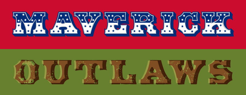
We’ve long been supporters of this cause at Adobe Type, conducting fundraisers and making donations, as well as by helping with the digitization effort. Members of our team digitized three of the designs in the HWT collection: Gothic Round by myself, Tuscan Extended by Frank Greißhammer, and Bulletin Script by Paul Hunt.
The bulk of the HWT Collection is made of digital revivals, but also included are two original designs made by Erik Spiekermann (HWT Artz) and Matthew Carter (HWT Van Lanen).
We included just a couple of HWT fonts in our library prior to this release, but now we’re all caught up: All of the font families of the current HWT collection are now available at Typekit, and you can use any of them on your desktop (and, in most cases, on the web) with a Portfolio plan or higher.
This initiative not only helps the dissemination of fonts that were previously only available as wood type, but it also helps the preservation of wood type history since a portion of proceeds from all sales of the HWT digital fonts goes toward supporting the mission and operation of the The Hamilton Wood Type & Printing Museum.
With over twenty fonts new to the Typekit library from HWT, we’d be here all day if we profiled each one. Here’s just a handful to give you a sample. (And check out the full list when you have time.)
HWT American
HWT American Chromatic was the first design in the collection to be digitized. Being a chromatic family means that it’s made up of fonts that act as layers, to which different colors can be applied — resulting in rich, attention-grabbing headlines. The family has a total of eight styles that can be arranged in multiple combinations for an almost endless number of variations. Try layering the styles on a web page using CSS, or create interesting hues in print by letting the colors overprint. The Behance gallery from Hamilton Wood Type goes into more detail about the work that went into digitizing this one-of-a-kind font family.
HWT Gothic Round

It’s hard to believe the contemporary-looking HWT Gothic Round was originally designed almost two centuries ago, in 1838. The round edges of this gothic (or sans-serif) give the design an undeniable warmth and bubbly quality, particularly noticeable in the lowercase letters. The design’s heavy weight will provide plenty of impact in applications that demand the readers’ heightened attention, such as a magazine masthead or a store sign. This typeface was a 2013 Typographica favorite. See more about the work that went into digitizing this typeface.
HWT Unit Gothic
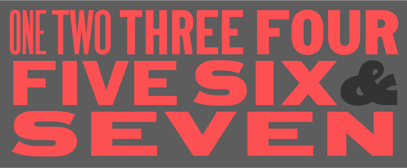
First shown in a magazine advertisement in 1907, the HWT Unit Gothic series includes a breadth of weight and width styles rarely seen in wood type designs. Seamlessly organized as a system of fonts, this family is believed to have been the predecessor of the neo-grotesque collections — Helvetica and Univers — released around 50 years later. Besides supporting extended Latin, HWT Unit Gothic also includes Greek and Cyrillic, thus providing broad language coverage for a wide range of applications, from newspaper headlines to logos. Read more about the digitization process for this typeface on the Hamilton Wood Type Behance page.
HWT Van Lanen
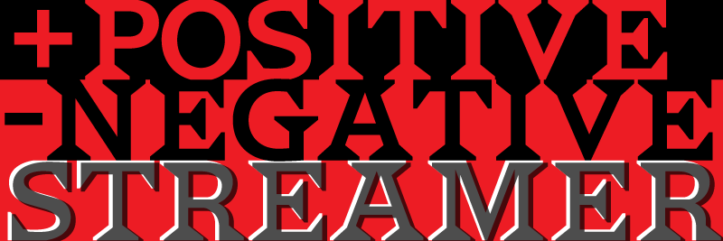
In 2002, the Hamilton Wood Type & Printing Museum commissioned typeface designer Matthew Carter to develop a new wood type design as a way to help promote the newly established facility. Part of the project included the fabrication of actual wood blocks. Named after Jim Van Lanen, the museum’s founder, this bold wedge-shape serifed design of HWT Van Lanen is reminiscent of the Latin Extended style popularized in the late 19th century. Included in the family is a reversed font style, called streamer, that can be used on its own or in combination with the default style to create interesting chromatic effects. See the Hamilton Wood Type Behance page for more details about the making of Van Lanen.
Let us know what you make with these new fonts; we love seeing cool type in action. If you’ve never tried Typekit, sign up and take a look around, and upgrade to a paid plan when you’re ready.