Creating a type style guide
As the makers of Paper for iPad, FiftyThree does some great work that has always impressed me — so I was pretty excited to work with them when they asked for some help cleaning up the type styles on their marketing website.
As is the case in many projects, as the FiftyThree site grew, the type styles grew along with it. As they added pages for new products, the styles weren’t as reusable as the team would have liked. Instead of using mixins or a modular set of styles, each page’s type styles were written directly to fit the design, causing a lot of property repetition as well as redundant styles that were only slightly different from one another.
It was my goal to dig in and inventory the styles, then work with the design and development team to create styles that could be used across the site. While figuring out which type styles would be best for accommodating change and growth on the site, I would put together some mixins that could easily be used for future designs.
Inventory
The first job in any project like this is to do an inventory of the styles used across the site. Thankfully, Nicole Sullivan has made Type-o-matic, a tool for doing exactly that. If you haven’t checked it out, this is a Firebug add-on for Firefox that generates a JSON report of all the type styles being used on a particular page — or across an entire site. So I went through the FiftyThree site using Type-o-matic, and generated the report to get a baseline for where the styles were at.
But we needed to be able to see the styles next to each other visually in order to make some decisions about them. So, I created a page and started adding in the various type styles, grouping them by the pages where they were used. I cross-referenced this with the JSON report from Type-o-matic to ensure that all the different styles used on the site were represented.
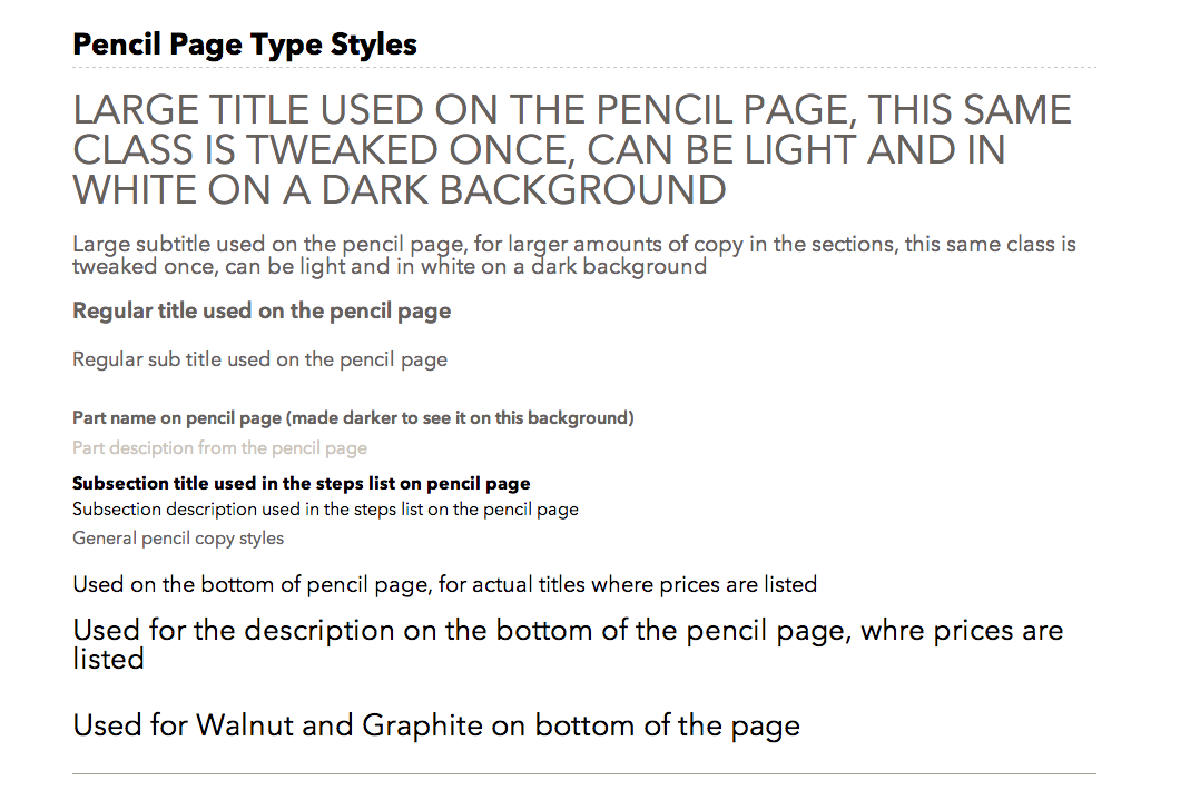
All the type styles from one page, presented without any further design for context. Some are visually very similar to one another.
To complete the inventory, I created a second page and grouped all the type styles by similar size and weight. By seeing the styles next to each other, the team could make better decisions about which styles could be consolidated. The results of this were striking, and showed several opportunities to create some great reusable styles that would easily work site-wide.
FiftyThree uses the stylus preprocessor for writing all their CSS. They also break up their styles so that each individual page calls its own stylesheet, on top of a set of base styles. I thought mixins would be the best way to ensure that styles remained the same across the various pages site-wide; mixins allow you to make groups of CSS declarations that you want to reuse throughout your site.
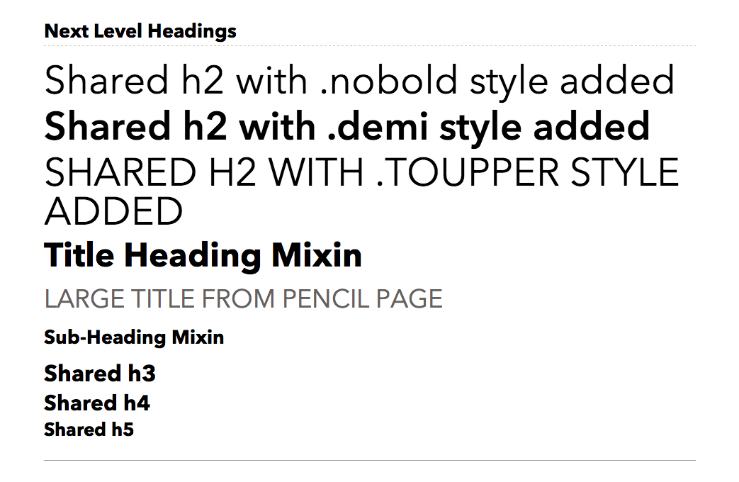
Type styles grouped by size. Similarities and overlaps are easy to spot.
Decision time
With the inventory finished, it was time to make some decisions. I began by creating mixins based on the grouped styles inventory, including nesting the media queries for any font size changes that would need to occur as the screen size got bigger. The example below shows you a stylus mixin that is also using a function for sizing in ems.
MidSizeHeading()
    font-size: em(24px)
    line-height: 1.1
    text-transform: uppercase

    @media $MQGrid4Col
        font-size: em(28px)
        line-height: 1.1

    @media $MQGrid6Col
        font-size: em(36px)
        line-height: 1.05

    @media $MQGrid8Col
        font-size: em(36px)
        line-height: 1.05
Using one page of the site, I began to insert the new mixins to see how they worked. The designer and developer I worked with on the FiftyThree team suggested I start with the Book product page, which features a wide range of type styles. Breaking a page and putting in the new mixins was a key part of the process, and I feel fortunate that branching in git makes this so easy to do. Also, having a client who trusts you and is excited about the work is awesome as well.
Throughout this stage, the type styles frequently shifted on our test page, but that was the point; we’d break one page to see where we were at, and evaluate how the mixins were working within the rest of the design. Then we met as a team to talk about it all and figure out what was working.
After the initial page was done, it was time to test out other pages on the site and learn whether the mixins would hold up or would need more tweaking. This process involved a lot of back and forth between myself and the FiftyThree team to ensure that the design wasn’t changing too drastically and that they were satisfied with where things were at.
Finalize the guide
We settled on several different mixins that were appropriate for the FiftyThree design, and inserted them into other pages to see how they were working across the site. With the final guide, we were able to see all the various mixins and how they were working, and could confirm that they met the needs of the site. We completed the testing process by taking a look at the in-progress site as we transferred the mixins over into the code, to make sure everything still looked the way the designers intended.
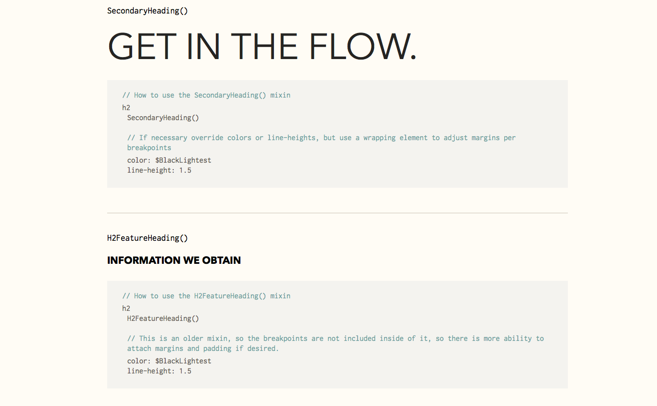
Part of the finished guide, with code examples.
Implementing the guide
Once everyone was happy with the mixins and final decisions had been made, I edited the CSS for the rest of the site, using the mixins for the majority of the type styles. The team at FiftyThree also did a final pass to make sure things looked right and they were happy with the code.
It was really great to get to dig into just the type styles of a site, especially one that is as beautifully designed as fiftythree.com. I learned a great deal about auditing a site’s type using Type-o-matic, and also how to unify styles across a site without compromising on design quality.
Many sites note their typographical styles within their broader styles guides. To see more about how other sites are working with type, here are some great style guides that have type sections in them:
As you think about the type on your site, think about the CSS as well, aiming to make it modular and easier to maintain. Creating a style guide can help you get there.
One Response
Comments are closed.
I am realy glad I came across this post. WOW . Its a lot more involved than I realized. Nice work ands great job expaining the process methodically and clearly.
Thanks Susan!