High impact typography with background-clip: text
This is the second in a pair of posts demonstrating the technique of using the CSS background-clip: text property to style headlines. Catch up on the first post from John Zeratsky if you haven’t already.
Back in early 2008, before Google Chrome had even been released to the world, the people at WebKit landed a brand new CSS property in Safari, background-clip: text. Never heard of it? I’m not surprised; it was never standardized as part of the CSS spec, and was never implemented at Mozilla or Microsoft.
I’m unaware of the reasons why it was never taken up, but WebKit has kept it and you can use it in all current versions of WebKit and Blink browsers.
So what can it do? you ask. Well, allow me to introduce you to some of the results you can achieve with it.
Live demo at http://boldfacedesign.co.uk/type.html
RADICAL!
OK, so how can you make your own kick-ass web type?
Well, before we start, there is one major caveat to deploying to the web: the CSS necessary to achieve these effects is only supported by WebKit browsers — namely, Chrome and Safari. We’re giving those WebKit users something a little special when they visit our site, but we won’t do it at the expense of the experience on other browsers. Here’s how the demo above appears, for example, without the fancy styling.

Less radical, but still totally readable. So long as the styling is done only for flair, and doesn’t change anything fundamental about the site navigation, all your site visitors will have a good time.
So, where do we begin?
1. Choose your font
This is the most crucial step to establishing an authentic look and feel for the style that you want to achieve. Have a browse through the Typekit library of fonts for some inspiration. I’m going for that 80s feel, so I picked Orbitron.
2. Add a background
Once you have your text on the page and your chosen font applied, it’s time to apply a background layer in your CSS. This will in fact become the “fill” for your text.
To create a gradient background we can use the following CSS property:
background-image: -webkit-linear-gradient();Simply pass in a directional value (optional, defaults to ‘top’), and as many color values as you like. You can define color points with percentages, pixels, ems, etc. Take a look at my example below:

background-image: -webkit-linear-gradient(
    #022486 0%,
    #0AD0FD 30%,
    #BDFCFC 40%,
    #D8FFFF 44%,
    #00081C 44%,
    #00081C 50%,
    #074A67 52%,
    #1CD8FE 60%,
    #7FEDFE 62%,
    #96F5FC 70%,
    #0FD8FA 73%,
    #0BD2FD 88%,
    #AFFDFF 100%
  );
There are a number of different gradient options you can apply with WebKit, such as -repeating-linear-gradient, -radial-gradient, etc. Play around with the various gradient types and values to find something you’re happy with.
You can also use an image for the background layer, but this should be done with care in order to avoid rather ungraceful degradation errors in non-WebKit browsers. In order to make sure our background image is only applied in WebKit browsers, we can use the following declaration:
background-image: -webkit-linear-gradient(transparent, transparent),
  url(path/to/image);
By using a double background declaration with a WebKit prefix, we can prevent non-WebKit browsers from applying the unwanted image.
3. Clip to text
Now to apply the two most crucial CSS properties:
-webkit-background-clip: text;
-webkit-text-fill-color: transparent;

We’ve now created a mask layer from the text, through which we can see the gradient or image background. If you’ve worked with layers in Photoshop before, you may already be familiar with this kind of thinking and technique.
4. Accentuate
So now that we have some good looking text on our screen, let’s add some more flare to it with a few other WebKit typographic treats.
-webkit-text-stroke: 1px #f008b7;Text stroke will create a solid outline around you text in whatever color you choose. The weight of the stroke will vary depending on the weight of your font. The effects of this will be very apparent for Mac users.
The text stroke property takes two values: a stroke weight and a color. You can set these with any variation of sizing unit and color format, so feel free to use rems, points, rgb, or rgba.
Now, let’s have a look at drop shadows.
The drop-shadow filter introduced in 2012 is the much welcome successor to box-shadow. Unlike box-shadow, which follows the outline of the box or div, drop-shadow will follow the outline of the text or any other shapes inside the box which you apply it to. Drop-shadow is also inclusive of pseudo elements allowing for more detailed and intricate element outlining and shadowing.
The drop-shadow filter takes four values: X offset, Y offset, spread, and color. Here we’ve set our spread to 20px, giving our text a nice glow effect.
-webkit-filter: drop-shadow(2px 2px 20px #f008b7);
The pink-tinted drop shadows are visible as thin outlines around the letters. The glowing blue effect comes from another drop shadow, which is described in the next step.
-webkit-filter:
    drop-shadow(1px 0px 0px #FFF2F7)
    drop-shadow(1px -2px 0px #FFF2F7)
    drop-shadow(0px 3px 0px #A1455E)
    drop-shadow(-2px 0px 0px #A1455E);
One of the nice features of filters is that you can chain together several of them on one element. A good reference point for learning syntax and seeing the effects of each filter is the HTML5-demos page.
5. Layer up
To add a final flair to our text, we can deploy some pseudo elements. One thing to note about pseudo elements is their content property. This must be defined on all pseudo elements in order for them to be visible in the browser. When creating simple CSS shapes, the content property is left blank.
content: ‘’;However, you can also pass in a text string or image URL, which means pseudo elements can be used to perform a number of different roles. We’re going to create a ‘ghost’ copy of our text on a layer with a higher z-index, which will allow us to add some reflection and spotlight effects.
.strike:before {
content: 'STRIKE';
position: absolute;
left: 21px;
top: 0;
padding-right: 30px;
z-index: 3;
-webkit-text-fill-color: transparent;
background-image: -webkit-linear-gradient(-92deg,
  rgba(255,255,255,0.85) 0%,
  transparent 15%,
  transparent 100%
);
-webkit-background-clip: text;
}
Here, we’ve created a subtle spotlight effect on the top right of our text.
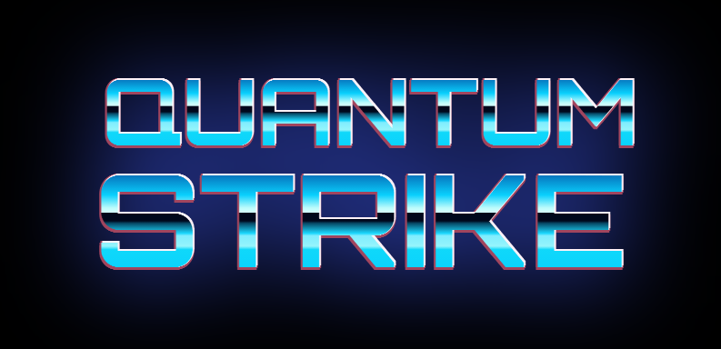
Putting it all together
Markup:
    QUANTUM
    STRIKE
CSS:
.wrapper {
  position: relative;
  text-align: center;
  padding-top: 100px;
  -webkit-filter: drop-shadow(2px 2px 55px #3F59F4);
}

.quantum,
.strike {
  position: relative;
  font-size: 99px;
  font-weight: 800;
  background-image: -webkit-linear-gradient(
    #022486 0%,
    #0AD0FD 30%,
    #BDFCFC 40%,
    #D8FFFF 44%,
    #00081C 44%,
    #00081C 50%,
    #074A67 52%,
    #1CD8FE 60%,
    #7FEDFE 62%,
    #96F5FC 70%,
    #0FD8FA 73%,
    #0BD2FD 88%,
    #AFFDFF 100%
  );
  -webkit-background-clip: text;
  -webkit-text-fill-color: transparent;
  margin: 0 auto;
  line-height: 1;
  -webkit-filter:
    drop-shadow(1px 0px 0px #FFF2F7)
    drop-shadow(1px -2px 0px #FFF2F7)
    drop-shadow(0px 3px 0px #A1455E)
    drop-shadow(-2px 0px 0px #A1455E);
  z-index: 2;
  width: 630px;
}

.quantum {
  padding-left: 2px;
}

.strike {
  font-size: 140px;
}

@media screen and (-webkit-min-device-pixel-ratio:0) {
  .strike:before {
    content: 'STRIKE';
    position: absolute;
    left: 21px;
    top: 0;
    padding-right: 30px;
    z-index: 3;
    -webkit-text-fill-color: transparent;
    background-image: -webkit-linear-gradient(-92deg,
      rgba(255,255,255,0.85) 0%,
      transparent 15%,
      transparent 100%
    );
    -webkit-background-clip: text;
  }

  .quantum:before {
    content: 'QUANTUM';
    position: absolute;
    left: 40px;
    top: 0;
    padding-right: 30px;
    z-index: 3;
    -webkit-text-fill-color: transparent;
    background-image: -webkit-linear-gradient(-92deg,
      rgba(255,255,255,0.85) 0%,
      transparent 15%,
      transparent 100%
    );
    -webkit-background-clip: text;
  }
}
For a bit of extra 80’s cool, I’ve added a drop shadow effect to the wrapper around the text. This gives it a nice glow effect.
Other styles
So, what if you’re not such a huge fan of the 80s? What other styles can you achieve? Well, here are a few examples to get you thinking.

Typeface: Azo Sans Web
HTML markup:
PICADILLY CIRCUS
CSS:
.picadilly {
  position: relative;
  font-family: "azo-sans-web";
  color: #fff;
  font-weight: 400 !important;
  font-size: 150px;
  -webkit-text-stroke: 10px #FD3A58;
  letter-spacing: 15px;
  -webkit-filter: drop-shadow(9px 11px 0 #98B5CC);
  width: 1000px;
  text-align: center;
  line-height: 1.2;
  margin: 4rem auto;
  z-index: 2;
}
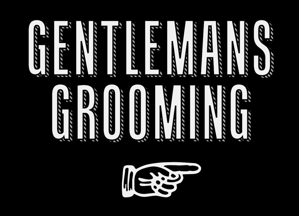
Typeface: Tandelle
HTML markup:
GENTLEMANS GROOMING
CSS:
.gentlemans-grooming {
  position: relative;
  font-family: "tandelle",sans-serif;
  font-size: 250px;
  color: #D9DEE5;
  line-height: 0.9;
  text-align: center;
  letter-spacing: 15px;
  background: -webkit-repeating-linear-gradient(-136deg,
    #A4A7AB 0px,
    #A4A7AB 1px,
    transparent 1px,
    transparent 2px
  );
  -webkit-text-fill-color: transparent;
  -webkit-background-clip: text;
}

.gentlemans-grooming:after {
  position: absolute;
  content: 'GENTLEMANS GROOMING';
  left: -20px;
  top: -7px;
  -webkit-text-fill-color: #f1f1f1;
  -webkit-text-stroke: 5px #000;
}

.gentlemans-grooming:before {
  content: '\261e';
  position: absolute;
  right: -30px;
  bottom: -260px;
  -webkit-text-fill-color: #f1f1f1;
  font-size: 340px;
  width: 310px;
  left: 52%;
  margin-left: -155px;
}
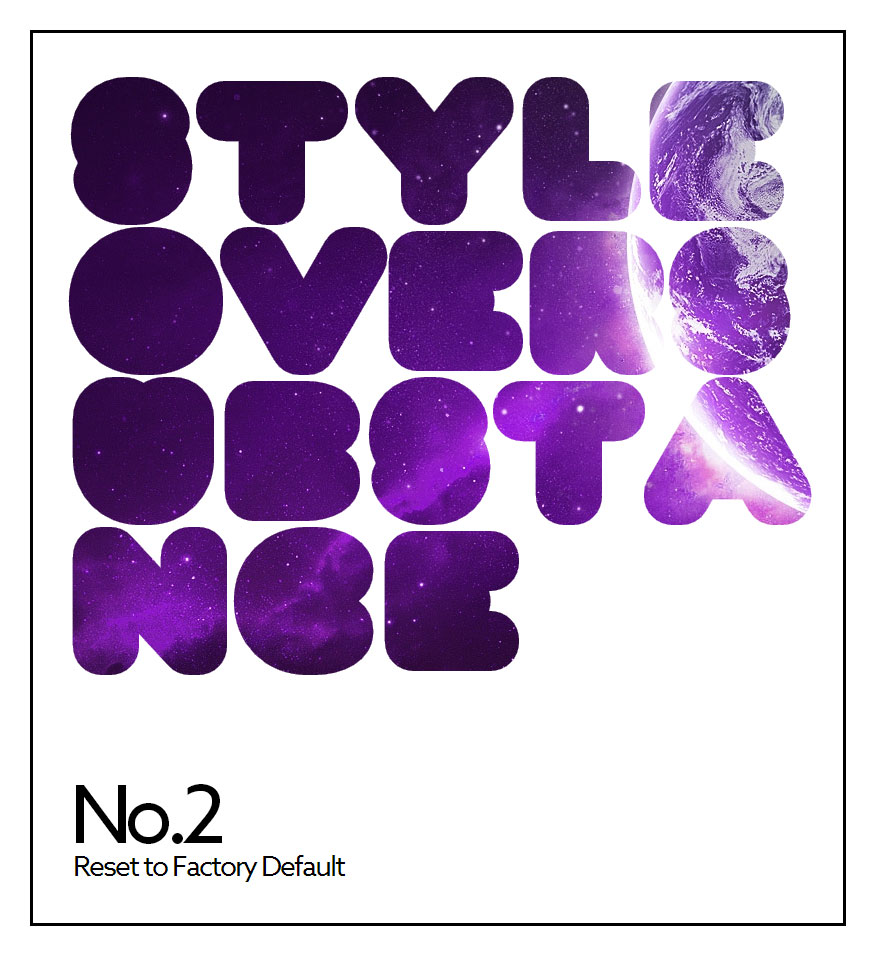
Typeface: Corpulent Web
HTML markup:
    S
    T
    Y
    L
    EOVERSUB
    S
    T
    ANCE
CSS:
.style {
  position: relative;
  font-family: "corpulent-web";
  font-weight: 800 !important;
  font-size: 200px;
  background: url(planets-1.jpg) -354px -607px repeat-x;
  -webkit-background-clip: text;
  -webkit-text-fill-color: transparent;
  letter-spacing: -8px;
  width: 755px;
  word-wrap:break-word;
  line-height: 150px;
  margin: 0;
  padding: 30px 25px 260px 30px;
  z-index: 3;
  border: 3px solid #000;
  margin: 30px;
}

.style:before {
  content: 'No.2';
  position: absolute;
  left: 37px;
  bottom: 30px;
  font-family: "azo-sans-web";
  -webkit-text-fill-color: #000;
  font-weight: 400;
  font-size: 80px;
}

.style:after {
  content: 'Reset to Factory Default';
  position: absolute;
  left: 40px;
  bottom: -20px;
  font-family: "azo-sans-web";
  -webkit-text-fill-color: #000;
  font-weight: 400;
  font-size: 28px;
  letter-spacing: -2px;
}

.s-1 {
  letter-spacing: -4px;
}

.t-1 {
  letter-spacing: 8px;
}

.l,
.y,
.t-2 {
  letter-spacing: 0px;
}

.s-3 {
  letter-spacing: -5px;
}
I had to do a little custom kerning on this one, so I wrapped a few letters and added specific letter spacing. A little extra work, but it paid off in the overall feel of the finished product.
Other CSS properties to look into
We’ve covered quite a lot here, but there are still more CSS properties we haven’t covered that can yield some interesting effects. Here are a few to get you started:
-webkit-box-reflect: below | above | left | right;- Use this to create some slick Apple-style reflections.
-webkit-font-feature-settings:- Use this to switch on ligatures and other font features when working with OpenType Fonts.
background-attachment: fixed;- This can be used to create some great scroll-to-reveal effects.
So there you have it. You are now armed and prepared to go out and make some awesome web typography of your own. Don’t be afraid to give things a try, experiment, and combine.
3 Responses
Comments are closed.
These are some absolutely awesome techniques – especially being able to make patterned shadows behind text.
I noticed however that in both the latest Chrome and Chrome Canary, the ‘Gentleman’s Grooming’ demo isn’t rendering correctly. It looks great in Safari. I thought I would point that out since it’s in your list of Webkit browsers.
Wow. Nice job guys. Such talent. Much awesome CSS.
The first example quantum strike reminds me of old computer games from the late 80’s, not a fan – but the 2nd example gentlemans grooming looks amazing