Subtle, textured headings with background-clip: text
This is the first in a pair of posts demonstrating the technique of using the CSS background-clip: text property to style headlines. We were lucky enough to get two different designers talking about this, and we loved hearing each of their experiences with it (and seeing the markedly different results!).
Behind the GV.com redesign
We began to talk about redesigning the Google Ventures website in mid-2013. When we brought it up with our partners, the most common response was, “already?”
The previous version of the website was only a year old. But things had been changing quickly at GV. We had new portfolio companies (like Uber and One Medical Group). New general partners (like Kevin Rose and MG Siegler). And we had produced a bunch of helpful new content for entrepreneurs (like our design sprint series and workshop videos).
It was time to redesign. We had a few goals:
- Explain the basics better. At 4 years old, we still weren’t doing a great job of explaining why we exist and where we invest.
- Present our team in a more useful way. Our old site showed faces and first names, but buried people’s accomplishments and expertise.
- Consolidate our content for entrepreneurs. We had four separate blogs, none of which were part of the GV website.
- Adopt a timeless visual style. We wanted a look we could live with for a few years.
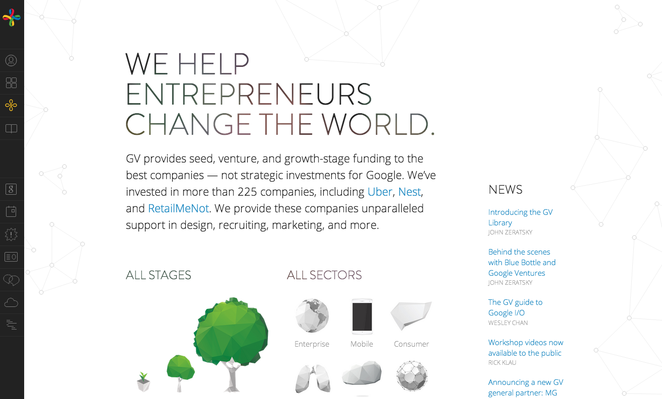
The redesigned GV.com website.
Creating a classic visual style
After three years of annual redesigns, we searched for a classic visual style that wouldn’t look old a year later. Some of our early prototypes were heavy-handed, but Daniel kept pushing us to remove elements and simplify styles. To avoid looking boring, we added details like the animated graph pattern and custom hand-drawn icons.
We designed the collapsible navigation bar early. It nearly disappears when closed, which keeps the page clean and dedicated to content. The large remaining canvas gave us plenty of space for articles, videos, and case studies.
Fitting headlines
Braden first noticed Brandon Grotesque at a restaurant in San Francisco:
“It reminded me of Arial Rounded, which was so over-used in Web 2.0, but signaled a ‘Comic Sans’-type friendliness. So I looked it up, and there it was: Brandon Grotesque!”
We started with heavier weights — typical for headlines. But after a few days, we felt like the headlines were dominating the pages. We made the headlines light weight and immediately loved it. Brandon Grotesque Light fit the austere yet refined style of the website. But we worried it was too cold. We started looking for ways to add soft, organic textures to the website.
Daniel is always on the look-out for inspiring design patterns and reference styles. He had noticed contemporary lifestyle brands (including Apple and Dove) using photos masked with text. We started experimenting, and found we could add subtle texture by using desaturated, blurred images. And the light weight of the headlines only exposed a bit of the image, so it wasn’t overwhelming.
After some experimentation, we loved the new headline style. Now we had to figure out how to build it.
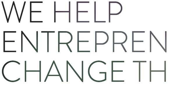
A closer look at the headline shows the subtle gradient.
How we built it
We marked up the headlines very simply: an with an optional class to specify a masked background image.
  We help entrepreneurs
  change the world.
(We use the nested to set line breaks in a screen-size-responsive way. For large screens, we control the line breaks by setting display:block on the .)
The CSS for masking images with text is simple. Most of our styles change the weight, size, and spacing of the headlines — the background mask only requires a couple of lines.
First, we set basic text styles for headlines:
h1 {
  font-family: brandon-grotesque, 'Helvetica Neue', Helvetica, Arial, sans-serif;
  font-weight: 300;
  text-transform: uppercase;
  line-height: 1em;
  color: #222;
}
Then we style the texture class, which gives headlines a masked background image.
h1.texture {
  -webkit-background-clip: text;
  background-clip: text;
  -webkit-text-fill-color: transparent;
  text-fill-color: transparent;
  background-image: url(/images/headline-texture.jpg);
}
Unfortunately, this technique only works in Chrome and Safari. We need to fail gracefully in Firefox, Internet Explorer, and other browsers. We use JavaScript to create a temporary div in the page and check whether background-clip exists. If it exists, we add the texture class to our h1s. It’s also possible to fall back in Mozilla, Internet Explorer, and Opera using CSS only (no JavaScript). Divya Manian wrote about a pure CSS fallback for background-clip that looks very good.
We tried a variety of background images in search of the proper texture. For a while, we used a photo of Braden! Our final image contains translucent circles on a dark background. We varied the hue and saturation between circles, but kept the brightness constant. (When the image contained too much contrast, our headlines were hard to read.)
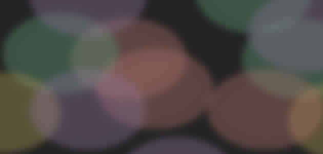
The design team chose an abstract background image for the headline styling.
Getting the details right
This kind of detailed design can be a lot of work, but it pays off when the result is effective and well-received. Collaboration is necessary — we combined visual design and web development to produce a unique and subtle headline style that will age well. We are happy with how the headlines turned out on GV.com, and hope you enjoy them too!
2 Responses
Comments are closed.
There are so many hiccups that occurs when trying to code for all browsers at once, it’s given me plenty of sleepless nights!
I really love the new design of GV. Very well done – the sidebar is unique too. Feels more like an app then a website.