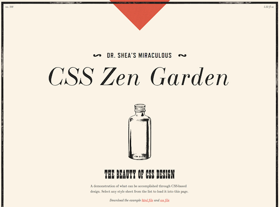
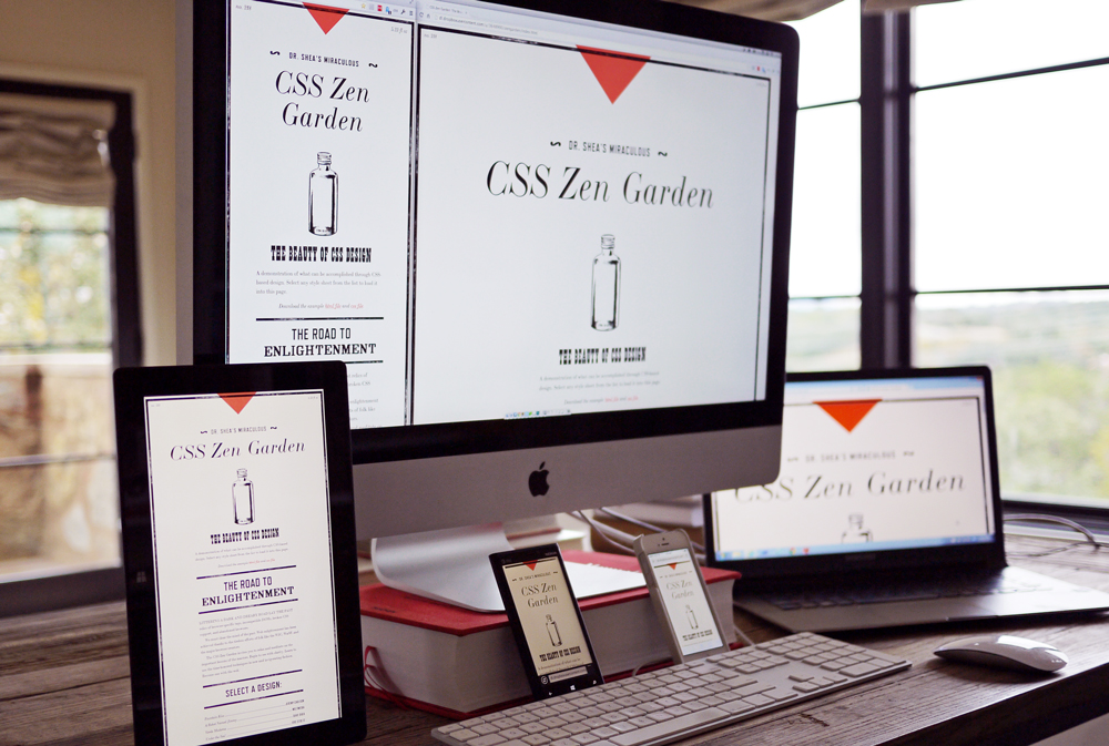
Typekit’s second CSS Zen Garden theme: Apothecary
Following our sponsorship of CSS Zen Garden, we’ve commissioned three CSS Zen Garden themes from different designers using fonts from Typekit. Our first theme was designed by Elliot Jay Stocks, and the second theme comes from designer Trent Walton.
It’s an exciting time to see CSS Zen Garden revitalized. For years it has demonstrated the power of CSS through a single CSS file. I believe that now, thanks to media queries, we are able to demonstrate that same power multiple times within a single file. Our layouts can change dramatically from viewport to viewport, and all we need is CSS.
Thrilled to see Typekit sponsor CSS Zen Garden, I wanted to pay tribute to the occasion by letting web fonts do most of the work in my Apothecary theme. Imagining labels on tonic and tincture bottles, I made my font choices:
- LTC Bodoni 175 by Lanston Type
- French Clarendon Ornamented & Grecian Light Face by Wood Type Revival
- Refrigerator Deluxe by Mark Simonson Studio
I wanted to have a wide range of eras represented: Bodoni goes back to the late 1700s while both Wood Type Revival typefaces come from the mid 1800s. I really like the inclusion of Refrigerator Deluxe, perhaps the oddball here, which takes its cues from the 1950s. It fits, yet creates an intentional confusion around where or when this thing comes from—which is exactly how I imagine one would feel after being handed a superlative-laden bottle of miracle cure from the local pharmacist.

On the more technical front, I put column-count and flexbox to use on the theme. Column-count allowed me to create wider sections while maintaining a sensible number of characters per line. Because most of the theme is one column, I used flexbox to move the design selection up on the page directly under the intro. I think it’s particularly helpful at the narrowest views—less scrolling to explore other themes.
File size is always a concern, and after Elliot went with no images and a sub-100k page load (darn good work), I knew I had to get serious. I focused my energy on optimizing the images as much as possible while retaining acceptable resolution. SVG didn’t work because the images were too detailed, so I went with 2-4 color PNGs. I also created the triangle shapes with CSS. Sure, it’s riskier on the browser compatibility front, but if you’re going to go for it, go for it in the Zen Garden. It paid off, because I ended up at 270kb for narrow views and 320kb for wider ones.

But that’s enough out of me. Take a look at the CSS file from my theme. Then, after you came up with 100 things you’d do differently, go and create your own theme. Happy gardening!
One Response
Comments are closed.
Looks great, nice clean layout.