Understanding Letters
In order to choose appropriate typefaces to set beautiful passages of text, it helps if we have a baseline for what constitutes ‘appropriateness’. The art and science of choosing a great typeface is in the details, and demands that we attempt to understand the fundamental building block of typography: a letter.
In his book The Elements of Typographic Style—a book I consider to be a must-read for any student of typography—Robert Bringhurst begins with this powerful phrase:
Typography exists to honor content.
If ever there was one sentiment to summarize everything ever written about typography, this is it. Some content shouts; other content whispers. Similarly, some typefaces shout while others whisper. Letters—and, by that, I actually mean glyphs—and the differences among them are what make this possible.
The right configuration of letters within the right combination of words set in the right typeface or typefaces sends the clearest messages. To see this in action, who better to study than the masters of letters: logo designers!
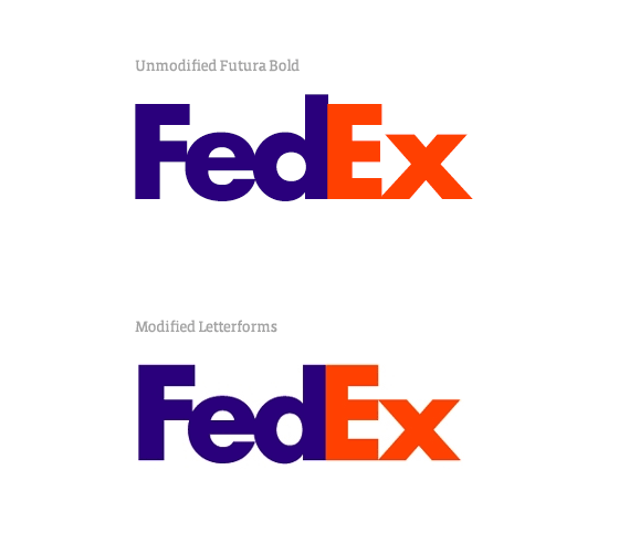
Perhaps the most pervasive example of a logo that demonstrates such a command of letters is the FedEx logo, designed by Lindon Leader. At first glance, it appears to be a standard employment of Futura Bold. However, upon closer inspection, it’s very clear how masterfully the letterforms were modified to create the desired shapes, most famously the arrow hidden between the “E” and the “x.”
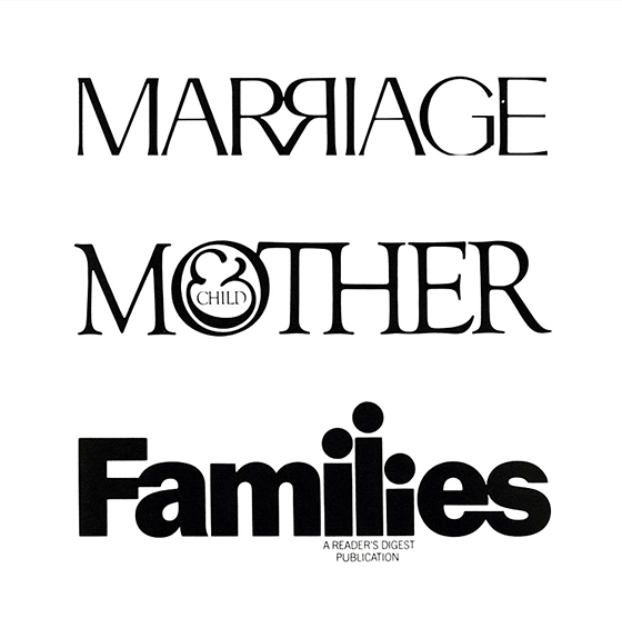
Some of my favorite logos were created by the late Herb Lubalin. To call him a master of typography is an understatement. He’s created some incredible pieces of design:
Guidelines for readable letterforms
Looking at and extrapolating from great examples can teach us some very useful lessons. Have a look at this beautiful logo by Volkan Eksi:
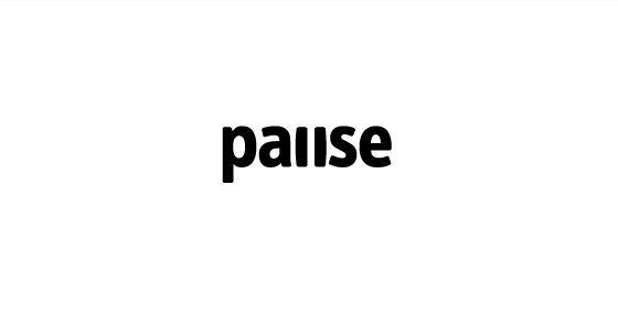
What a great balance of conceptual thinking without compromising readability! Why does this work so well?
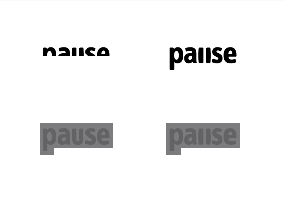
Let’s look at two variations that might make this clearer. As quickly as you can, try to read each version aloud:
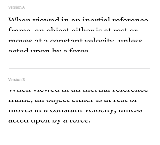
I’m betting version A was easier to read. (If you thought version B was easier, you probably have some special talents that you should be profiting from!) Version A is easier because the tops of English words are easier to read than the bottoms.
(For reference, here’s the full text.)
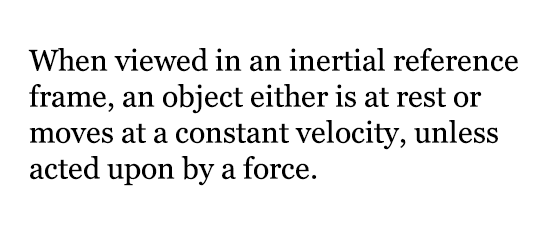
This demonstrates a valuable lesson: when modifying letterforms, it’s safer to modify the bottom than the top in order to preserve legibility. The shape of a word—which we’ll get into in just a minute—is generally more unique at the top because there’s more variation in ascenders and majuscules; keeping the top intact preserves that uniqueness. Notice that all of these great pieces of lettering have most of the ornamentation and variation at the bottom rather than the top.
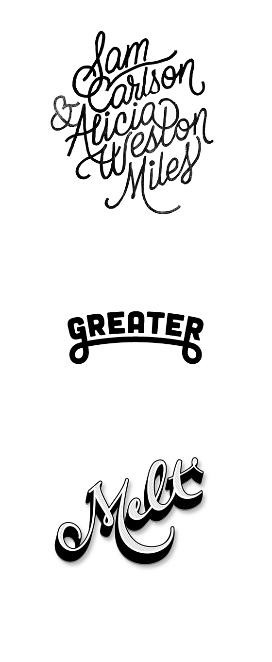
Credit: Wedding lettering by James T. Edmondson, Greater by Chandler Van De Water, Melt by Agency26
Let’s look at another example that makes a different point about readability:
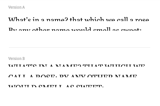
Version A again! (Seriously, you version B-ers really need to join the circus or something.) This one tells us that mixed case is easier to read than uppercase. The reason is because we don’t read individual letters—we react to the shapes of words. Years of reading have gotten us accustomed to what words actually look like. Uppercase text creates more rigid rectangles, decreasing readability because we lose more of the shape of the word.
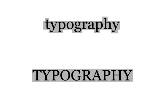
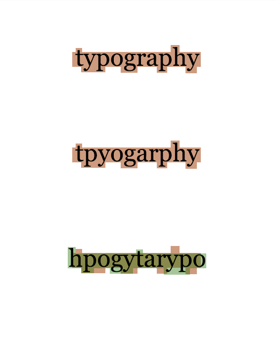
You may have seen an article passed around a while ago about readability. “Aoccdrnig to a rscheearch at Cmabrigde Uinervtisy, it deosn’t mttaer in waht oredr the ltteers in a wrod are, the olny iprmoatnt tihng is taht the frist and lsat ltteer be at the rghit pclae. The rset can be a toatl mses and you can sitll raed it wouthit porbelm. Tihs is bcuseae the huamn mnid deos not raed ervey lteter by istlef, but the wrod as a wlohe.”
The reason you can still read this relatively easily is that the word shapes generally don’t change. It’s no coincidence that words whose shapes change drastically are the most difficult to read.
So, back to the Pause logo we previously discussed. Why does it work so well?
- The modified “u” is only altered at the bottom of the letterform, not the top. Readability remains intact.
- The word shape was unchanged.
Given the simple guidelines we’ve discussed, you’re now equipped to start—or continue!—playing with letters without sacrificing legibility. Good luck!
You can catch Dan talking more about typography at his full-day workshop at Smashing Conference.
24 Responses
Comments are closed.
Fantastic Article!
Gorgeous lesson… thanks to typekit and other services we have the possibility to give weight to our content through typography. This can be overwhelming, so it’s important to learn as much as possible about typograpy. Thank you!
Gorgeous lesson… thanks to typekit and other services we have the possibility to give weight to our content through typography. This can be overwhelming, so it’s important to learn as much as possible about typograpy. Thank you!
A definite bookmark article.
Love, love, love this article. I’ve always been a huge fan of typography and how certain modifications can either make or break a word in terms of legibility. The FedEx logo is one of my favorites.
Hi Dan,
I’m not sure I can agree with some of the latter points in your article. In particular this section:
“The reason is because we don’t read individual letters—we react to the shapes of words. Years of reading have gotten us accustomed to what words actually look like. Uppercase text creates more rigid rectangles, decreasing readability because we lose more of the shape of the word.”
About a year ago I bought a book, “100 Things Every Designer Needs to Know About People”. One of the sections I remember was about this very topic. Susan mentions that the above is a popular myth. In fact, the reason uppercase text is harder to read is due to our unfamiliarity with it. Or, that is, how much more familiar with lower cases we are.
She also mentions we’re not looking for the shape of a word when we read, we’re piecing together our past knowledge and predicting what will come next. So in the paragraph that has words with mixed letters, we’re piecing together words in the beginning of the sentence to predict the end. And piecing together the pieces of the first sentences to predict the next.
She cites a few studies where she thinks we went off track and some studies that have tried to correct it. But the big doozy she mentions is a paper by Kevin Larson titled, “The Science of Word Recognition”. His conclusion is that it was all a grand misunderstanding of research that is often cited as support for word shape recognition.
“Word shape is no longer a viable model of word recognition. The bulk of scientific evidence says that we recognize a word’s component letters, then use that visual information to recognize a word. In addition to perceptual information, we also use contextual information to help recognize words during ordinary reading, but that has no bearing on the word shape versus parallel letter recognition debate. It is hopefully clear that the readability and legibility of a typeface should not be evaluated on its ability to generate a good bouma shape.”
Thanks so much for this comment, Josh! I haven’t read that book, so I’ll certainly pick it up to do more research.
I think, though, that we’re saying the same thing. I wasn’t really making the point that mixed case is INHERENTLY more readable; I was saying that we recognize it more easily. Or, said the way Susan mentions in the book per your description, it’s more familiar to us.
Readability has a lot to do with cultural context. Left-to-right reading is easier for societies that use Latin-based languages, but Arabic societies have the opposite experience. I’m sure that if our society switched to majuscule-only writing from now on, uppercase letters would be easier to read in a hundred years.
Thanks again for poking at this!
Always good to hear from Dan about typography!
Aw shucks. Thanks Liam!
Excelent article!!
rscheearch?
Whoops, that should have been “rseearerch.”
Great post, typography online doesn’t always get the same treatment that it does in print, but in recent times its getting alot more love.
Reblogged this on Why not wander… ? and commented:
Great read for a typography lover!
Hey! Thanks for this great article! It was very pleasant to read! Are there any tutorials to handle typography well with Adobe Illustrator which I can check out? Iam a beginner when it comes to logo design in general but I would love to learn!
Would really appreciate your help!
Great article! Thank You! I’ve translated the post into Russian:
http://habrahabr.ru/post/190910/
Dan,
Thank you for this precious contribution to good Typography.
Wow, Dan! Thanks for sharing this wonderful information!
Great article.
Great article and well illustrated, thanks!
Thanks for sharing this with us! The examples were wonderfully illustrated and took us right to the point.
I feel like I just read a book about typography. Thanks!
Great article.
In the bit showcasing the different word shapes, the last misspelled version of “typography” includes two o’s.
Brilliant, I love this article! It’s so well written and makes such good points. I never knew that letters were more readable at the tops, but it really makes perfect sense.