Sites We Like: Pitchfork’s Daft Punk feature, Nautilus, and Fabien Seguin
We talk about pairing typefaces all the time here, and it’s always inspiring to play with the ways multiple fonts can add visual interest to a page. In this week’s sites we like, we’re looking at a few pages that not only pair typefaces nicely, but also put visual design at the forefront. The results are inspiring.

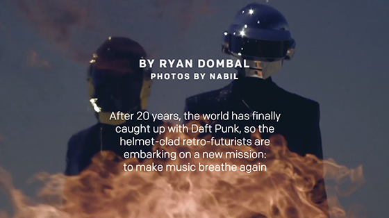
In most web contexts, FF Spinoza matches nicely with Colfax; it’s a traditional serif-with-sans pairing, but both typefaces are graced with a slightly edgy energy that makes them hum in combination. When it comes to Pitchfork’s feature story on Daft Punk, however, the designers clearly wanted something with more volume—and they accomplish this by incorporating that humming text with some fantastic and loud scrolling visuals. Ever seen a long-form article you could rock out to? This one comes pretty close.

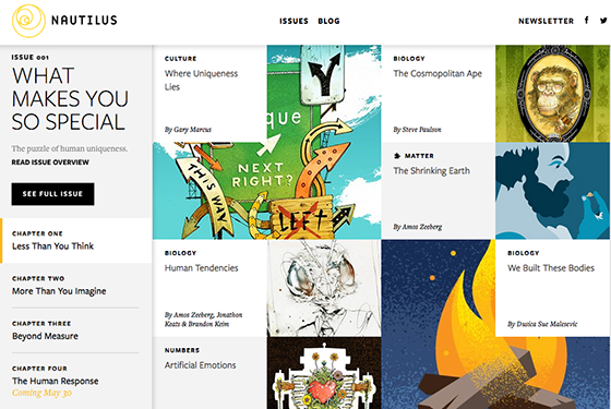
A gorgeous interpretation of what a popular science magazine can be, Nautilus introduces its first full issue with stunning graphics and thoughtful use of the Freight family. Freight Display and Freight Text both contribute to the airy, intelligent feel of the site. Bold visuals do the heavy, upfront communication, with this gentle serif text acting almost more as a side note, while Freight Sans takes on the bulk of navigational and headline duties.

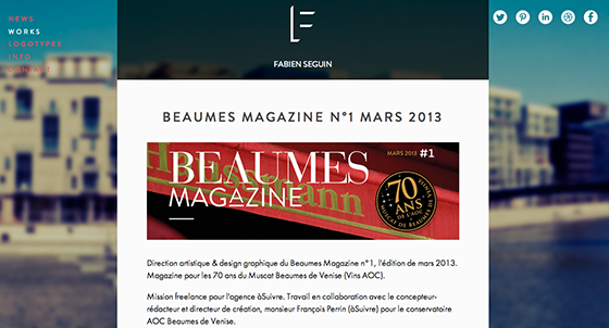
It’s a treat to see body text set in Futura PT, and designer Fabien Seguin uses this in an understated but effective pairing with Brandon Grotesque. It’s easy to overdo it with geometric fonts like this, but Fabien has a subtle touch that balances the text in his portfolio with a bold, entrancing background image and targeted splashes of color.
That’s it for this week; share sites you like in the comments!