Type study: Hi-DPI web typography
Our digital world is often a textual world. We take in information via news sites, blogs, and e-books. We communicate with our friends and co-workers via email, chat, Twitter, or Facebook. Some of us even use text to interact with the computers themselves via terminals and source code.
Most of our time using computers, smartphones, and tablets is spent reading and writing, and reading is one way the digital world becomes physical. Our eyes are physical organs that can get tired—especially if the text we spend hours looking at is rendered poorly. Because we read so much when looking at screens, it’s vitally important that the text before us is as readable as possible.
Hi-DPI displays can be a huge boon to readability. At first, high-resolution text can seem like a luxury — after all, modern operating systems are generally capable of producing good-looking text. But even though anti-aliased text on regular displays is much better than what came before, it’s still far more pixelated and “fuzzy” than print—and even the best, most screen-optimized text can strain the eyes over a long day of reading. In apps with hi-DPI support, text is rendered with less anti-aliasing (that is, less pixel “fuzz”) so letterforms are crisper and easier for the eye to distinguish. And in apps or on devices with this support turned on, you get all of this great, text-beautifying behavior automatically.
Historically, the fonts that look best on-screen at text sizes have been ones specifically optimized for that purpose, via hinting instructions. (Our own Tim Ahrens explained hinting and why it’s important in an earlier post.)
On hi-DPI displays, hinting is useful but far less important. Whereas a standard-resolution device needs the hinting instructions to avoid blurry lines and edges, hi-DPI devices—having many more pixels to work with—can make a font look crisper and more readable, at any size.
Not only does this make a wide range of unhinted or less-well-hinted fonts potentially available for screen use, it also broadens the range of weights one can safely use on screen. For example, at a standard screen resolution it might not be a great idea to use a very thin font such as Helvetica Neue Light or Source Sans Pro Thin. Most text rendering engines have a hard time rendering such ultra-thin lines at anything but large display sizes. Even as headings or titles (say, around 24 px size), text set in one of these fonts tends to look like a blurry spray of pixels.
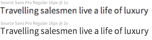
Light weights of Source Sans Pro at 1x resolution. The heading is set in Extra Light (200), body text in Light (300).
But at higher resolutions, light fonts can offer the same clean, elegant look as in print.
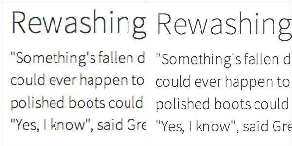
Comparison of Source Sans Pro light weights, as rendered at 1x (left) and 2x (right).
This gives web and app designers a much broader palette of type to work with, but also some new constraints to think about.
Consider the laptop
While most current smartphones have hi-DPI displays, many tablets and most PCs do not. And even as more platforms start to offer and support high-resolution screens, the way that they are supported can vary a lot from platform to platform, or even from device to device.
With so many different kinds of screens out in the world, I find it helpful to establish a good, working definition of what makes a device “hi-DPI” or not. In general, a device is hi-DPI if it has both of these things:
- A display with a (relatively) high pixel density, say, over 200 pixels per inch (PPI) for mobile devices or over 150 PPI for laptops.
- Pixel scaling, where the on-screen graphics are rendered using extra physical pixels so that they appear sharper and clearer than on a standard display.
Pixel scaling works by turning the pixel from a physical unit of measurement—measuring a number of actual, physical pixels—into an abstract one. That is, what we’re used to thinking of as “1px” might be rendered onto the screen using more than one physical pixel.
The best way to understand these new, abstract pixels—which Peter-Paul Koch calls CSS pixels—is relative to the viewport. For example, on an iPad with Retina display, the screen (when held in portrait orientation) may be 1,536 physical pixels wide, yet Safari will report the width of the browser viewport as just 768 CSS pixels, just like the non-Retina iPad 2. The number of physical pixels per CSS pixel is called the device pixel ratio or scaling factor.
While it’s tempting to think these two things—high density displays and pixel scaling—always come together in a device, let’s consider the Asus Zenbook Prime, a Windows 7-based laptop released in 2012. The 13.3″ Zenbook’s display resolution is 1920×1080 pixels, which works out to a hefty 168 PPI. (As if that weren’t crazy enough, Asus also sells an 11.1″ Zenbook with the same screen resolution, which works out to 189 pixels per inch. Yikes!)
At the time of writing, both Zenbooks ship with Windows 7 installed, which has no hi-DPI mode, so web type sized at 16 pixels in CSS is rendered at the normal 1x scale—i.e., with 16 physical pixels. This is how most computers work, of course, but that’s because most computer displays (on both laptops and desktops) shipped in the last decade fall into the same comfortable 96–115 PPI range. (As far as Windows 7 knows, the Zenbook’s screen is a 24″ desktop monitor.) On one of these typical displays, 16px web type renders at around 0.14 inches, or just over 10 pt, which is a more or less decent size for reading.
On the Zenbook’s high-density display, however, the same text is just 0.09 inches high, or 6.48 pt—49% smaller.
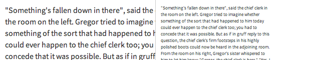
This simulated example shows the difference in physical size between 16px web type rendered on a “normal” display (left), versus the high-density display on the Asus Zenbook (right). As you can see, the Zenbook text is 49% smaller.
That’s a big difference, especially when you consider that these two laptop screens are the same physical size. Unlike a tablet or smartphone, readers are unlikely to hold a laptop screen closer to their eyes. And unfortunately, because of Windows 7’s lack of support for hi-DPI displays, there’s no way for us as designers to detect the Zenbook’s high screen resolution and respond accordingly.
The value of pixel scaling, beyond making it possible to deliver higher-quality graphics to our users, is that it gives us a framework for understanding how devices are different from one another so that we can provide the best experience. Most of the hard work is done for us by the operating system, by scaling type automatically to an appropriate, readable size.
However, there are still some things we can and should do in the hi-DPI era to ensure a great reading experience for all users. Using CSS media queries, we can show users the most appropriate font for their screen resolution, and improve readability on screens with no pixel scaling by increasing the font size based on the viewport width.
Responsive, hi-DPI typography
As I mentioned earlier, hi-DPI displays make it possible to use lighter text weights, and to use them in more places. For example, on a Retina display paragraph text set in a light (300) weight can look cleaner, more readable, and just prettier than at the normal weight. However, on standard displays, that lighter text will be even more anti-aliased than normal, making it less readable.
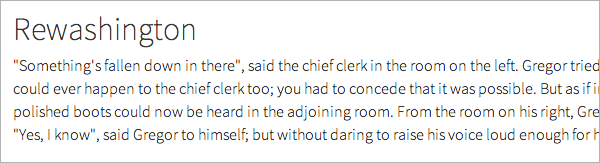
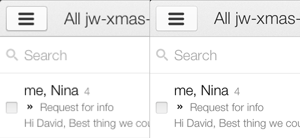
Here’s an example from the Gmail mobile site. Much of its UI text is set in Helvetica Neue Light, looking thin but readable on Retina displays, but very pixelated on regular displays:
The solution to this and other problems can be found in responsive web design: use CSS media queries to set the most appropriate typeface, weight, and size for each kind of screen.
Because hi-DPI browser support is still fairly new, there isn’t yet a standard media query for detecting hi-DPI displays. However, all major browsers do support at least one syntax for detecting screen resolution, and you can combine the most common syntaxes to produce a “bulletproof” query for styling hi-DPI web content.
The CSS code below sets body text at a normal weight on standard-resolution displays, but switches to a lighter weight on hi-DPI displays:
.body-text {
  font-weight: normal;
}

@media only screen and (-webkit-min-device-pixel-ratio: 1.5),
        only screen and (-o-min-device-pixel-ratio: '150/100'),
        only screen and (min-resolution: 96dpi),
        only screen and (min-resolution: 1.5dppx) {
   font-weight: 300;
}
(If you’re using Sass, you can save some typing by wrapping this in a mixin. Here’s a Gist showing how to set it up.)
Responsive typography also affords us at least one option for handling devices like the Zenbook, which have very high resolution screens but no hi-DPI support. As I alluded to earlier, what makes the Zenbook such a strange device is that it’s a small screen (an ultraportable laptop) that, due to its pixel density, behaves like a very big one (a TV or desktop monitor). We can adapt to it, however, through a bit of forced-perspective trickery, by treating it as a big screen seen from far away.
First, following Ethan Marcotte’s advice in these very pages, start by sizing type and other elements with relative units, such as ems, rems, or percentages. On most devices, the default 16px (or 100%) font size on the body element will be the right size. But on very wide screens, we’ll increase the body font size by 25%.
body {
  font-size: 100%;
}

@media screen and (min-width: 1200px) {
  body {
    font-size: 125%;
  }
}
Now, if someone using a high-density laptop (or even big-screen desktop) visits our site, and their browser window is maximized (which is fairly common), this media query will help improve readability by simply making the type larger. If all our other measurements are specified relative to the body text size, everything should scale up to fit, maintaining a consistent design that also adjusts itself to the user’s device. While not as nice a reading experience as true hi-DPI rendering, this large-print version of our web site does what it can to make text more readable and, in turn, avoid or alleviate eye strain.
Above all, the best way to make sure your web sites are readable is to test them on as many different kinds of screens as possible. Media queries are wonderful tools for responding to strange new devices, but only by using — rather, reading — your site on different screens can you find out which responses are necessary and useful. Choose a page of your site and read it on your computer, then read it again on your phone. Look at it on a standard display and on Retina displays. As you read, look out for the aspects of the reading experience that feel uncomfortable, compare those aspects across different kinds of screens, and adapt accordingly.
3 Responses
Comments are closed.
I don’t usually like to be negative, but I find the main point of this article to be really depressing. Not only do we have to have a suite of phones and tablets to test on, but now we’ve got to factor in laptops in a variety of different resolutions too.
I’ve got a modest collection of devices that consists of different Mac, Windows and Android laptops, desktops, tablets and phones, but apparently that’s just not going to cut it anymore. 🙁
This also underlines a commercial point and a growing concern I’ve had for some time —client expectations have naturally changed with respect to the prevalence of the mobile user and similarly Hi-DPI screens; as have my own expectations of the work I do, however, the rates I can expect to achieve in order to remain competitive for the additional work are disproportionate to the extra work involved. Don’t get me wrong, I —like 99% of the other designers out there, am in it for love not money but the fact remains we have to maintain a living and the trend is worrying (…well this is the view of a freelancer with the resource of just one anyway!)
“In apps with hi-DPI support, text is rendered with less anti-aliasing (that is, less pixel “fuzz”) so letterforms are crisper and easier for the eye to distinguish.”
Do you mean less aliasing?