Type study: A responsive 3D text effect
Type study is an ongoing series of guest posts about typography on the web. In this article, we hear from Russ Maschmeyer on a nifty trick for creating a responsive 3D text effect.
While perusing the Lettering.js website, I saw this example post by Trent Walton. When I saw that dynamically-generated graphic and the words “My site is responsive,” I assumed those letters would fold and unfold like an accordion to accommodate any browser width. Suddenly all seemed right and good in the world.
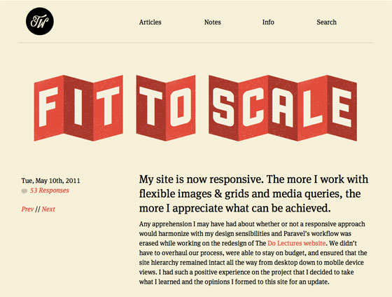
Trent Walton’s inspiring blog post.
Alas! As I pushed and pulled on my browser’s window pane, the graphic folded not. But what a great idea! Why hadn’t it been done? My life had new purpose. The result was foldup.js.
Foldup.js works with jQuery and Paravel’s Lettering.js to create an adaptive folding and unfolding effect for headlines, body copy, or any other text deemed worthy. Let’s walk through how to use it.
Example
Before we begin, let’s see it in action; the demo works in Safari, Chrome, Firefox, and Opera, but not Internet Explorer. (Think of it as an experiment.) Be sure to stretch and squish your browser’s window pane to really get the full effect.

The demo, at a wide browser width.
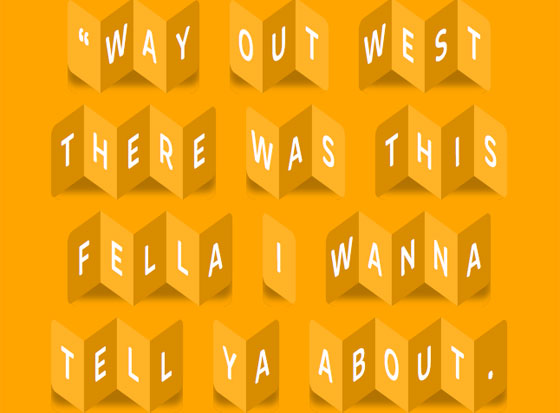
The demo again, but at a narrow width; the letters fold like an accordion.
Getting started
The goal is to get this working with as little HTML as possible, so, we’ll start very simply:
Hello World!
We’ve created an We’ve got our content marked up, so it’s time to add some CSS so that our letters and words look and behave properly. First, we’ll set the body background to orange ( Next, we’ll style the element to be folded up. In this case, we’re going for large, uppercase, and center-aligned for our folded letters. Now for the fun part. Lettering.js will dynamically wrap each word in its own span and label them sequentially (e.g. Lettering.js will also wrap each letter of each word in its own sequential span element. We can reference these new child letters using another child selector: The last three lines of CSS combine child selectors and pseudo selectors to round the corners of the first and last letters in each word; if there’s only one letter in the word, it rounds both the left and right side of the single letter. Now that we’ve got our content and style prepped, it’s time to make it dynamic. First, let’s add our script files to our HTML document, like so: The first two document, added a generic style sheet called style.css, and created a foldup to that paragraph. This will allow us to identify which elements on the page we actually want to fold up.
Adding style
#ffa500) and declare our font stack — featuring Brevia, plus some appropriate fallback fonts. Next up, we want to set up a responsive, centered page to put our text in. We’ll give our #page element a width of 80% and center it with margin: 0 auto.
body {
background-color: #ffa500;
font-family: brevia, helvetica, verdana, sans-serif;
}
#page {
width: 80%;
margin: 0 auto;
}
.foldup {
text-transform: uppercase;
font-size: 3em;
text-align: center;
color: #FFF;
}
.word1, .word2, .word3, etc.). We can then use the child selector (.foldup > span) to style every span element within .foldup without having to know how many there are going to be. We’ll also set a display property of inline-block to keep long words from breaking into two lines and use margin: 20px 10px to set both the line height (20px) and the word spacing (10px).
.foldup > span {
display: inline-block;
margin: 20px 10px;
border-radius: 12px;
}
.foldup span > span. We’ll again set display to inline-block; next, we’ll set the width for each letter to 1.5em to make sure they have a consistent width which adjusts appropriately to the font size. We’ll also set the top and bottom padding to .2em and set position: relative; the latter allows us to adjust the vertical position of the letters with our JavaScript for the accordion effect. If you also wanted to add a background texture to each letter, this would be the place to do it!
.foldup span > span {
display: inline-block;
width: 1.5em;
padding: .2em 0;
position: relative;
}
.foldup span > span:first-child {
border-radius: 10px 0 0 10px;
}
.foldup span > span:last-child {
border-radius: 0 10px 10px 0;
}
.foldup span > span:only-child {
border-radius: 10px;
}
Making it happen
(function(){
var foldEverything = function(){
$('.stranger').foldup();
}
$(document).ready(foldEverything);
$(window).resize(foldEverything);
})();