Five new display fonts from Porchez Typofonderie
Today we’re delighted to welcome five more typefaces from Porchez Typofonderie to the Typekit library. They’re meant for display use, so we serve them with PostScript-based outlines for optimal rendering at large sizes.
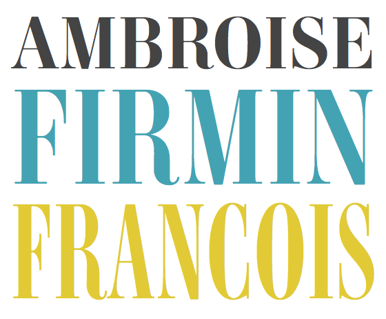
Top to bottom: Ambroise STD, Ambroise Firmin STD, Ambroise Francois STD
Two condensed styles now join Jean François Porchez’s popular Ambroise STD in the Typekit library: Ambroise Firmin STD (five weights) and Ambroise Francois STD (four weights). While family resemblances are evident throughout, it’s clear that each width was designed for its own level of formality. Just look at the tail of the capital R — the more it curls up, the more self-aware and authoritative the typeface.

Top to bottom: Allumi STD Extended Bold, Black
With equal parts sport and heft, Allumi STD Extended is a wide-bodied sans with machined curves and laser cuts. Choose from among its nine weights, from Extra Light to Black, to find the perfect tone, or combine several for different needs while maintaining family consistency.

Top to bottom: Parisine STD Clair Regular, Parisine STD Sombre Regular Italic, Clair Regular (left), Sombre Regular (right)
Parisine STD Clair is a simple, elegant sans with an expressive (and hefty) counterpart, Parisine STD Sombre. Both styles come in two weights, with italics. To compare these two styles of Parisine is to study the economies of designing a type family with extreme weight differences, while maintaining a family affinity. The counters not only differ in shape, but shift their balance; the contrast increases with thickness; and the letterforms bend, not only to accommodate thicker strokes, but to preserve the balance between positive and negative space. Observing these differences allows you to use them to your advantage when designing.
Upgrade to a Portfolio plan or higher to access all of these new fonts from Porchez Typofonderie. If you’re already a Portfolio plan customer, enjoy! If you’ve never given Typekit a try, sign up — it’s free! Upgrading is easy, whenever you’re ready.