Another classic comes to Typekit: Franklin Gothic URW

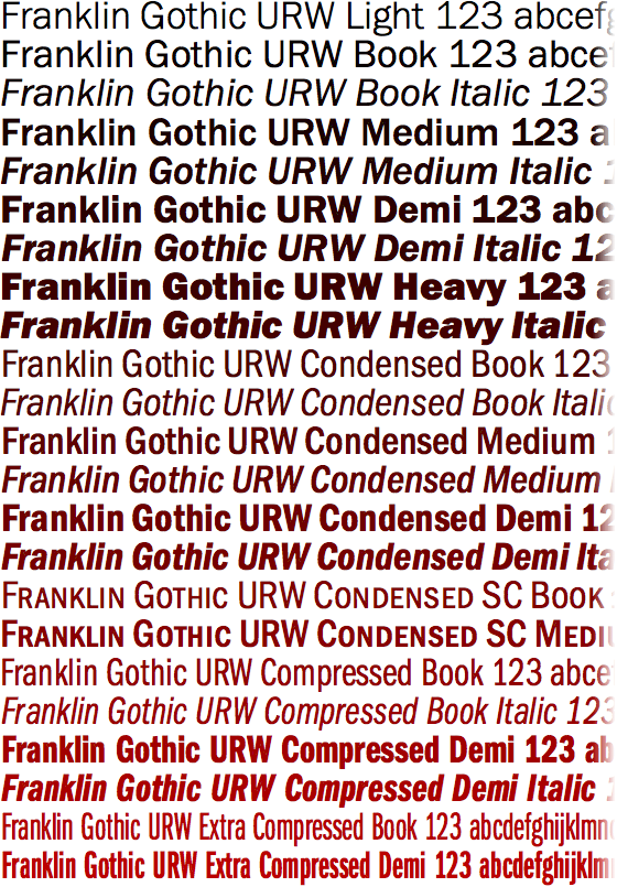
Today we’re excited to announce that Franklin Gothic from URW++ is now available on Typekit. Among the oldest of American sans-serifs and the most popular typefaces in history, its character is indisputable. Among web fonts, it’s an instant classic.
Inspired by then-new German sans-serifs like Akzidenz-Grotesk, Morris Fuller Benton designed Franklin Gothic in the early twentieth century for the American Type Founders. Synonymous with industry and manufacturing, this working-class typeface satisfied innumerable printing needs thanks to its availability in incremental weights and widths, which allowed printers to maintain design concepts while making practical decisions at the press. And Franklin’s utility persists in pixels.


Franklin Gothic URW Book (left) and Compressed Demi Italic (right), both on Windows XP
Franklin is comprised of twenty-three styles overall, including condensed (with small caps), compressed, and extra compressed widths. The normal and condensed widths are served with manually hinted TrueType outlines, for crisp rendering at small sizes. The compressed and extra compressed styles are served with PostScript-based outlines for the best possible rendering results at display sizes.
Suggested pairing: Franklin Gothic with Alternate Gothic and SchoolBook

Top to bottom: Alternate Gothic No. 1, Franklin Gothic URW Condensed Demi, SchoolBook Web Regular
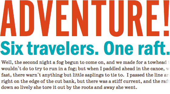
Try pairing Franklin Gothic with Alternate Gothic No 1 (see also, Nos 2 and 3), also from URW++. They were literally made for one another. Morris Fuller Benton designed Alternate Gothic as a narrow bold for Franklin, an alternate to its wider bolds. ParaType’s SchoolBook, also designed by Benton, makes a historic and stylistic match for text.
Suggested pairing: Franklin Gothic with Adobe Caslon

Top to bottom: Adobe Caslon Pro Italic, Franklin Gothic URW Compressed Book Italic, Franklin Gothic URW Book
Adobe Caslon works well with Franklin, too. These faces are stylistically different, but both possess a proportional elegance, and both were born of workroom practicality. As with many exercises in pairing type, pay close attention to negative space, typographic color, and relationships between thick and thin.
Upgrade to a Personal Plan or higher to take advantage of Franklin Gothic URW. If you’re already a paying Typekit customer, enjoy the new fonts! If you’ve never given Typekit a try, sign up (it’s free) and upgrade to a paid plan whenever you’re ready.
One Response
Comments are closed.
The hinting on this is seriously good!