New from Typekit: Improved rendering for Ratio and Proxima Nova
At Typekit, we expend a great deal of effort on optimizing fonts for the web. In particular, improving font rendering via “hinting” is as much an art as it is a science, and we constantly work to find the right balance between how much time we invest to improve a font and how quickly we can release those fonts to our customers. Fortunately, one of the benefits of a hosted font service like Typekit is our ability to release updates, allowing us to iteratively improve upon font rendering so that the fonts you use just keep getting better.
In that vein, we’re pleased to announce that two popular Typekit typefaces have been improved via TrueType hinting by our resident type designer and font scientist, Tim Ahrens.
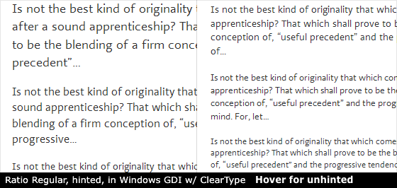
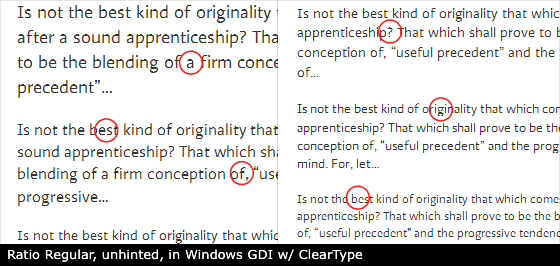
Long a part of the Typekit library, all twelve weights and styles of PS Type’s Ratio have now been TrueType hinted to render well at text sizes in Windows browsers. If you already use Ratio, just republish your kits to receive the latest files.
Top left: Regular; top right: Italic; bottom left: Semibold; bottom right: Semibold Italic.
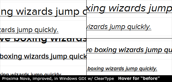
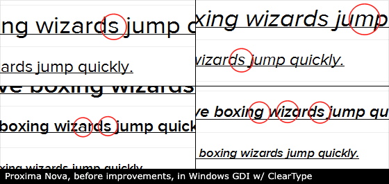
Mark Simonson’s Proxima Nova has always rendered well at paragraph and subhead sizes, thanks to Mark’s work to TrueType hint it. But there were a few subtle details that we thought could use refinement, so we showed Mark some proposed adjustments. He approved. Proxima Nova now renders even better. Again, republish your kits for the latest files.
A detailed look at how we optimize fonts
We’ve talked about TrueType hinting before, as well as our work to serve PostScript outlines for some fonts. Deciding between these two tactics depends upon the design of the font and its intended use. We seek TrueType hinting if a typeface is meant for paragraph use, because there is a striking improvement in clarity at small sizes in Windows browsers. Similarly, we serve PostScript-based outlines to Windows browsers if a typeface is meant for use at large sizes.
Making these decisions means working closely with our foundry partners and sharing what we learn. It also means taking a very close look at font files with the utmost respect for the typeface’s design integrity, and with a keen eye toward efficient and gradual improvements.
In the coming weeks, Tim Ahrens will explain what it means to optimize font files for the web. Stick around, subscribe to our RSS feed, and follow @Typekit on Twitter to be notified as we publish each post in the series.
5 Responses
Comments are closed.
Most excellent, thank you! That two-story ‘a’ in Proxima Nova will terrorize me no more! 🙂
Yay! Always very excited to see fonts get improved rendering on Windows. Now.. any chance of trying to improve Le Monde? 🙂
Lovely work
Thanks so much! Proxima Nova is looking great in Windows now.
Really great looking improvements. Look forward to seeing much more of this type of attention to detail.