Alternate Gothic from URW++

Top to bottom: Alternate Gothic No 1 D, 2 D, and 3 D
In the early twentieth century, Morris Fuller Benton designed Alternate Gothic — a condensed counterpart to the historically popular Franklin Gothic. Today, we’re glad to bring his newsworthy legacy to the web, in Alternate Gothic Nos. 1 D, 2 D, and 3 D from URW++. All three widths of Alternate Gothic are best used at large sizes, and we serve them optimized for such use. So the need for a compatible text face is inevitable. Let’s consider a few options.
Suggested pairing: Alternate Gothic with SchoolBook

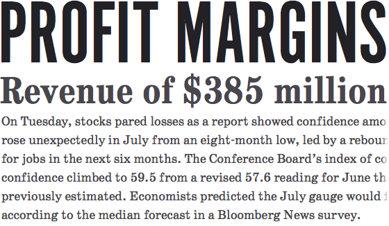
Top to bottom: Alternate Gothic No 1 D, SchoolBook Web Condensed Bold, SchoolBook Web Regular.
ParaType’s SchoolBook is based on a version of Century Schoolbook, another typeface by Morris Fuller Benton. It shares Alternate Gothic’s early American roots, and the family has a couple of condensed styles, too. These two typefaces have a storied history in twentieth-century commercial printing.
Suggested pairing: Alternate Gothic with FF Dagny

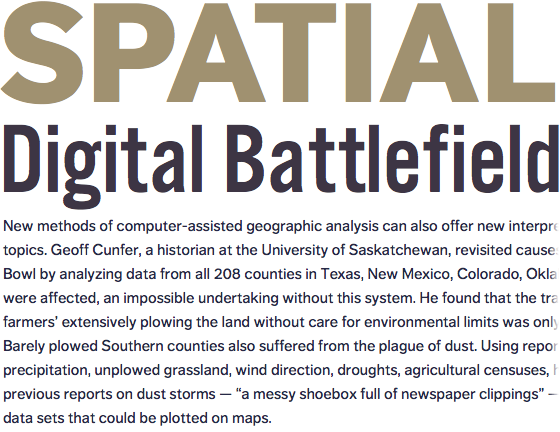
Top to bottom: FF Dagny Web Pro Black, Alternate Gothic No 3 D, FF Dagny Web Pro Regular
FF Dagny was released by FontFont in 2009 and is based on a typeface commissioned for Sweden’s largest daily newspaper. It shares Alternate Gothic’s rhythm, compact descenders, and sharp corners, but its round letters feel more natural. It’s newsy, but comes from a different cultural and historical perspective than Alternate Gothic.
Suggested pairing: Alternate Gothic with Chaparral

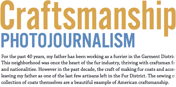
Top to bottom: Alternate Gothic No 2 D, Alternate Gothic No 3 D, Chaparral Pro Regular
Or perhaps try something quite different, based entirely on visual compatibility and contrast. When paired with Alternate Gothic for headlines, Adobe’s Chaparral echoes the old timer’s dusty workroom aesthetic, while its heft and spring set an inviting tone beneath Alternate Gothic’s stoicism.
Upgrade to a Personal Plan or higher for access to the three widths of Alternate Gothic. If you’re already a paying Typekit customer, enjoy the new fonts! If you’ve never given Typekit a try, sign up — it’s free! Upgrading is easy, whenever you’re ready.
12 Responses
Comments are closed.
It’d be great to see “suggested pairing” as a regular feature here. (It would be even better to suggest compatible typefaces when looking at a font in the library.)
@Dan big 2nd!
Maybe even a common pairing feature, which shows the most common pairings of other typekit users.
+1 Would love to see pairings as a regular feature.
the lack of font-pairings is the only reason I’m not a paying customer yet… I would love to see suggested pairings, or pairings based on other users.
Surprised to see that you are not eating your own dog food. Why don’t you use Type Kit for the examples in your blog?
+1 For the font pairings. Can we see this more often please?
You just made the dreams of a million designers come true =) I def love the font pairings as well. +1 for font pairings in the font browser too
Also love the font pairing idea. I do like playing around and coming up with pairings, but what a great way to ease people into the idea.
I’ll agree with everyone on suggested pairings, but also echo Ephraim regarding the examples – it’s always struck me as odd that Typekit uses images for their type samples.
But then I also find it strange that nearly all the text on the site is set in Arial and Georgia…
Tim, you should add URW Grotesk by Hermann Zapf! A good mix between Zapf design and Futura. http://www.identifont.com/show?62M
+1 for the font-pairing. As a paying user, I have been waiting for this feature for a long time. Every font should have suggested pairings.