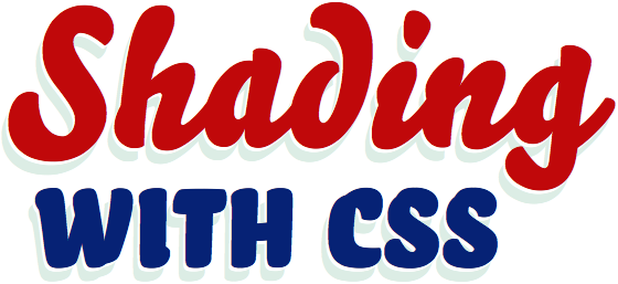
Shading with CSS text-shadows

Last Thursday in New Orleans I attended a glass gilding workshop with John Downer and Leonard Otillio, part of TypeCon 2011. It was excellent, and I cannot recommend the experience highly enough. As a web designer, it felt great to use physical materials. And to be around John and Leonard, such careful stewards of their craft, was an education I could abstract; it’s easy to see opportunities for similar craftsmanship in the subtle and practical details of web typesetting.
During the workshop I picked up a few sign painting terms that were new to me, and relevant to web designers as browser support for CSS text-shadows becomes more widespread. Check out these various shading techniques on the demo page I made to accompany this post. Each of my examples uses multiple text-shadow values, which is pretty well supported (and even possible in Internet Explorer), but I encourage you to design with progressive enhancement in mind.

Bello Pro with a relief shade
h1.drop .relief {
  font-family: bello-pro, serif;
  font-weight: 400;
  background-color: #3a50d9;
  color: #e0eff2;
  text-shadow: -4px 3px 0 #3a50d9, -14px 7px 0 #0a0e27;
  }
The drop shade is a technique with which web designers are already familiar. There is a clear separation between the text and its shadow. It is as if the text is made of cut paper, floating above a surface. With a relief shade, there is a visible gap between the letter and its shadow. A relief shade can be achieved using two text-shadow values — one nearer to the letterform, and matching the background color. If the background is something other than a solid color, this won’t work.

Freight Sans Pro with a two-toned close shade
h1.close {
  font-family: freight-sans-pro, sans-serif;
  font-weight: 900;
  background-color: #fff;
  color: #202c2d;
  text-shadow:
    0 1px #808d93,
    -1px 0 #cdd2d5,
    -1px 2px #808d93,
    -2px 1px #cdd2d5,
    -2px 3px #808d93,
    -3px 2px #cdd2d5,
    -3px 4px #808d93,
    -4px 3px #cdd2d5,
    -4px 5px #808d93,
    -5px 4px #cdd2d5,
    -5px 6px #808d93,
    -6px 5px #cdd2d5,
    -6px 7px #808d93,
    -7px 6px #cdd2d5,
    -7px 8px #808d93,
    -8px 7px #cdd2d5;
  }
With a close shade, the text shadow is connected to the text, which appears to give the letterforms thickness. Sign painters often include lighting effects too, varying the hue and value of a shade’s colors depending on where the hypothetical light source is positioned. This can be a particularly cool effect on storefront signage when the close shade is in sync with natural sunlight the sign receives. The close shade above uses diagonally staggered text-shadows in two different colors, so that the letters appear to have dimensional lighting applied.
I use the same staggered text-shadow technique for the printer’s shade below, with one small difference: toward the middle of the stack of text-shadows, I add a subtle blur. This smoothes out some of the LCD striping artifacts, and gives the type a painterly look.

News Gothic STD with a slightly blurred, two-toned printer’s shade
h1.printers {
  font-family: news-gothic-std, sans-serif;
  font-weight: 400;
  font-style: italic;
  background-color: #edde9c;
  color: #bc2e1e;
  text-shadow:
    0 1px 0px #378ab4,
    1px 0 0px #5dabcd,
    1px 2px 1px #378ab4,
    2px 1px 1px #5dabcd,
    2px 3px 2px #378ab4,
    3px 2px 2px #5dabcd,
    3px 4px 2px #378ab4,
    4px 3px 3px #5dabcd,
    4px 5px 3px #378ab4,
    5px 4px 2px #5dabcd,
    5px 6px 2px #378ab4,
    6px 5px 2px #5dabcd,
    6px 7px 1px #378ab4,
    7px 6px 1px #5dabcd,
    7px 8px 0px #378ab4,
    8px 7px 0px #5dabcd;
  }
A printer’s shade, to the right and on the bottom of letters, is something sign painters only occasionally use — because shades on the right sides of letters generally take more brush strokes to achieve. This is not a problem for printers (or web designers), and for that reason we don’t avoid it. But most styles of sign painting shade (see every other example in this post) appear to the left and on the bottom of letters.
Heirloom terminology like this helps us remember where we came from. Although browsers have only just begun to support CSS3, graphic design mechanisms like text shadows aren’t a new thing. We have boundless precedent on which to rely, if we know where to look for inspiration.
44 Responses
Comments are closed.
Hat-tip to you for helping push web design/development towards a craft that respects its history!
Thanks Corey, that means a lot to me.
I would recommend shadows to the bottom right, not the bottom left.
Explain your rationale, please.
Surely it depends on the time of day?
I’ve actually noticed that I will draw my shadows and such based on where the actual light in the office is coming from. Took a while to figure that out because I always wondered why sometimes I drew them left, sometimes right without ever really thinking about it.
@LeeKowalkowski i had to make an account just to LOL at that. hehehe
You’re doing it wrong. You’re supposed to put shadows on all paragraph/body text if you’re going to make a modern website.
is this guy serious? duh
Haha, I always have the same thought, Jeff. 😉
Great articles. I always knew CSS had great power, but never knew these text-shadow techniques until now. You can basically do anything with CSS which is great. I can’t wait for CSS3 to be fully compatible with all browsers!
Thanks for this!
Great article. Love the retro feel of these examples. My text-shadowing script that you link to has a small bug that prevents pages with Typekit accounts applying the text-shadows appearing in IE, but can be easily fixed. Gives me an excuse to buy a Typekit account! 🙂
Everytime I walk down the older street in Toronto, I always see signs that contain these type of shadows on storefront signs. Great to see I’m not the only web dude seeing text-shadows everywhere.
D’oh! Thanks for speaking up, Zoltan. Let us know how we can help.
Fantastic tutorial. Typekit and its support just keeps getting better and better.
I have long used Photoshop layer effects to create subtle drop shadows for emphasis and legibility (over images) in on-screen or projected presentations. Great to see it can be done in CSS as well, especially the very cool techniques you used to make dimensional type.
I learned graphic design from a typesetter, and his obsession with readability and beautiful type have never quite left me.
Great tutorial Tim, i guess i purchased my Typekit subscription at the right time 🙂
Amazing Post :=) I like the Shadow of ” Close ” Word !
Very nice effects Tim! Two-toned close shade effect is my favorite.
I love the look of the relief shade. Bello Pro is a great font for it, too.
Can´t see any shadows, neither in Firefox nor in Internet Explorer!!
Hey ! Anybody out there?
Yoohooooo ! Hallooooooo !
Ah!
“*#@$%&@@/¬\#”
I hadn’t even tried this with text-shadow yet – thanks for the demos
Came to this from css-tricks.com. awesome text-shadow demos here. Thanks, Tim!
Great post and examples.. I can’t wait to do some cool :hover manipulations and see what kind of dimensional rollover effects can be produced.
Awesome article – I think it’s really great to show people all of the fantastic things that be accomplished with fonts and CSS these days. Typography is going to be the next big growth explosion in the web industry I reckon and, personally, I can’t wait for it to become more widely used 🙂
Just as a sidenote for any less experienced developers reading, text-shadow is a CSS3 property and thus isn’t natively supported by older browsers or any version of Internet Explorer (including 9). To get it working in IE7+ you have to use the JavaScript workaround that Tim kindly linked to.
Anyway, again, great post! 😉
awesome use of multiple text shadows, kudos.
Totally dig the use of dual shadows in Bello Pro. This is an effect I use very often in Illustrator. Nice to see it in CSS!
Fantastique! :DD
Very cool stuff! I have been hand painting signs as well as working as a web designer and this really stopped me in my tracks. Thanks!
Ty for sharing. Will be pretty useful.
Beautiful type and code.
Hey, that’s awesome! Thank you.
very nice shadow ideas
awsum effects
Wow, great. I test it by my own. Super. 😉
it feels a bit “laggy” or slow when selecting text… not so sure this would apply very well on a page with lots of scrolling.
Awesome ! , thanks for sharing.
Does it work for all browsers. Example IE7
This is awesome. I can’t wait to try a few text-shadows.
Thanks for sharing.
D’oh! Thanks for speaking up, Zoltan. Let us know how we can help.
Very nice. I’ve made on of my own. http://demos.kopepasah.com/wordcamps/fayetteville/text-shadow/
Cool stuff! I’ve been a sign painter for 30 years, and now you’ve shown me how to add this to my website. My favorite is the two-toned Close shadow.
Thanks!
Cool stuff! I’ve been a sign painter for 30 years, and now you’ve shown me how to add this to my website. My favorite is the two-toned Close shadow.
Thanks!
Great post. I like the “CLOSE”, very beautiful. Thanks for sharing.
Check this: http://www.backpackunion.com