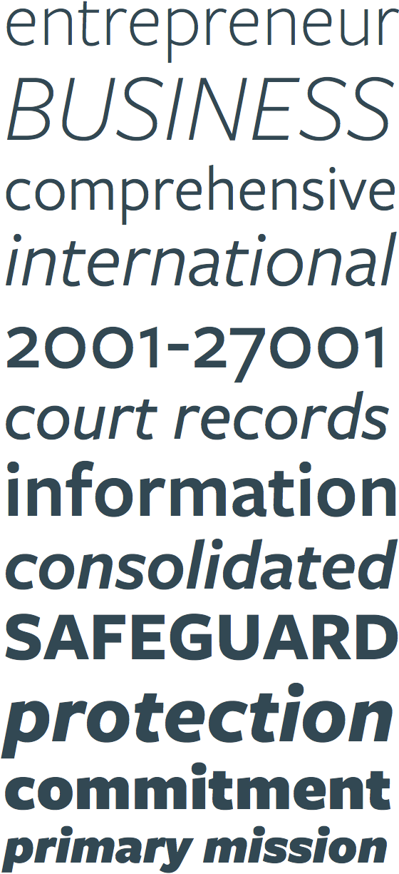
Freight Sans, Phil’s Fonts join Typekit

Hot on the heels of last week’s Omnes Pro announcement, we’re glad to welcome Freight Sans Pro and Phil’s Fonts to Typekit’s library. Freight Sans, like Omnes (both typefaces by Joshua Darden), is another very versatile family. But whereas Omnes is warm, Freight Sans is cool. Its chiseled physique and steely construction can set a serious tone, or play the foil to a more facetious face.

Including six weights — each with an italic — Freight Sans is built for formality and authority, without being stodgy. Nor does it try to counterbalance its straight face with a goofy attitude. Crisp edges and a brisk pace signal success (see how the roman lowercase e leans forward?), while open shapes and a generous x-height maintain an affable air. And it looks fantastic on Windows, too.

Freight Sans Pro Book at 16, 14, & 13px. Left, on Mac OS X. Right, on Win 7 (GDI ClearType).
Upgrade to a Portfolio plan or higher for access to Freight Sans Pro. If you’re already a Portfolio plan customer, enjoy the new fonts! If you’ve never given Typekit a try, sign up — it’s free! Upgrading is easy, whenever you’re ready.
3 Responses
Comments are closed.
A lovely looking font for sure. Comes out very nicely on Windows systems too.
Looks just like the Gotham font?
No, not even close. Gotham is much more open and sharp.