Skolar Web hinted for better screen rendering
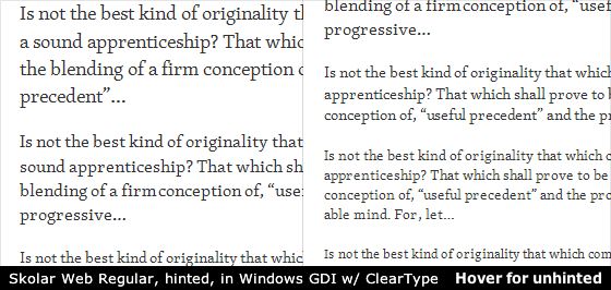
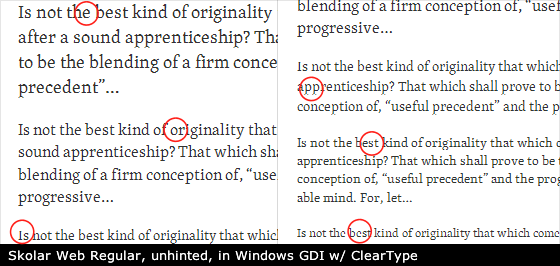
We’re happy to announce that Skolar Web from TypeTogether has been hinted for better screen rendering. Skolar’s designer, David Březina, worked through many iterations to get the improvements just right, and checked the fonts often using Typekit’s foundry review tools. It’s wonderful to finally release these new, TrueType-hinted versions of Skolar Web Regular, Italic, Bold, and Bold Italic. They look great — including Cyrillic characters, which are also hinted.
To receive the latest Skolar Web fonts, just republish your kit. And be sure to give Mr. Březina a shout and tell him how much you appreciate his hard work.
Update: And be sure to thank Ross Mills as well, who in David Březina’s words, “is the mind behind the screen optimisation.”
12 Responses
Comments are closed.
Now if we could just convince PS Type to do the same for Ratio…
This is precisely the level of attention to detail and craftsmanship that’s making native web typography so very exciting indeed. Great work Mr Březina.
That’s pretty drastic. Looks like an altogether different font x-height-wise.
Good observation, Jeff. It’s easy to imagine how Skolar Web’s proportions at certain pixel sizes might vary, had it been automatically hinted (or manually hinted by a different person). A type designer’s aesthetic sensibility is crucial for hinting type.
Stem thickness, x-height, and stroke/spacing consistency are examples of aesthetic decisions that type designers need to make as they do the very technical work of hinting. See our own Tim Ahrens’ post on TrueType hinting.
That’s a great example of how much change is required to make a typeface fit for screen. Lovely stuff.
I have nothing but the utmost respect for craftsmen that take this much care into their work. Beyond astonishing, Mr. Březina.
Thank you all, Tim especially for his patience. Please, note it has been hinted by Ross Mills (www.tiro.com) who is behind some work for MS for example. Indeed we worked in iterations to get it right, but he is the mind behind the screen optimisation.
The best thing about the better screen rendering for Skolar: I don’t have to wince every time I visit *certain* designers’ sites anymore on Windows.
I do hope Adelle will be given the same treatment soon.
And was it mentioned here that the webfont includes hinted Cyrillic as well? It does. All the languages Skolar Cyrillic supports. Unfortunately some stylistic differences (Serbian, Bulgarian) can only be activated via OT features. But it is there, waiting for the future.
A most impressive difference, for sure.
It’s wonderful that using a service like Typekit allows for use of advanced typography online as well as being assured that people are behind the scenes adjusting our type to make things better all the time.
Impressively, this improvement shines up my existing site without any steps from me (except republishing, which is, arguably, VERY DIFFICULT!).
Thank you Mr. Březina and Mr. Brown.
Can we try to get Mark Simonson to do the same for Proxima Nova? Please. Just started using the light typeface at small sizes (18 and under) and it’s starting to fall apart on windows machines using Firefox.
Fantastic. I remember being very diappointed when I first saw the Bobulate site in Windows, it actually put me off the whole concept of web type for quite some time. It is great to see that type designers are recognizing the importance of hinting their faces for enhanced screen rendering on the Windows platform. Now Bobulate looks very nice in Windows. Bye bye jaggies!