Type study: An example of Lettering.js
This is part of a series of guest posts covering tips and tricks for working with fonts on the web. Today’s post was written by Trent Walton of Paravel.
Lettering.js is a jQuery plugin for radical web typography. With all the exciting progress in the realm of web fonts, Lettering.js allows you to target specific letters, words, or lines within an element by wrapping them in spans, all while keeping the markup manageable. You can learn more about how and why Lettering.js was developed by reading Dave Rupert’s post, but here we’re going to walkthrough a use case, so let’s get going!

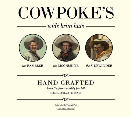
I’ve built a quick webpage for a fictitious cowboy hat outfitter, set in LTC Bodoni, called Cowpoke’s Wide Brim Cowboy Hats. I’ve included jQuery and Lettering.js and have added a block of script to the :
  $(document).ready(function(){
    $("#company").lettering();
    $(".hat-name").lettering('words');
    $("#footer-text").lettering('lines');
  });
We have Lettering.js applied to 3 elements on the page:
#companyis the Cowpoke’s title, which is broken into letter spans such as.char1and.char2.hat-nameis the name of each hat, broken into word spans such as.word1and.word2#footer-textis the “Hand Crafted” blurb at the bottom of the page, which is broken into line spans such as.line1andline2
The Cowpoke title, after kerning; hover to see the title before it was kerned.
Let’s start with the Cowpoke’s title itself. The font size is set at 105px, and it could use a bit of kerning. Here’s the markup along with the corresponding CSS to tweak each O and the apostrophe:
Cowpoke’s
Of course you could use relative positioning or margins to adjust every character, but in this case these few slight tweaks go a long way. It’s also worth noting that since each browser handles kerning differently, it will be necessary to test your results for the desired outcome.

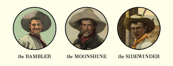
Next, let’s take a look at the hat titles; the word “the” is set in italics, while the hat name is displayed in all caps. In the head, we’ve already told Lettering.js to target .hat-name for words, so all we’ve got to do is apply some style to this markup:
The Rambler

To wrap things up, we’ll target the “Hand Crafted” footer text. In this case, we’re using Lettering.js to break the following markup into spans for specific styling:
Lettering.js translates that into:
Now, we can add some CSS to stack and style those spans:
#footer-text .line1{
  font-size: 38px;
  text-transform: uppercase;
  display: block;
  letter-spacing: 4px;
}

#footer-text .line2{
  font-size: 21px;
  text-transform: lowercase;
  display: block;
  font-style: italic;
  margin-bottom: 6px;
}

#footer-text .line3{
  font-size: 13px;
  text-transform: uppercase;
  display: block;
  line-height: 24px;
}
There you have it. There are lots of ways Lettering.js can be put to good use. While it’s probably not something you’d apply to every element on every site you’re working on, it can come in handy — providing extra control whenever necessary. In the future, I can’t help but wonder if expanding CSS selector capabilities to yield similar results without Javascript would be sensible. In the meantime, download Lettering.js, build your kit, and get to experimenting!
5 Responses
Comments are closed.

Finally, kerning on the web. But what’s so “radical” about an idea that’s hundreds of years old? Nonetheless, very excited.
Trent showed us some kerning here, and what’s exciting about it is that some browsers currently don’t respect (or respect by default) the kerning instructions that come with font files. But Lettering.js is about any kind of character-specific control, not just horizontal adjustments. You can do some pretty crazy stuff.
This is really interesting stuff, very granular technique, very powerful=..!!
I will be giving this a try shortly…
It’s a nice utility to break up long words…. but it’s not needed to do that. Just enclose each letter in its own div/span.
It should be touted as a faster way to break up characters via div’s than actually allowing placement.
It’s the CSS doing that. Not the js
Very interesting. It’s nice to see that it’s possible to gain some modicum of control over the display of type – although as it was pointed out, this little bit of control could definitely have some big effects. Informative!