Sites we like: The Kick Awesome Show, Campaign Monitor, and Designing Monsters
Careful use of CSS3 marks the excellent round of sites we like this week.

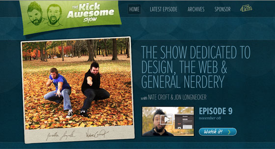
The Kick Awesome Show is dedicated to design, the web, and general nerdery, not to mention fabulous typography. Proxima Nova Thin Extra Condensed looks, well, awesome set large and in all caps. A tiny bit of negative letter-spacing (just 3px) tightens the headline text. The casual button style — sporting FF Market and a CSS3 gradient — contrasts nicely.

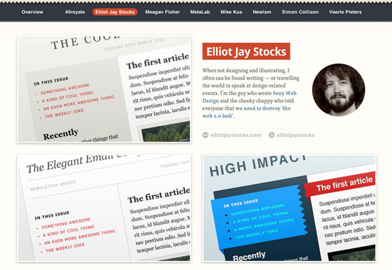
Campaign Monitor’s Templates gallery features Droid Sans and Skolar. Skolar is a workhorse at text sizes, managing to be readable, authoritative, and friendly all at once. Droid Sans looks great knocked out against a red background, while a very subtle text-shadow lends just a bit of depth.

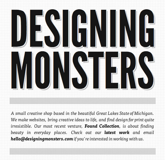
Designing Monsters is a small design agency based in Michigan. Headline text set in League Gothic pairs beautifully with the black and white color palette and narrow page width. Two different text-shadows applied to the heading create a wonderful, paper-like effect previously only achievable with images.
Noticed any other great sites? Share them in the comments.