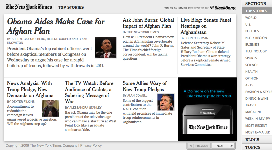
Featured Site: The New York Times
 It’s hard to argue with the rich typographic tradition of the New York Times. For over 150 years, the paper has defined the look and feel of news and created an unrivaled journalistic standard. We’re proud to help bring that tradition to the web with today’s launch of the Times Skimmer, featuring the paper’s renowned typefaces Cheltenham and Franklin — optimized and served via Typekit.
The application is an alternative interface to the remarkable content on NYTimes.com, offering users the ability to flip though the site’s sections and quickly pull up articles. The Times blogs are also available, as are topic views such as swine flu, global warming, and — of course — bacon.
Besides being a great user experience, the Skimmer is also an example of a smart web app. Lead developer Andre Behrens told us he made use of many HTML5 features in the browsers that support them, including off-line storage for speedier loading and visual effects like CSS transitions.
It’s great to see all these cutting-edge features blended with traditional typography.
12 Responses
Comments are closed.
It has to be an honor for your service to be used by a company like New York Times. Congrats!
Sweet!
Wow, impressive that a site like NYT is using custom fonts with Typekit! Wonder if Khoi had any influence.
Yup, we worked with Khoi on this. As expected, he’s great.
Am I the only who thinks this looks a tad messy?
And when will your average TypeKit user get to use the immaculate Cheltenham, eh?
Sadly, the average Typekit user will get to use Cheltenham when they go to work for the New York Times. This font is a special engagement. Sorry to disappoint.
great, New York Times i love you
Spiffy.
How come it only works on Safari (4)?
(And not Gecko 1.9.1 nor Chrome 4/mac? – They *do* support @font-face.)
This looks fantastic.
As a NYT frequenter, this is a game-changer. I really dislike the front-page as they have it because its just too much. Skimmer is pretty nice… so far
Now Mr. Veen, can you recommend some capable logo designers to the NYT staff to get rid of the chrome rip-off logo they have going on there?! 😉
Fantastic. A truly beautiful interface. This is how you read the news! The grids are fantastic and I love how fluid everything is. Will this be something NYT possibly could transition to site-wide?