Creating Bickham Script
Richard Lipton was a “budding calligrapher” when he first fell under the spell of George Bickham’s Universal Penman — nearly 35 years ago now, after finding a copy of the Dover facsimile in a Harvard Square bookstore. Lipton was smitten: “The rhythms of its pages were seductive and intensely romantic, imploring me to sit with it for a while, hypnotized, wondering, above all else, how such marks could have been made by mere mortals.” He bought the book, rushed back to his studio, and immediately set to work trying to emulate what he was seeing in Bickham’s pages.
The results were not brilliant. He found that the flexible steel point was not an easy writing tool to use, and he decorated his pages with entirely too many inkspots and splashes. “Many months passed, and in the end, although I had achieved some accuracy with this treacherous tool, I was unable to re-create the elegant swelling lines of these copperplate styles to my satisfaction.” He set it aside, and only came back to it years later.

One of Richard Lipton’s ink-splotched early attempts at the English round hand.
In his eight years as a type designer at Bitstream, Lipton digitized several script faces as well as many roman, italic, text, and display designs, including two original type families — Arrus and Cataneo (the latter designed collaboratively with Jacqueline Sakwa). Lipton “came to understand the underlying structures of these many type styles and began to see, from this new perspective, the connections between calligraphy and type, and how through history, different tools have dictated specific letter shapes.” He kept coming back to Bickham and The Universal Penman, and continued working on cursive styles of lettering, designing two more original calligraphic fonts — Sloop and Avalon — for the Font Bureau.
It was at the 1994 ATypI conference in San Francisco that Fred Brady, who was then Adobe’s head of type development, invited Lipton to submit a new design for the Adobe Originals library. Lipton recalls, “With Sloop behind me, I felt I had sufficient experience creating at least a partial joining script, and I finally came around to looking at Bickham’s work again from a different angle, a digital one. Folks at Adobe seemed excited by the idea of a multiple master family, and so the project began.”

Facsimile of a business letter written by John Baskerville in 1757. (Printed in 1996 by White Dove Press.) From the collection of Caroline Archer.
The calligraphy shown in The Universal Penman was not type; it was handwriting: written, engraved, and then printed. No two letters were alike, even in the samples of the same writing master’s hand. And these masters had pulled out all the stops; not only were there elaborate ligatures between letters, there were ligatures and joined strokes between words, and short lines were often filled out with patterns of extended flourishes for no other purpose than to create a pleasing shape. The pages were very readable, but they were by no means simple.
Creating a typeface from these examples would mean making decisions and compromises, finding the right forms to be repeated as letterforms in a typeface. “While endlessly studying the manuscripts’ pages, I knew there were many ways for this endeavor to go wrong,” Lipton says. “I had to make some hard choices as to where to begin and what to include… The possibility of excess and overkill was always looming over my shoulder.”

A very practical 18th-century business document: example of a bricklayer’s bill, from The Universal Penman. (Folio 122, detail.) Image courtesy of the Letterform Archive, San Francisco.
Rather than directly imitate any of the examples in The Universal Penman, Lipton wanted to create a typeface that would embody the spirit of those pages, suggesting their spontaneity while still working as a practical digital font. “My goal was to create a typeface based on the spirit of these letters, to achieve some practical middle ground, where the look and feel of Bickham’s pages could be revealed.”
First he worked on developing the underlying structure of the lowercase, which would provide the general rhythm and color of the typeface, leaving the more obvious capitals for later. He found a few pages in The Universal Penman that gave him what he needed: “access to many basic lowercase forms and a sense of the look I wanted Bickham Script to have.” He had to modify some of the connecting arms between letters so that they would have a consistent standard join in most cases; that’s one of the compromises of creating a joining typeface that looks as though it’s been written by hand.
The typeface that emerged after nearly two years of intermittent work was Bickham Script, released by Adobe in 1996 as a multiple-master font with a single axis: weight, from light to bold. Lipton says, “It included two sets of caps, 43 alternate lowercase characters, 27 beginning, 19 ending, and 18 ornaments, presented in three weights with eight separate fonts.” This gave people a large variety of different forms to use.
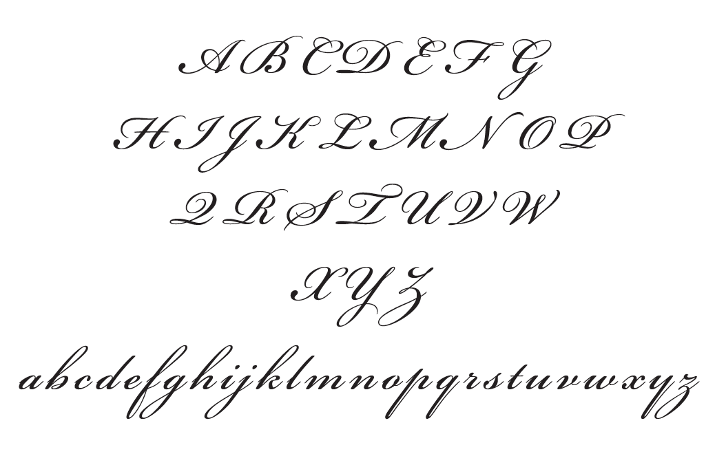
Initial set of caps and lowercase for Bickham Script.
Once the typeface was on the market and in designers’ hands, Lipton noticed that very few designers were actually taking advantage of the font’s many alternate forms. “They were basically using it ‘out of the box,’” says Lipton, “perhaps with a swash cap thrown in for drama.” Bickham Script was used frequently as an elegant cursive typeface in a wide variety of printed matter, but Lipton felt that its possibilities were being largely missed.
“This was of course both an educational issue and a technical one,” Lipton says. “Bickham is not an easy display font to ‘dress up’; it requires some keen typographical skills to use in an appropriate manner, and sad to say, these skills weren’t readily apparent as I began to see it in use.”
The alternate characters were broken up into eight separate fonts: the base font, Alternates 1, Alternates 2, Beginnings, Endings, Ligatures, Swash Caps, and Ornaments. People who wanted to access these alternate characters needed to reference a keyboard chart in order to learn which of the eight fonts it had been grouped into. “It was a manual process and took some skilled, patient, and thoughtful typographic work,” Lipton says. “The results I witnessed weren’t always successful.”
From multiple master to OpenType
The opportunity to revisit both the design and its technical usability came in 2002, when David Lemon at Adobe asked Lipton to consider expanding the typeface to take advantage of the recently developed OpenType font format. OpenType offers features that can automate much of the manual process of choosing alternate characters that had stymied so many graphic designers. When these features are turned on, the font can automatically replace default forms with appropriate alternates, depending on the context. This opened up the possibilities enormously.

Some of the proposed additional forms for the OpenType version of Bickham Script.
“The development of OpenType created a new playing field for Bickham Script,” says Lipton. “It would on the one hand add a great deal of functionality to the typeface, and it would make typesetting with such a complex font much more comprehensible, with access to all its contents much less exasperating.”
The first stage was simply converting the existing glyph set of Bickham Script into OpenType format. An advantage of OpenType fonts is that they can have a much larger glyph set than PostScript Type 1 fonts, even multiple master fonts: instead of a maximum of 256 glyphs in Type 1, an OpenType font can contain more than 65,000 different glyphs. This meant that there was no longer any need to break up large character sets into multiple fonts. All of the glyphs in one weight of Bickham Script could be contained in a single font file.
The new OpenType version was released in 2003 as Bickham Script Std — “Std” being the suffix Adobe used for fonts that had simply been converted from Type 1 format to OpenType without any major new additions. In this case, the only additions were the “Mac Symbol” set of 13 characters and the Euro symbol; at the same time, a handful of minor bugs got fixed. This was also the first version of the font to use OpenType’s contextual layout feature, incorporating some of the already-existing alternate forms into the text flow automatically.
But the really interesting process was already going on behind the scenes: turning Bickham Script into a Pro font, which meant adding Central and Eastern European language support, and opening up a much wider set of alternates and additional characters.

Bickham Script Pro’s many alternate forms of the lowercase r.
Bickham Script Pro
Lipton’s guiding principle in developing the expanded version of Bickham Script was “to add alternative forms which could be used more frequently than the elaborate alternates, but wouldn’t be used by default. The current version had a set of relatively plain glyphs, and a fairly complete set of more elaborately swashed glyphs, but much of what Bickham himself wrote falls in between, with variant forms and slightly-swashed forms sprinkled about.”
Lipton dove back into The Universal Penman in search of potential alternate forms that could be incorporated into the OpenType font. “In addition to a third set of medium-size flourished capitals, we looked for additional lowercase alternates, beginning and ending forms, and ligatures that could be implemented automatically according to a set of contextual rules built into the font. This required that they be somewhat unobtrusive in design and practical for general text use.”
Lipton worked closely with Adobe’s principal designer, Robert Slimbach, in researching and choosing letterforms that would make sense in context and be in keeping with the historical engravings. As Lipton recalls, “This rough stage of the design, the research and back-and-forth decisions necessary to make Bickham Script Pro successful, was a very exciting time in the process of creating this typeface.”

Robert Slimbach’s edits to sketches of lowercase letters.
Contextual changes
OpenType didn’t just offer a much larger number of possible alternates; it also supported contextual rules to determine which alternate characters should be used where. Working out those rules was a big task, though, involving a lot of careful thinking about the ramifications of every choice made.
“We needed to decide which letterforms should be contextual,” says Lipton. “These would be the more restrained glyphs, governed by automatic rules, that would always appear according to the context around them. Because these glyphs would be on by default, they needed to blend into text in a subtle manner.” They should look like the sort of natural variants that any skilled penman would use when writing by hand, not flamboyant flourishes that might be added for effect.
“The idea is to program the natural variations of handwriting into the font, while maintaining the utilitarian aspects of setting repeated lines of running text,” explains Lipton. “We wanted to create variants that would add visual interest, immediacy, and a slight increase in animation to normal text, while retaining its practicality.”

Excerpt from Robert Slimbach’s guidelines for initial implementation of contextual glyphs, showing variations for the lowercase c — one of the relatively simple letters.
At the simplest level, substitutions would make two occurrences of the same letter in the same word look subtly different, while also keeping the letters from colliding or overlapping unnaturally. But as type development manager David Lemon put it, “Some alternates would be used more than others, to get the right degree of liveliness.” Font engineer David Parsons worked with Slimbach on the complex task of developing the rules for contextual substitution, and implementing them seamlessly.
Adobe’s type development team had already begun exploring the possibilities of contextual substitution in the OpenType version of Caflisch Script, a joining, monoline script in a chancery style based on the handwriting of typographer and book designer Max Caflisch. Caflisch Script was a groundbreaking project, involving the creation of functional joins between letters that would work with the design without losing the visual spontaneity of handwriting. Bickham Script Pro, they hoped, would push the technology as “the next step” in OpenType contextual substitution.
Robert Slimbach says that the nature of English round hand lends itself especially well to contextual alternates. The style of writing taught by the 18th-century writing masters was extremely regular, with a practical rhythm of consistent variation. This variation was based on accepted rules of construction; a penman might add the embellishments that are the most obvious feature of round hand to our eyes, but the underlying structure was almost machine-like. The writing masters used those rules to “express virtuosity and intellectual mastery,” says Slimbach, “like a human creating complex typographic arrangements on the fly.” He describes it as “a chess move, always seeing ahead.” The same kind of thinking, with the same kind of rules, can be programmed into an OpenType font.

The regular pattern of round-hand forms, from George Bickham’s The Universal Penman. (Folio 94, detail.) Image courtesy of the Letterform Archive, San Francisco.
David Lemon emphasized the time and thought that went into creating true contextuality in Bickham Script Pro. “Robert worked long and hard with the production person here (David Parsons) not only to get the alternates set up to be used where they were visually appropriate, but also to craft the selection rules so as to get the simpler alternates used more often than the more ornate ones, retaining a more balanced appearance. To this day we think that Bickham is still the most well-crafted use of alternates in a connecting script.”
Hello,
Please tell me where I can locate and get the initial set of caps and lowercase bickham fonts released in 1996 by Adobe.
Hi Brenda,
We think the earlier release may still be available on MyFonts (https://www.myfonts.com/fonts/adobe/bickham-script-mm/). Current versions of this and most other Adobe Originals are available for purchase on Fontspring: https://www.fontspring.com/fonts/adobe/bickham-script-pro-3. Hope this helps!