Now in the library: More fonts for desktop
Hard to believe we’re nearly halfway through October. We’ve got a lot of updates for you this month, many of which you’ll hear about next week at Adobe’s annual MAX conference. Let’s kick it off with a look at what we’ve added to the library recently.
This week’s news comes from two of our foundry partners, Typofonderie and Underware. Both have just made their full collections available for desktop use in addition to web — that’s right, no more web-only fonts from these two!
Typofonderie
The collection from Typofonderie is full of winning options for all sorts of design needs. Now that all their fonts are available in more places, this cheat sheet might come in handy.
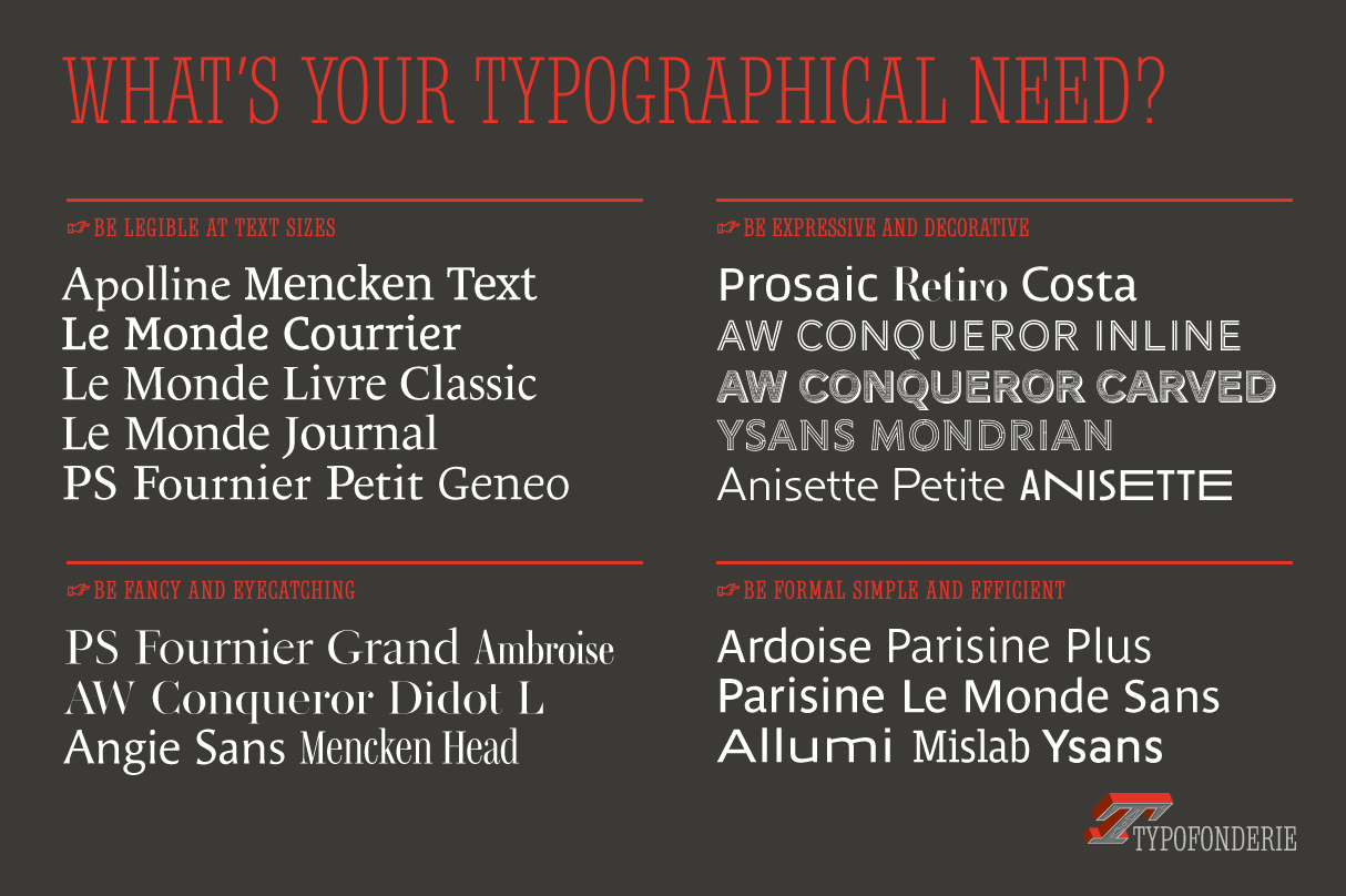
What’s your type? Consult the Typofonderie cheat sheet for quick diagnosis. Courtesy of Typofonderie.
The formal serifs are gorgeous, and easy to put to use. Le Monde Journal is a great one to start with if you need something flexible; the subtle Demibold and Book weights that fall between the usual Regular and Bold give you just a bit more volume without sacrificing too much breathing space.
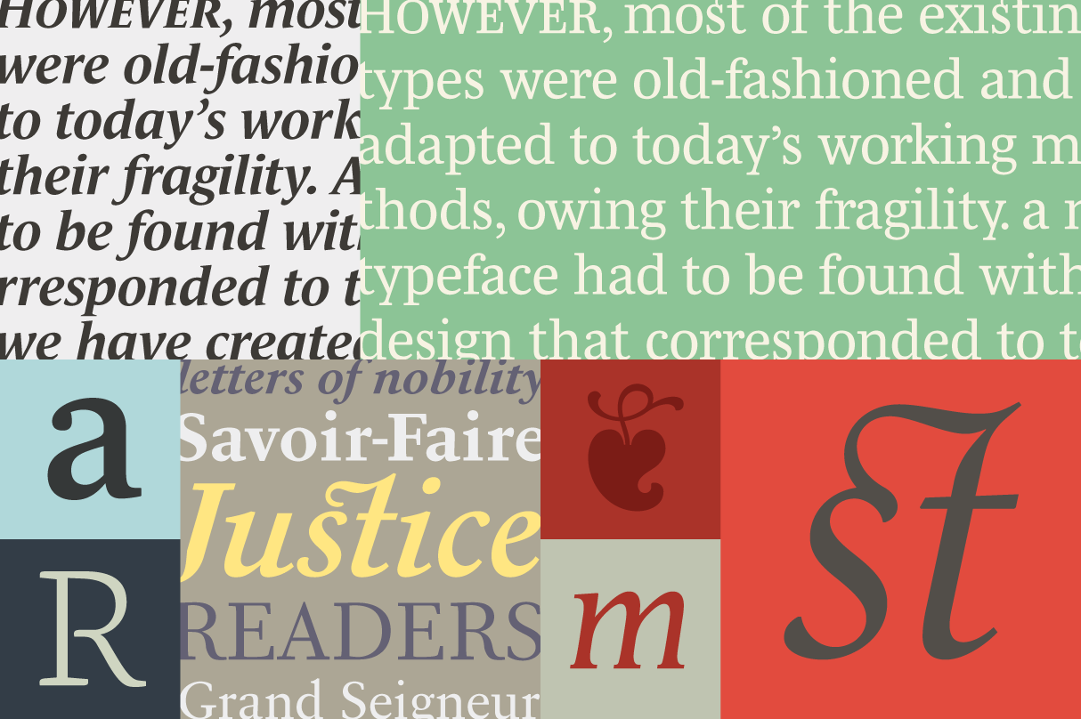
A sampling of serifs from Typofonderie: Le Monde Journal, Mencken Text, Mencken Text, PS Fournier Petit, Apolline, Le Monde Livre Classic, Geneo, and Apolline. Courtesy of Typofonderie.
Let’s not overlook the sans options! Ysans Mondrian is a mesmerizing display font that could make for great logo design. Less obviously decorated options like Anisette contain a few surprises of their own.
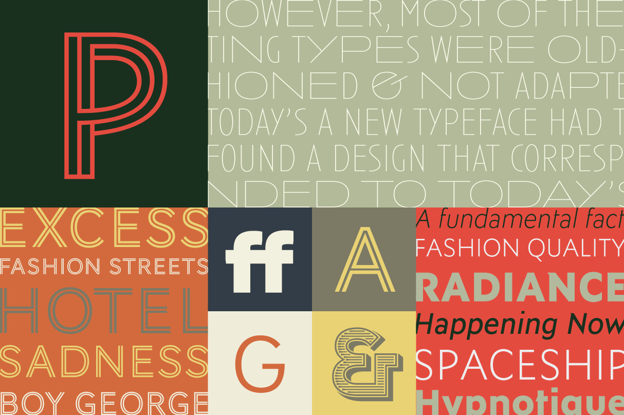
Display sans-serifs from Typofonderie: Ysans Mondrian, Anisette, AW Conqueror Inline, Prosaic, AW Conqueror Inline, Ysans, AW Conqueror Sans, and AW Conqueror Carved. Courtesy of Typofonderie.
Underware
The Underware collection includes several outstanding and unique options that can make for unforgettable signage.
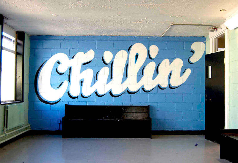
Bello literally takes up the whole room. Photo courtesy of Underware.
Bello is an all-time favorite of ours. You just can’t look away from it, and it’s supremely fun to work with. Use it big! This one’s meant to take up all the room you can give it.
The mono styles of Zeitung. Courtesy of Underware.
Zeitung is what we call a “superfamily”: dozens of weights and styles with the same name intended to work in tandem with one another. It’s a great option for all kinds of editorial use, and we’re particularly smitten with the italic monospace. Some people would say there’s no practical need for italic monospace fonts, but… we really want to use this one. Don’t you?
Let us know what speaks to you from this round of new fonts in the library. More to come soon!