Typespotting: Car dealership window painting
Perched on the corner of a busy intersection, normally all you see when you look at this SOMA car dealership is… well, a lot of cars in their showroom. I wasn’t too disappointed when their remodeling work gave me a fresh opportunity to look at some lettering instead.
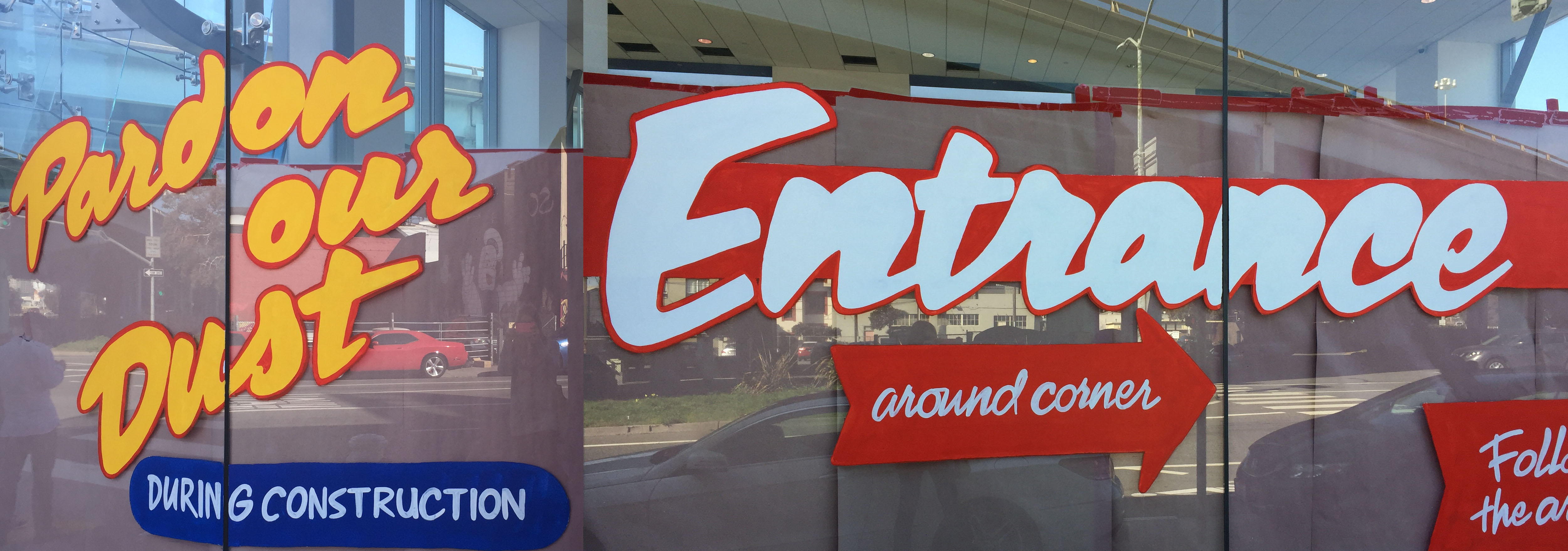
I was impressed by the different styles at play, and I thought all of them seemed really fun. I counted at least three distinct variations, and I expected our visual search feature would match each with a different font from the Typekit library.
I started with the large, swashy script first.
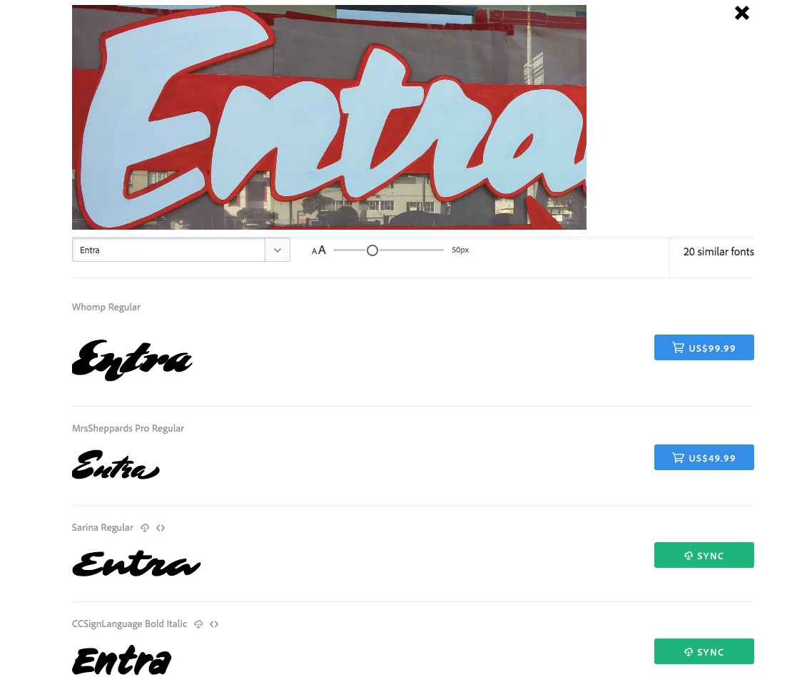
Results of running the “Entrance” lettering through visual search.
The first two results here didn’t feel quite connected enough to me. Sarina seemed much closer — although it’s a little more sprawled-out than the original lettering and doesn’t quite match the style of the capital E.
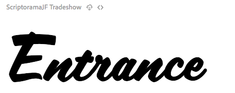
Scriptorama sample
As I scrolled down the list of possible matches I also noticed Scriptorama, which fit the E a little better.
Then I tried finding a match for the blockier lettering.
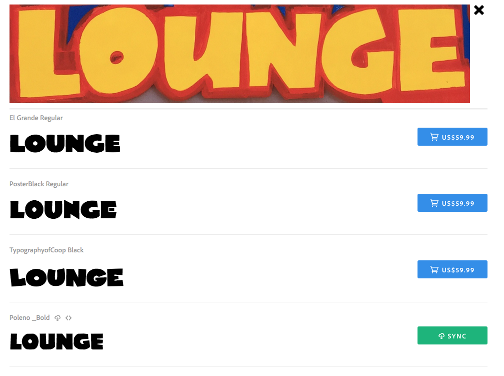
Visual search results for bubbly, boxy lettering
The visual search engine seemed to have some trouble reading this one. Maybe the asymmetry was too much for its robot brain to handle. The off-center O in particular reminded me of Blackcurrant, which wasn’t anywhere in the search results. Typography of Coop seemed close, though.
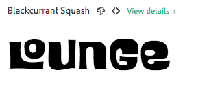
Blackcurrant was even wackier than I remembered.
Finally I looked for a second script, this one a little more able to accommodate fine lines and details.
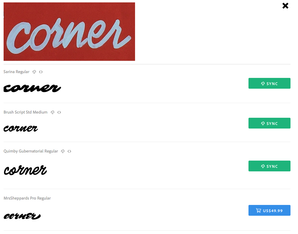
Visual search results for the smaller script lettering
Among the top results, Brush Script is great but maybe a little too beautiful for the setting here.
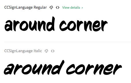
CC Sign Language
CC Sign Language showed up further down in the results, and while it definitely isn’t a script font, its personality actually seems just about right for this situation.
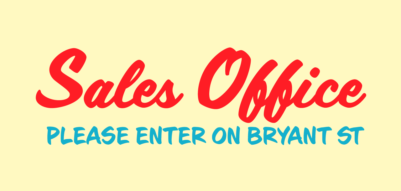
I stuck with showy Scriptorama for the larger “Sales Office” copy here, which captures a 1950s vibe that feels about as fun as the original sign did in my mind. For the smaller copy I used CC Sign Language, which gives a truly hand-painted character to the sign. It’s hard to imitate really good lettering with fonts, but I feel that the styles here come close to getting the right personality. Maybe I’ll revisit it next time I have a car to sell…
Seen any neat type in the wild lately? If you snap a photo of it, try sending it through our visual search to see what’s similar in the Typekit library – and let us know what you find!